

ELLIE O'DONNELL
Project 2: Candy Bar
Concept
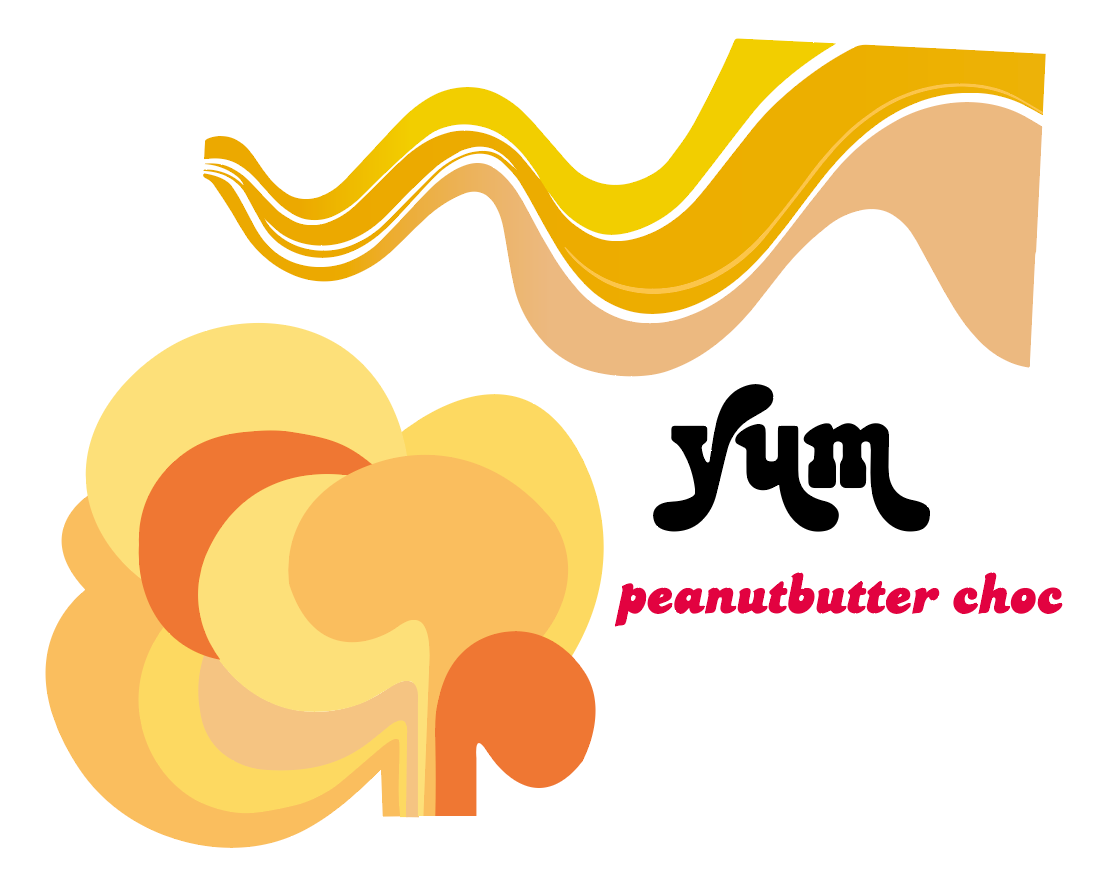
Oozing with creamy peanut buttery goodness and coated in a delicious layer of milk chocolate; Yum-Yum-Yum will be new to shelves in 2018. Instilling a feeling of sweet nostalgia, the packaging takes inspiration from the fun and vibrant disco era of the early 70’s.
When deriving my concept in response to the brief, my main objective was to create something that would be unique and eye-catching among the plethora of candy wrappers that currently line the confectionary aisles. I've attempted to capture the essence of the main ingredient; peanut butter, depicting this through fluid, lustrous graphics and type reminiscent of 70’s styling, with a colour palette dominated by variations of yellow and orange.
INITIAL Client Feedback
- Ensure design does not resemble existing peanut butter chocolate packaging.
- Refrain from using colours orange and brown.
- Think about targeting a younger demographic
Sketch development

Logo/Title
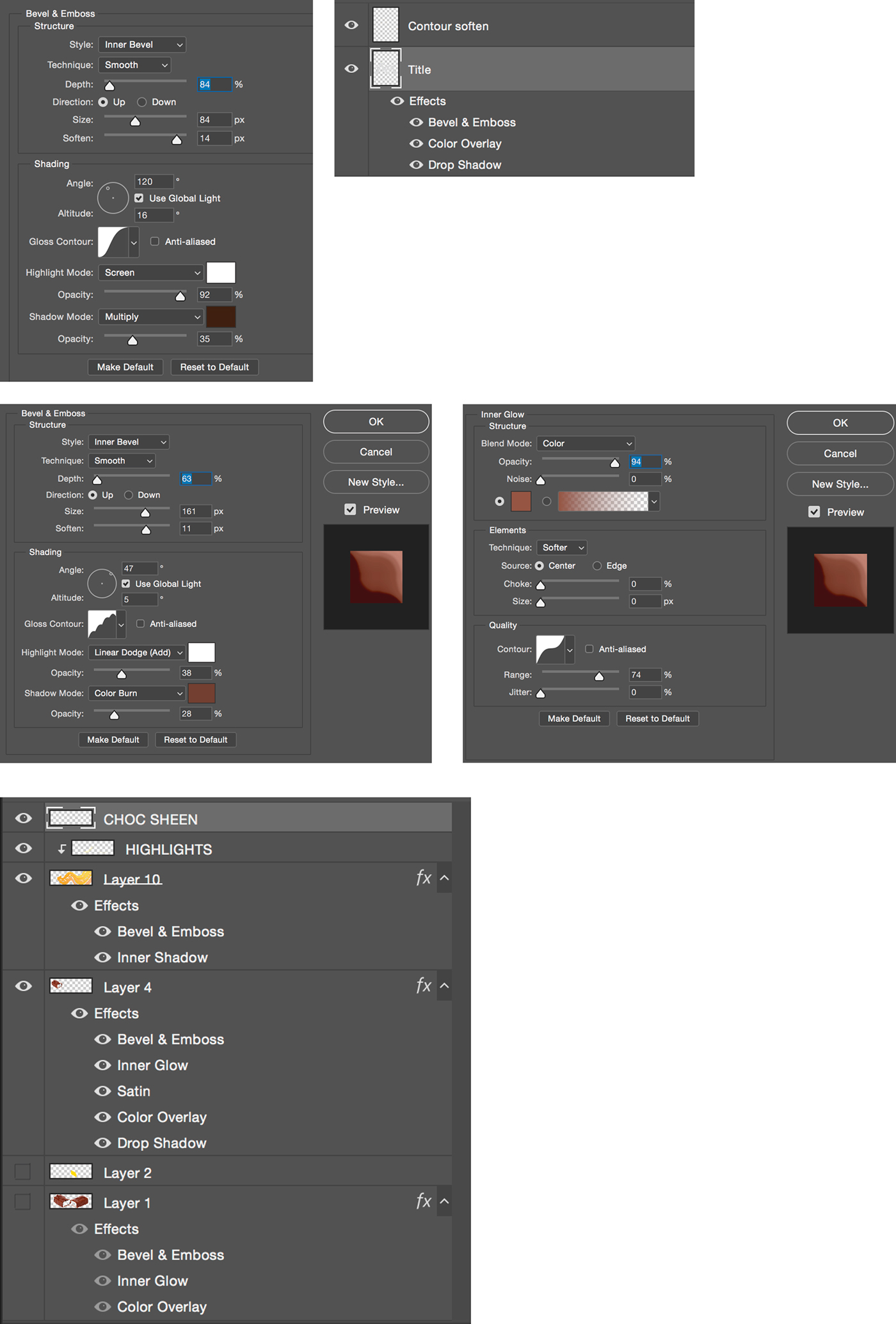
I created my logo/title using a combination of Adobe illustrator and Photoshop. Taking the typeface JackPot Sweep I experimented with different treatments to enhance the title’s impact, so that it would stand out against the background. Fine tuning layer style effects; inner bevel, contour, colour overlay and drop shadow, I was able to add dimension to the letters, while making them look illuminated. I then went in with a brush tool, and using a lighter colour softened the contour edges, to make the text appear more creamy/fluid in the hope that it would better suit my illustration.

Illustration
I have combined stock imagery sourced from pxhere.com and my own illustration to depict the main ingredient; peanut butter. I felt it was important to include realistic imagery with vector graphics to make the design more striking and fun, while also targeting a younger demographic.
To create the illustration I used Adobe illustrator and Photoshop. Using the pen tool in Illustrator I constructed different shapes to make up the Peanut butter swirl. Keeping each component separate allowed me to vary the colours of each section, adding dimension and realism.
Using the pen tool in Photoshop I made a selection path to cut out the chocolate bar from it’s original stock image. I then outlined the exact shape I would need to fill the space that exposed the inside of the bar, before moving it into illustrator to utilise the shape builder tool to combine this shape and the swirl. Finally, I added a gradient to ensure the elements would blend together seamlessly.
I completed the image composite in Photoshop, using layer style effects and the brush tool to perfect shading/highlight details and enhance surface texture.

Initial illustrations and type
Techniques
Final MockUp

Written Reflection
My personalized brief was to create a fun, eye-catching and appetizing design for a foil chocolate bar wrapper. The following features were mandatory: The title: Yum-Yum-Yum, an illustrative depiction of the main ingredient: Peanut butter and the weight: 75g.
Throughout my initial research and concept ideation I took inspiration from existing designs, referencing vintage candy bars from the 60’s and 70’s. I took note of the typical colour palettes – brown, orange, white and yellow - used by companies like Reece’s and Peter Paul’s. Upon receiving client feedback on my initial ideas however, I was advised to steer away from using colours like brown and orange, as this would look too similar to existing Peanut butter products and thus lack innovation. Instead I took a new direction, attempting to design something more playful and vibrant – that would appeal to a younger demographic.
During the design process I gained insight into the importance of dynamic typography in commercial packaging. As my initial title ideas were more artistic and abstract, I found it challenging when asked to adapt my design aesthetic to meet the style and standard of ‘impulse goods’.
Selecting an appropriate typeface for the product title was difficult. It needed to have legibility and simplicity, while being strong enough to stand out from the background and become memorable amongst consumers. Through familiarizing myself with impulse packaging design, as well as conducting research into why this style is favoured for marketing food, I was able to gain a deeper understanding of commercial design and what it means to respond appropriately to the needs of the client.
Delving further into my design process I observed the essential need to continue expanding my techniques beyond that of what Photoshop effects can create alone. Having gotten comfortable using the layer style effects when constructing the title, I initially found it difficult to go beyond these tools when bringing my peanut butter illustration from Illustrator into Photoshop. Despite the effects filters being helpful and often necessary during editing and compositing, it’s important not to forget the effectiveness of using manual tools like the soft brush, pen tool, different gradients and the eraser. These methods required me to pay closer attention to the image composition, allowing me to more accurately enhance certain areas whilst focusing on; the detail, where the light was coming from, where the shadows and highlights should be etc.
A third major insight I became aware of throughout this assignment was the crucial element of time. As I had trouble deciding on a solid direction in the initial stages, I learned first hand about the importance of leaving enough time to make alterations that I felt were necessary or were requested by the client.
As well as this, I became increasingly mindful of the need to use time efficiently and to design quickly. I find managing my time while deliberating over of an idea considerably challenging; this is something I feel I need to improve on. Completing an invoice as a final step definitely assisted me in understanding the importance of setting deadlines and working within time constraints.
When evaluating my final outcome I consider whether I could have made the peanut butter illustration look more dynamic and prominent within the composition. I also wonder if the use of more contrasting colours in my design could have made the overall product more eye-catching to consumers.
Ultimately I found this assignment both challenging and rewarding. I gained a deeper understanding of a different kind of design and realized the importance of adapting personal aesthetic to meet the commercial demands of a brief. Moreover, I continued to advance my skills in Photoshop and Illustrator, being conscious of time constraints and the client’s needs.

References
Vukovic, P 2012, ‘6 Rules for packaging design that will shine on the shelf’, 99Designs, Viewed 25 October 2017, https://99designs.com.au/blog/tips/6-rules-of-great-packaging-design/
Photoshop Tutorial: How to make Glossy, Molden, Plastic text 2012, Youtube video, Blue Lightning TV photoshop, viewed 20 October 2017, https://www.youtube.com/watch?v=otSOKc3v3yo
Chocolate bar, n.d., stock image, viewed 20 October 2017, https://pxhere.com/en/photo/1387114
Protein bar mockup template, n.d., stock image, viewed 15 October 2017, https://creativemarket.com/search/Protein/Bar/Mockup/Template


