Inspirational Designs For Gunita
When creating and laying out my designs, these are the inspirational pieces of work that I use as a form of inspiration when creating stuff for my proposal Gunita. However, I try my best to not just copy the designs, but rather take the central but different elements, techniques, and conventions (whether it'd be its use of color, composition, and tone) that make up the design.
Breaking Down The Techniques And Conventions For My Inspirations
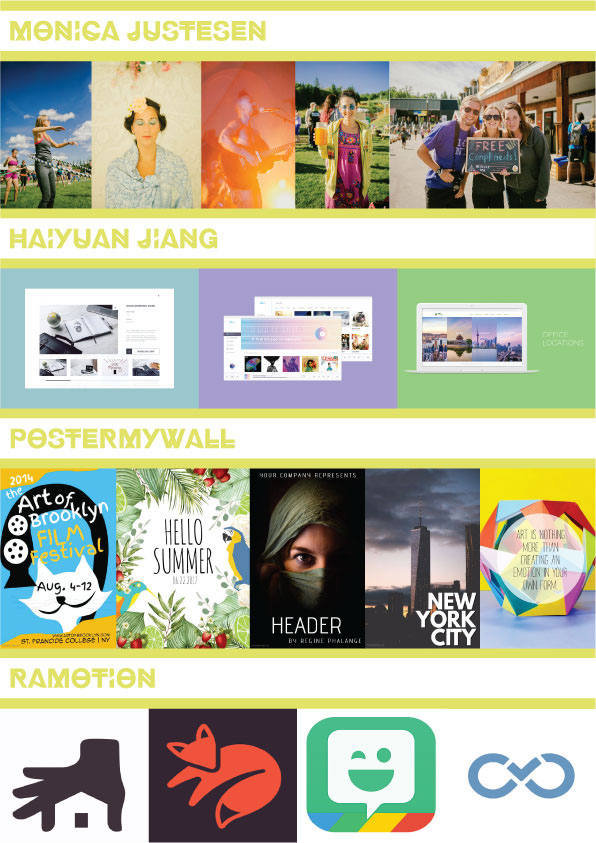
Logos By Ramotion
Use Associating Symbols
For each of Ramotion's designs, it cleverly used objects and symbols that connotes with the name of their project. To illustrate, looking at the logos above from left to right: Movers have a hand grabbing a house and its contents, to show that it's a home-moving company; Kitsu, which comes from the word "kitsune" (Japanese for fox), has a logo design that consists of a simplified fox; Bitmoji uses a personal emoji as its logo, to demonstrate how the app allows the user to create expressive avatars; and InfinityDrive simply uses an infinite loop. When creating the concepts and developments of my logos, I'll deconstruct the meaning of Gunita: summer memories; and use symbols/objects that associate with this meaning (i.e. camera, sun, eye, photos, beach).
Keep It Simple To Process
What makes Ramotion's designs effective is how simple it is to process, to the point that it can easily be drawn by a child. In addition, it uses minimal colors so that it's easier to remember. I wish to apply this simplicity in my logo designs by only implementing around two to three hand-drawn ideas in my A5 pad, to keep things simple. When it comes to color, I intend to further emphasize on using my main yellow-gold colors to make it easy to remember for people.
Posters From PosterMyWall
Aspects Should Be Bold And Clear
Every element of the posters of PosterMyWall are bold and stand out in the image; and are clearly readable for someone, whether it’d be close up or at a distance. The colors used in their posters (especially for their illustrated posters) are bright and lively, with its use of yellows and light blues stimulating positivity and grabbing attention. PosterMyWall’s use of text is either centered and covering up most of the poster (refer to the first, second, and last image) to make it enlightening and informative. Or medium-size and at the edge of the poster (refer to the third and fourth image), in favor of the poster’s main design/photo dominating the image. In turn, conveying an aesthetic appeal. It all depends on the context and content. I intend to implement this convention by having only necessary information and aesthetics (such as the main design(s)/photo(s), title, saying) in my posters distinct from minor aspects, by using warm and radiant colors; allowing those standout elements to pull the person into the picture. A balance between substance and style.
Use Minimal Elements Throughout all of PosterMyWall’s posters, a number of elements used in the posters are kept to a minimum. Similiar to the reasons of having a simple logo, posters with minimal elements allow it to be more identifiable and recognizable as a poster and/or a mockup. Most of the time in PosterMyWall’s posters (refer to second, third, and fourth image), it consists of a main design/photo that takes up most of the poster, and some form of text to complement the image. I want to exactly implement this technique in my designs, not just for simplicity’s sake, but so I don’t overstuff my posters with content; creating an effect that there is too much going on.
Photos By Monica Justesen
People Make Memory
What each photo has in similarity with one another is that they use people or a person as the foreground of their picture. Consequently, it conveys a sense that this isn’t an ordinary picture, but a memory captured in time; whether they are having fun, a laugh, or good time. When taking photos for my project proposal, I wanted people/a person to be at the center of the photo (or at least somewhat involved in the photo), conveying a positive emotion so it genuinely looks like a memory. Preferably, I would have one or some of my family members or relatives framed in the picture.
Add Summer Filter
For most of Justesen’s summer photos (refer to the second, fourth, and fifth photos), there’s a warm, soft but light tone that gives an inviting and friendly feel to it, whilst also enhancing the natural vibe of the image. My photos will also use a warm and soft tone for my summer photos, however, I wanted to have a slightly more intense tone so I can achieve that vintage look I wanted in my pictures. Whereas Justesen’s photos convey something modern and inviting, I want my photos to embody something nostalgic and have them saying “remember that…”
App UIs From Haiyuan Jiang
Keep It Clean
Jiang’s app design layout is accurately proportional so that each icon, each button, and each text is placed accordingly and perfectly. In effect, Jiang’s designs has a slick and professional appeal to it. As if it was inspired (or even copied) by the UI layout of websites like Spreadshirt, iTunes, and some travel site respectively. To put this technique into application, I used my computer science skills - on what makes a good UI - to develop my app designs for my project. In addition, I also took inspiration, but not copy, from social media and photo editing apps such as Instagram, Snapchat, and Photoshop; looking at how they layout each element in their app.
Limit The Use Of Colours
The use of colours throughout each of Jiang’s app designs and layouts is minimum (or having none at all using only tints and shades of white) and only using it scarcely. Used as accents that direct the user where are the buttons the user needs to press. Minimum use of colours means that when color is used, they stand out more in a crowd of hues of whites. For Gunita’s app design project, I also plan to realize this convention by using my main yellow-gold colours (and the various shades of it) as the accents for my app.
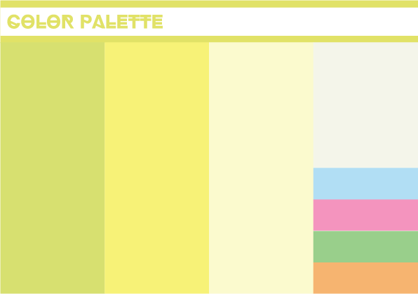
Color Palette
I plan to have this color scheme utilized throughout all the designs I work on for my proposal Gunita. Since this is quite a diversely colored palette, I didn't want to use all the colors in the palette, as it may result in creating an unnatural and freakish aesthetic that could ruin some of my designs. Instead, I will always use the main yellow colors, that make up most of the color palette, in my work. And if I can (in an effective way), use some secondary/minor colors to add an accent to some my designs.
Ideas For Gunita
These are the hand-drawn ideas that illustrate what my design concepts and developments could potentially look like in Illustrator (but obviously it'll have color and be more cleaner). Apologies for how dirty my drawings are, I have a tendency to press hard with my pencil and erase occasionally.


