Patch and the Giant Identity Design
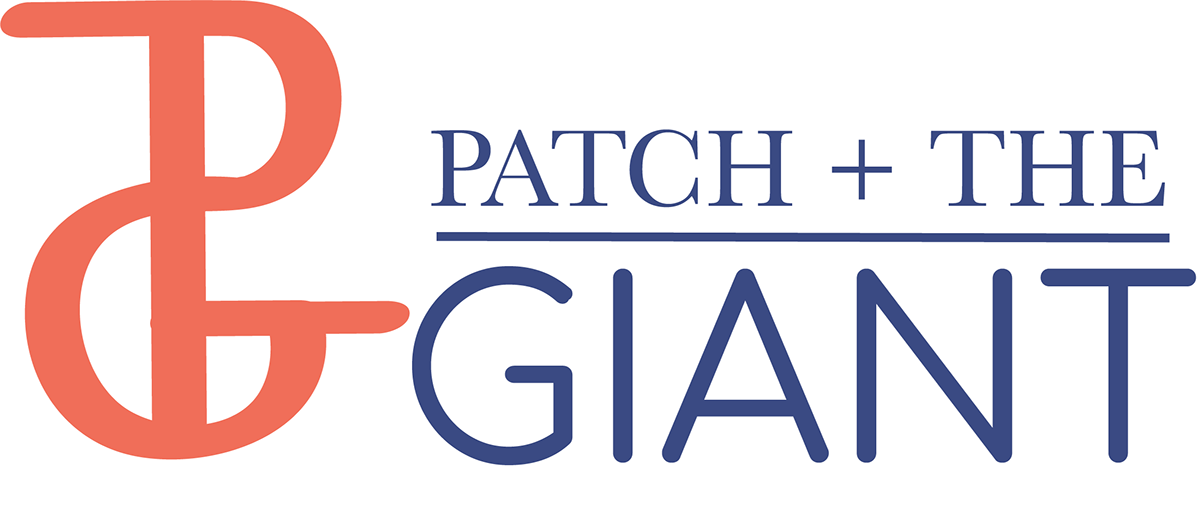
Logo
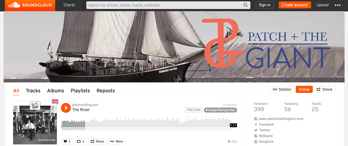
Soundcloud Banner
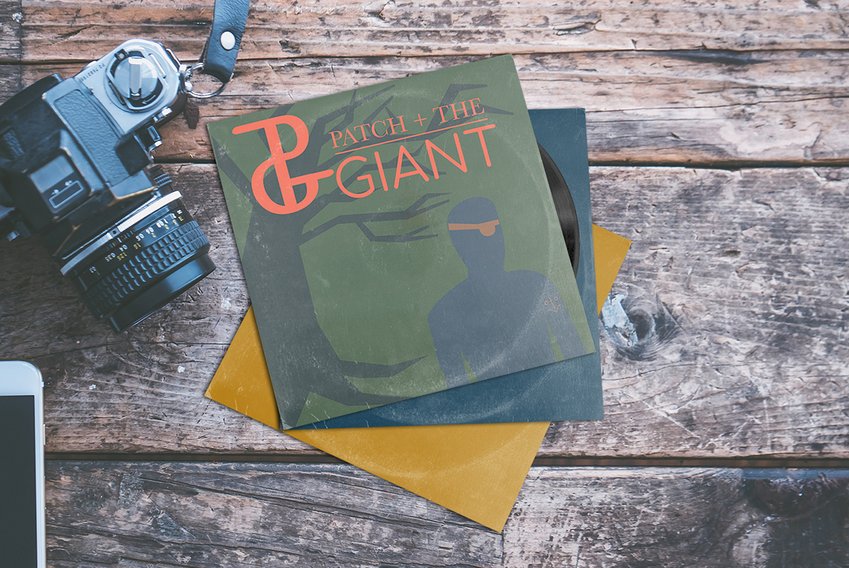
Album Cover
T-shirts


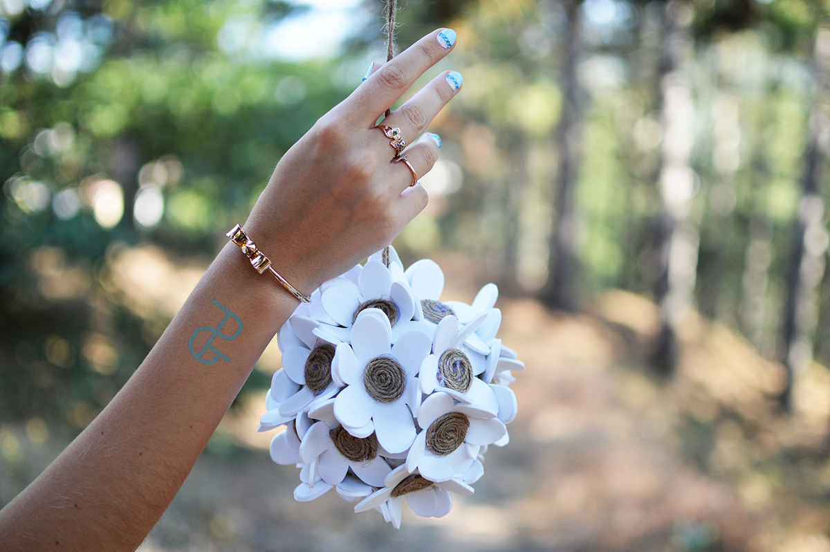
Tattoo Design
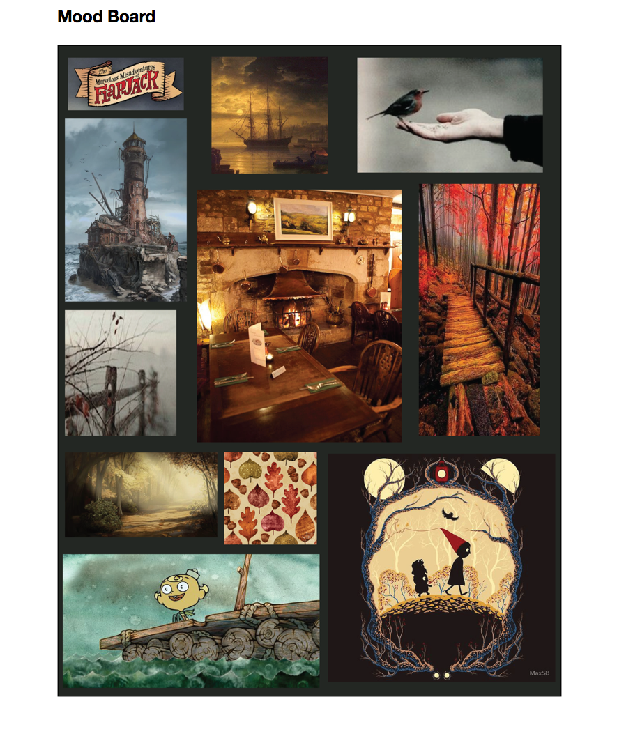
Mood Board
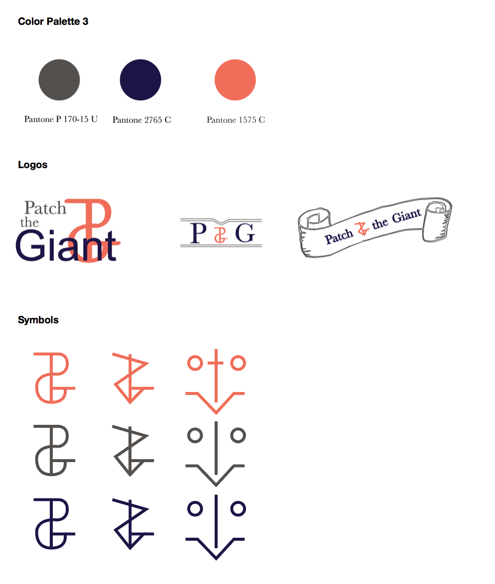
Identity System


Reflection
For this project, I was tasked with choosing an up and coming artist from Soundcloud or Band Camp and creating an identity for them. I had to develop a word mark, a symbol, a logo, and collateral items for the band. Each part of the design was to be well thought out and made to reflect the bands sound visually. All of the design items would then go through multiple critiques and would be fine-tuned.
After listening to the artists my initial thought was to use a serif typeface with old world style something similar to Baskerville. I also wanted to incorporate the use of a scroll as well as autumn tones to convey the folky nature of the music. As I worked on the initial sketches I developed a symbol which used the band's initials in such a way that it worked as an ampersand. I continued to play with type and in my final version, I used a mix of Baskerville and a round san serif font to compliment my symbol. In the end, I chose to remove the scroll because It felt to visually distracting and I went for a more cleaner look which still gave off a folky vibe.
For this assignment, I was given quite a bit of time to work on it so my process was spread out quite a bit. First thing I did when receiving this project was get on Soundcloud and listen to different bands. I knew from the start I wanted to design for a folk band and so I decided on the band Patch and the Giant. After choosing my band I began sketching rough ideas down this process allowed me to get my general ideas on paper. After my initial sketches I chose the best designs and began improving upon them and refining them. Once I had finished my refinement process I moved to the computer and began working in illustrator and after multiple iterations and critiques I developed my final logo. For my collateral I used different designs I created and dropped them into photoshop mock ups for presentation purposes, including my album cover which I designed in illustrator.
I learned a lot from this assignment. I learned that it is important to be critiqued and to take criticism with an open mind while still being true to yourself and your design. I learned that it is important for you to let the criticism you receive motivate you rather than let it get you down. Another major thing I learned from this process is that good designs take time and dedication and sometimes it is best to put your design away for awhile and come back to it with fresh eyes. The most important thing I believed I learned from this whole experience is communication is extremely important, ask questions about your design, figure out what works and doesn’t work, and get input from both designers and non designers alike.