
What I learned from my first digital painting.


(If you’d like to read the TLDR summary, you can scroll to the bullet points at the bottom)
This post is in reference to my my first digital drawing project located here. I had a few fellow artists ask about my process and decided to write this up.
Last year when the hype for Mass Effect Andromeda was strong and I had an excess of passionate feelings I started work on a portrait of the (then) newly announced Krogan squad member, Drack. I hadn’t done any digital drawings from scratch and was just learning how to properly draw with paper and pencil. I was equipped with a sub-par, glitchy Monoprice tablet that I caught on sale and an out of date version of Photoshop CS6 but I was determined to try.
Let’s get started
When I worked at Insomniac Games last year I saw that everyone drew their rough work with blue pencils first so I thought why not do the same digitally with a very rough sketch in blue using the pencil tool set to 1px in Photoshop. I wanted to get the shape and high contrast points defined first and I’m actually really glad I did it that way. Psychologically, the blue felt easy to get rid of and temporary. I started with all of the outer lines and profile before moving to grounding features like his eye and horns and building out from there. In hindsight I wish I checked the scale a bit more, there were parts that I couldn’t go back and fix after I added a lot of detail. I was honestly just so happy to have a drawing that looked like something real that I moved on to the next step.
After the “pencil” I used a 2 point black brush tool to “pen” the lines and also darken areas I knew would have more contrast. Things got tricky around this part. The crest (forehead) in my reference image has some excellent tones I wanted to capture but I couldn’t figure out how to blend the colors well. I tried a few different brushes but nothing was quite working. At this point I also got a little obsessed with the shading of the neck and put far too much work into it. Thankfully, someone kindly reminded me that it’s important to get base colors on all of your work before adding too much detail in one area.

It looks a lot easier when a few months of drawing is sped up to less than 30 seconds.
Now that we’re started, let’s get started
The task of adding base colors helped so much because I could just eyeball the values in specific regions of the reference picture and it would give me a place to start. I feel like finding that starting position is the hardest thing for me to get over and once I do, I can actually get invested. Now I combined the base colors with the brush techniques by smudging a lot of low opacity layers so that I got my desired colors and textures. It took a lot of work to get it right. I would throw in multiple layers of color blobs with 30-60% opacity on top of a base grey color, blend the edges of the blobs with streaks of the smudging tool. and then keep adding layers and smudging. I also used the blur tool until the blobs became highlights with a nice depth of color that wasn’t too sudden.
While I tried to avoid adding too much detail to one area, I began using the Pen tool to give small details and texture in 1 or 2px black. This was mostly to encourage myself that what I was creating wasn’t trash. Staying motivated was hard. I was absolutely certain I would sabotage myself and mess this crotchety Krogan face up. These details, the same layer as my “pen” always stayed as my top layer.


Balancing base colors with brush strokes was a challenge for me. Blending and smudging low opacity layers was my solution.
Sabotage from within
My cheap Monoprice tablet was slowly trying to kill Drack, and I didn’t know it at the time. Every third time I brought my pen down it would gain a life of its own and make a slough of unnecessary marks that I’d CTRL+Z into oblivion. This was quickly wearing on me, to the point that the project felt like a burden. I would often go for hours using my mouse, because I knew it wouldn’t make random marks. At the time I didn’t realize how bad it was, but thankfully my wonderful significant other made note of my obscene outbursts in the next room. She convinced me to “buy a damn tablet that works already”. I think she just wanted me to stop complaining. When my Wacom Intuos Pro arrived, it was like night and day. I could feel that I was on the home stretch.
OK, back to the art stuff.
I kept adding more and more detail, trying to keep a balanced hand around the entire piece. I didn’t want to lose sight of the overall composition and it was VERY tempting to add nonstop detail the jaw or a horn for an hour. The more finely tuned nicks and scratches that Drack gained the more realistic he looked and I decided to try and add a layer of these black/grey details on each section of him to keep progress balanced. The only difficulty I ran into is that I wanted to add too much detail. I decided to add “groupings” of detail, something I read in the @creaturebox artbook: Shred. This would give the impression of texture without overloading him. Not only that, I had invested a lot of detail already and didn’t want to get burnt out.
Details aside I also realized from my ongoing freehand still life drawing that adding points of very strong contrast would make him pop, so I decided his eye, chin, front horn, and crease on the center of the crest would be good places to draw attention. I also tried to keep textures and details on the back of his neck, second row of horns, and lower neck less defined to try and keep attention on his face and crest. This is the point where I realized that some of my scale was off. I wasn’t quite happy with the nose placement and gave Drack a quick and dirty cut/rotate/warp nose job that took a while to blend away. There were other spacing issues with his mouth, the angle of the crest, and some of the cheek but I was already at the point of no return. I decided to keep him as is. Next time, I’ll be sure to add more contrast and shading earlier as well as look at a variety of reference pictures instead of 2 or 3.
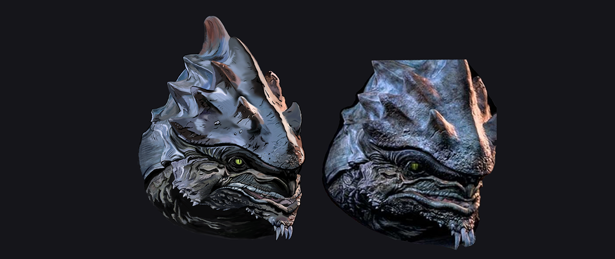
The near finished piece compared to the primary reference.
Finishing touches
Highlights of white, light tan, and cool grey were the last layer I added in earnest. These increased the contrast and gave a nice simulation of light. I kept the opacity low and patiently added more brightness while zooming in and out constantly. I really didn’t want to mess things up at this point. The biggest problem I had was actually stopping myself. I kept adding detail to try and make it pixel perfect. I wanted to blend the color again and again until it looked just right. I couldn’t let go after putting so much work in. Two nights ago a gauntlet was thrown down, “you have two hours to finish this”.
No, I did not finish it in 2 hours but, at the 3 hour mark I was done. Giving a deadline to myself that other people knew about helped. I gave my finishing touches with more blending in places that looked flat and added a black line around the outside of areas that weren’t super bright. This seemed to make Drack pop out nicely against a lighter paper-like background that I decided on.
In conclusion
Thanks for sticking around and reading my first post like this. If people like it, I’ll gladly start doing more write ups.. It’s honestly really helpful for me to process what went right and what could have been better.
So, to summarize my lessons learned.
Positive:
-Sketching a very rough initial draft in blue made it feel temporary and flexible.
-Adding a top “pen” layer to bring out shadows and corners was invaluable.
-Experimenting with different methods of brushwork on the piece itself with the expectation that some would fail was very valuable.
-Deciding high contrast points early was very helpful.
-Investing in a quality tablet made the drawing process a breeze. I shouldn’t have let bad tech get in the way of my art and enjoyment.
Points of improvement:
-I wish I added more prototype shading earlier to figure out if I had my proportions right.
-It would have been better to have more reference pictures that I keep revisiting early in the drawing. Once I get too late into the coloring, there’s no going back.
-Set hard deadlines that you tell people you trust about. This will encourage you to not dawdle and drag the project out.
-Accept that it will never be perfect.
You can see the finished work below:


