


MYRIS is a creative community with a goal to create a new standard of living. It is the parent company of a number of subsidiaries in the fields of interiors, architecture, retail, fashion, homewares and accessories, music, film and textiles.
These subsidiaries share a basic need, a need to create. They are imbued with their own identity and conscious self-creation, fostering thoughtfulness and largely inspired by Nature’s complexity.

When constructing the identity, we focused on creating a background story as a foundation for the brand. With their goal of creating a new standard of living, we came up with the idea of making Myris as a new independent ecosystem - which serves as a golden thread that pulls together the brand and its subsidiaries.
The Story
MYRIS is a living ecosystem that anchors itself on the idea of an imperfect beauty. While an ecosystem may seem perfect from afar; take a closer look, then you would realise how it is made up of polar entities: the pretty and the ugly, the pleasant and the unpleasant, the living and the dead. But one would only need to look from another angle to find the profound fact, how the other half of these opposites would form a new perspective towards the idea of aesthetic - that beauty, indeed, does lie in imperfection.
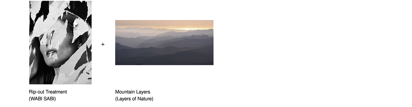
WabiSabi
The Japanese philosophy, Wabi Sabi, takes us on a journey to appreciate the frailest, most flawed, and ephemeral. The keyword is “process”. We can explore this word through rust, paper folds, shredded paper, stencil, scratches etc. and mediums that behaves naturally but also represents the imperfection.

Layers of Nature
Myris is an independent ecosystem, and nature plays a fundamental part here, where it serves as the main setting for almost all of the ecosystems in the world. Deriving ideas from the Mother Earth, I incorporated natural elements to the design.

The concept of WabiSabi & Layers of Nature were combined to create an imperfectly perfect outcome. This would inspire the aesthetic of the brand and collaterals.
The set of cards consist of different sizes and shapes, each one is different according to the sub brands. When you pile these cards on top of one another, they will look like layers of mountain forms.


2017. Done as Malt Studio.
Thank You.


