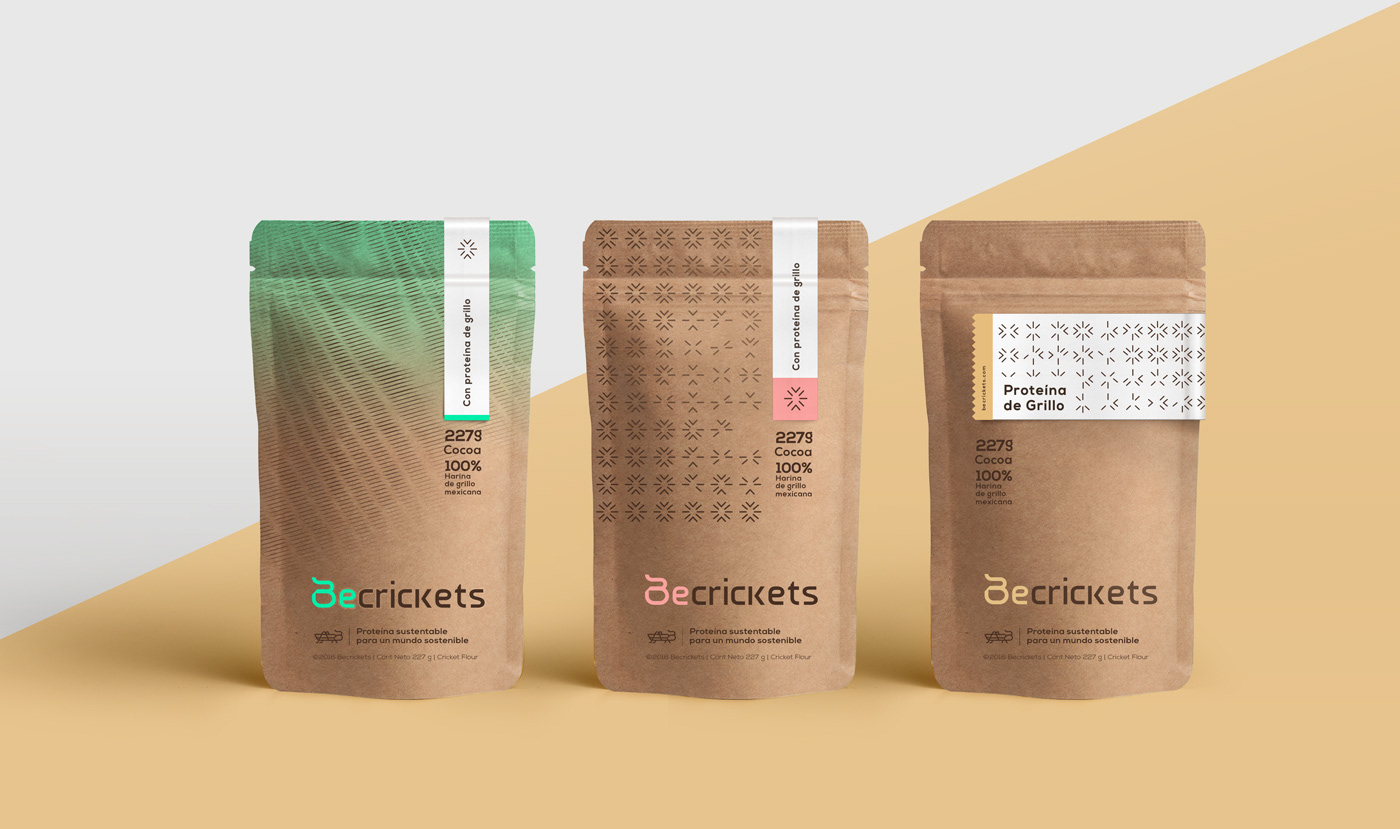
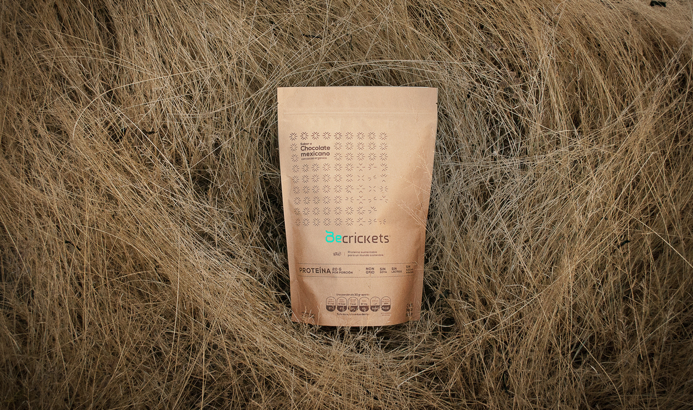
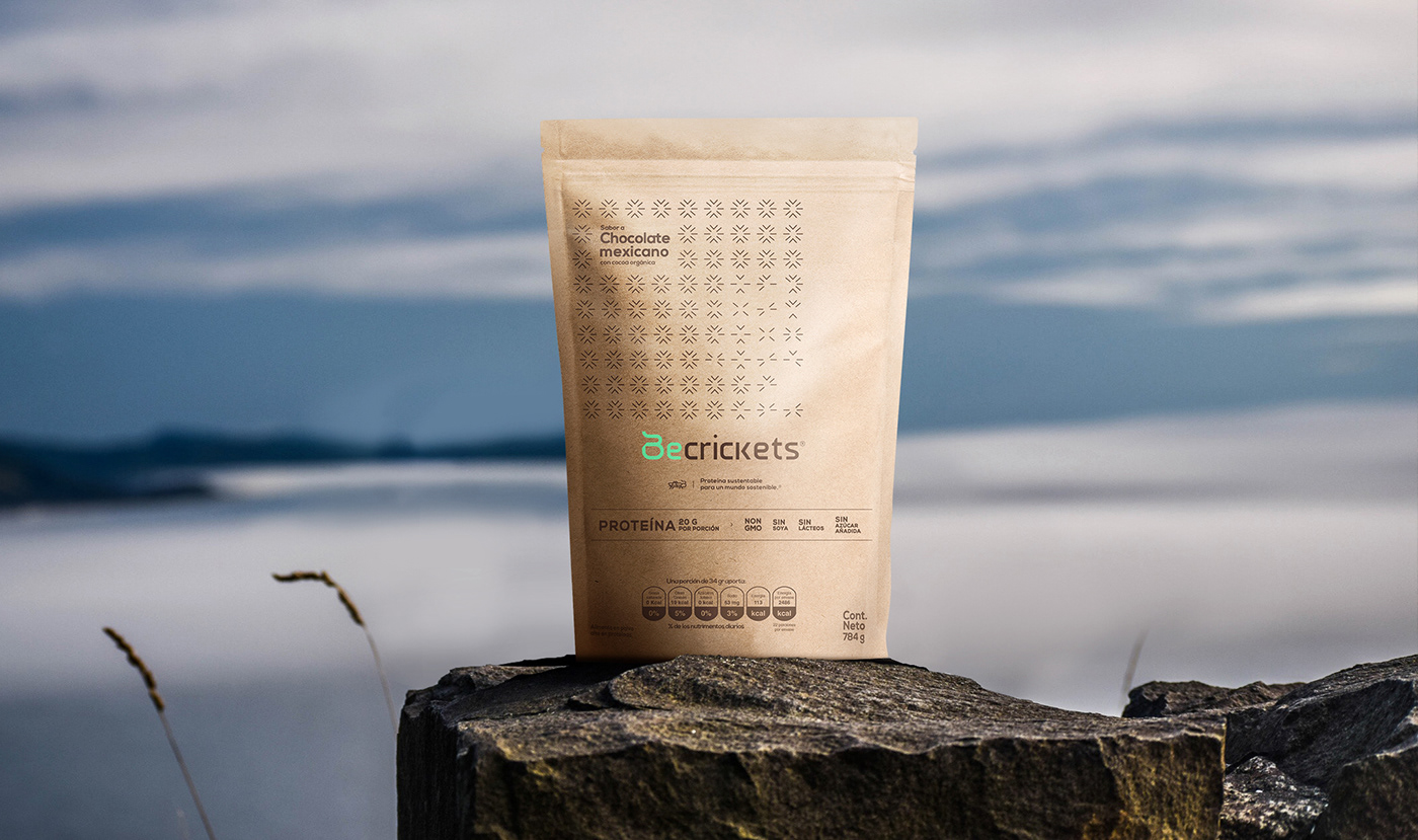
BeCrickets.
Beyond a cricket protein, BeCrickets is a sustainable movement. It is a food revolution. That’s why this innovate brand required a futuristic image. First, we create a logo from the letter B which transforms into cricket then we work with lines to form a life cycle relating both crickets & humans; a call to our natural being and our shared essence: vitality, speed, agility, energy, and dynamism. The graphic design is a nod to being a cricket, to liberate the power in our own skin and change the way we move, the way we consume, the way we eat, but the most relevant, the way we take care of the planet. Finally, the strong statement through our slogan says it all: Sustainable protein for a sustainable world.