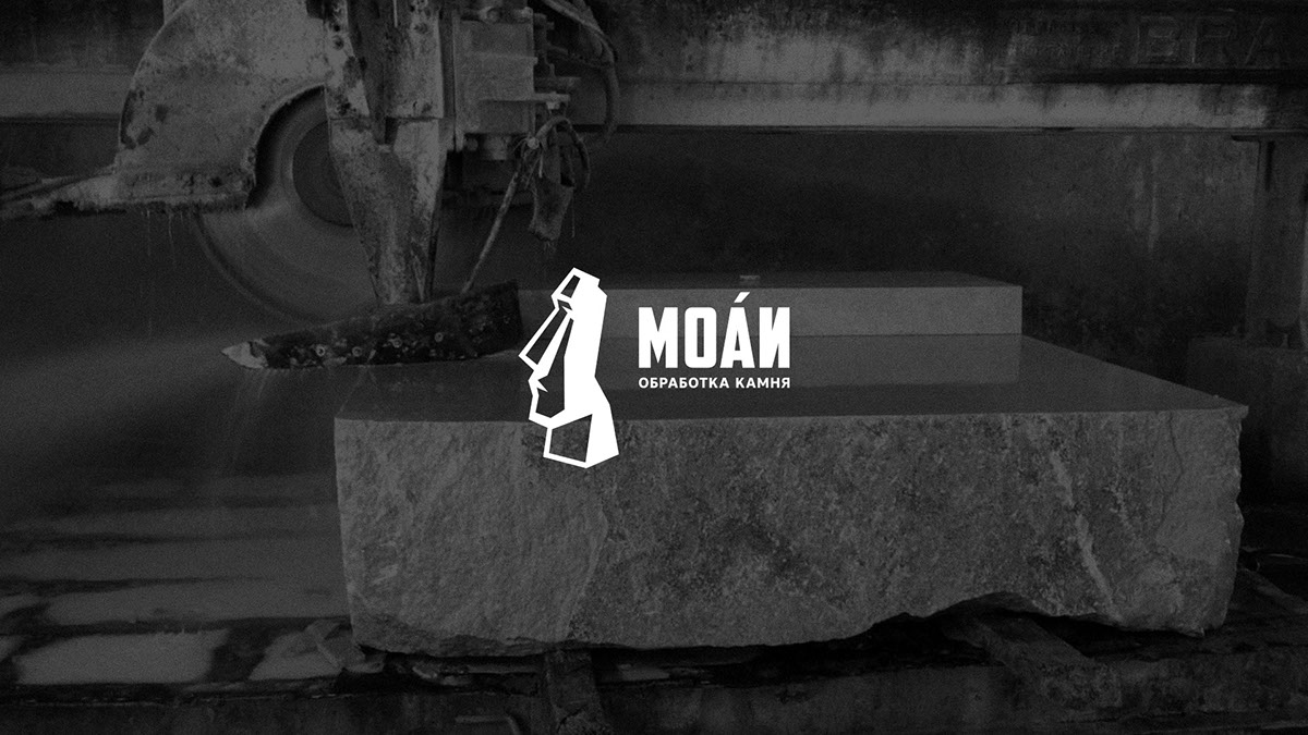
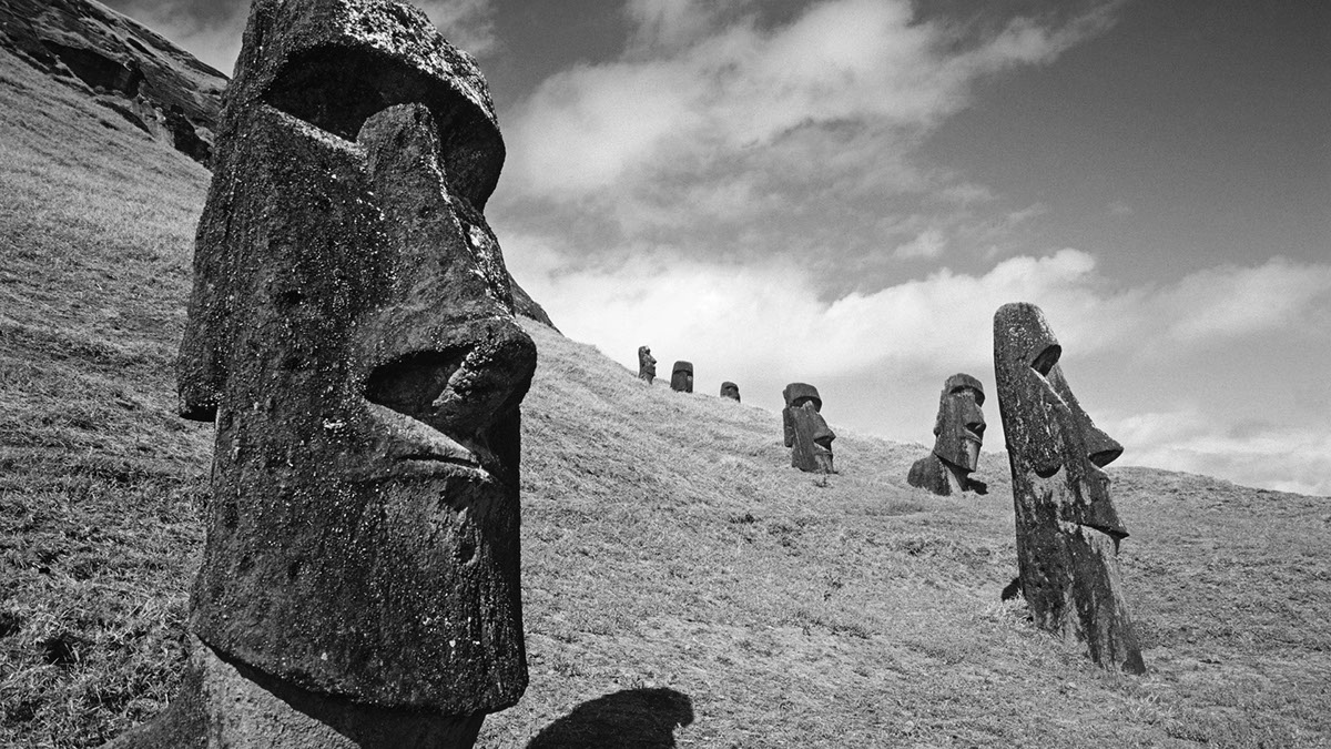
Компания "МОАИ" занимается резкой и обработкой натурального камня. Основным продуктом являются памятники, скульптуры из камня и бронзы. Для лучшей узнаваемости компания сменила название. Несмотря на популярность острова Пасха, многие не знают, что МОАИ — это имя идолов, разбросанных по острову в Тихом океане. Символ в виде каменного исполина стал идеальным решением, на мой взгляд.
________________
The company "MOAI" is engaged in cutting and processing of natural stone. The main product are monuments, sculptures of stone and bronze. For better recognition, the company changed its name. Despite the popularity of Easter Island, many do not know that MOAI is the name of idols scattered around the island in the Pacific Ocean. The symbol in the form of a stone giant was an ideal solution, in my opinion.
Стилизация символа — одна из важнейших деталей хорошего логотипа.
Максимально убираю всё лишнее, оставляя лишь узнаваемость образа.
Максимально убираю всё лишнее, оставляя лишь узнаваемость образа.
________________
Styling a character is one of the most important details of a good logo.
The maximum I remove all unnecessary, leaving only the recognition of the image.
The maximum I remove all unnecessary, leaving only the recognition of the image.

Люблю когда логотип вписывается в чёткие пропорции. Когда выверены все расстояния и отступы.
________________
I love when the logo fits into clear proportions. When all the distances and indents are reconciled.


Logo on dark background