
Typographic design series | 17" x 11" prints | April 2011
This typographic study aimed to create implied motion using typography.
This typographic study aimed to create implied motion using typography.

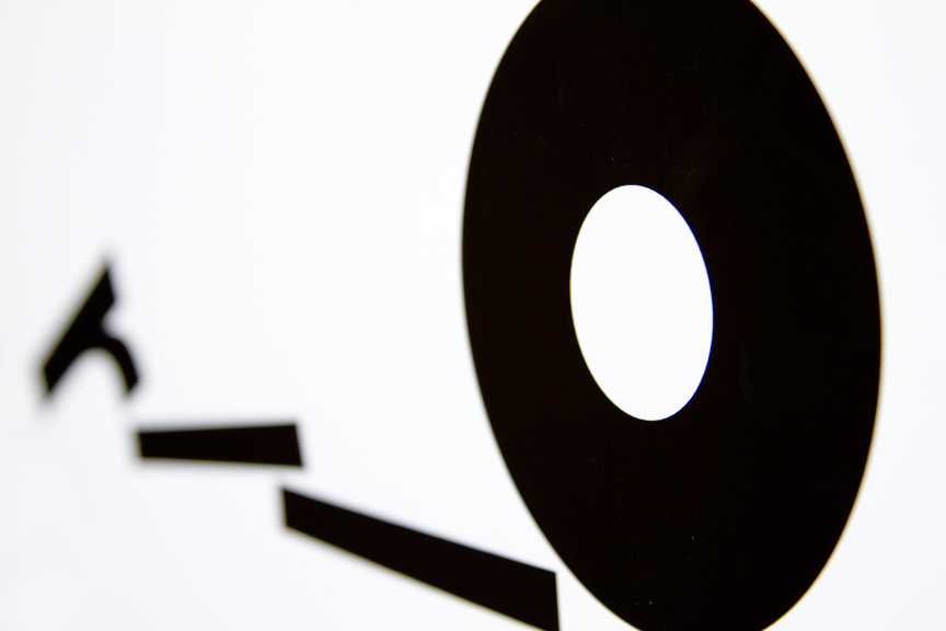
In this first work I wanted to create the sense that the 'r' had tipped over and sent the 'o' rolling to the right. The 'o' consequently rolls over and flattens the 'l's.
Alternate Take

A second study using the word roll. This time I imagined that the type was being tossed about inside a ball that was in motion. The 'L's are arranged to reference feet and give the illusion of a rightward motion.


