Our studio was faced with the task of developing the brand concept and visual language of the AMBERG Brewery and with creating a label for the 1842 Pilsner beer. In our search, we turned to history in the face of the small and picturesque Bavarian town of Amberg. One of the town’s main buildings is the Town Hall (Rathaus Amberg). Since the Middle Ages, the town hall has been a city landmark where the city council, headed by the mayor, conducts their meetings and makes important decisions. Its 16th century facade, with its balustrade and arched spans, became the starting point for our logo. "Typography is two-dimensional architecture" (Herman Zapf) and the accented letter “A” best conveys the emotional connection between the modern font choice and the recognizable architectural elements.

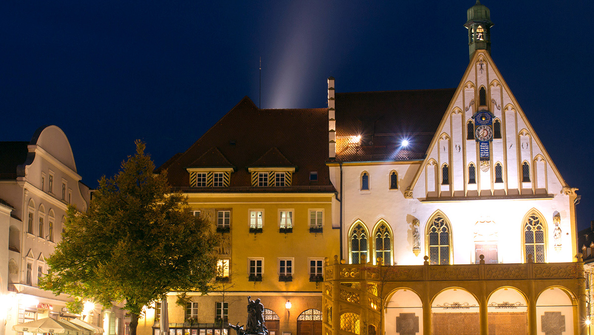

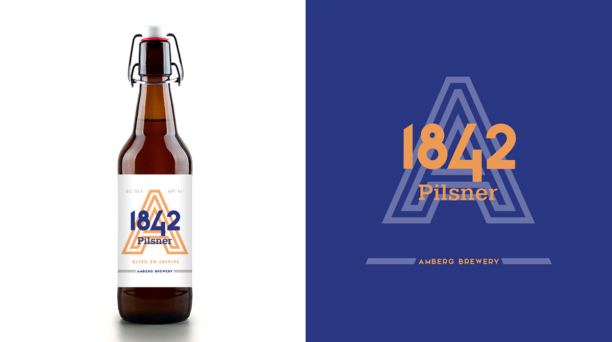


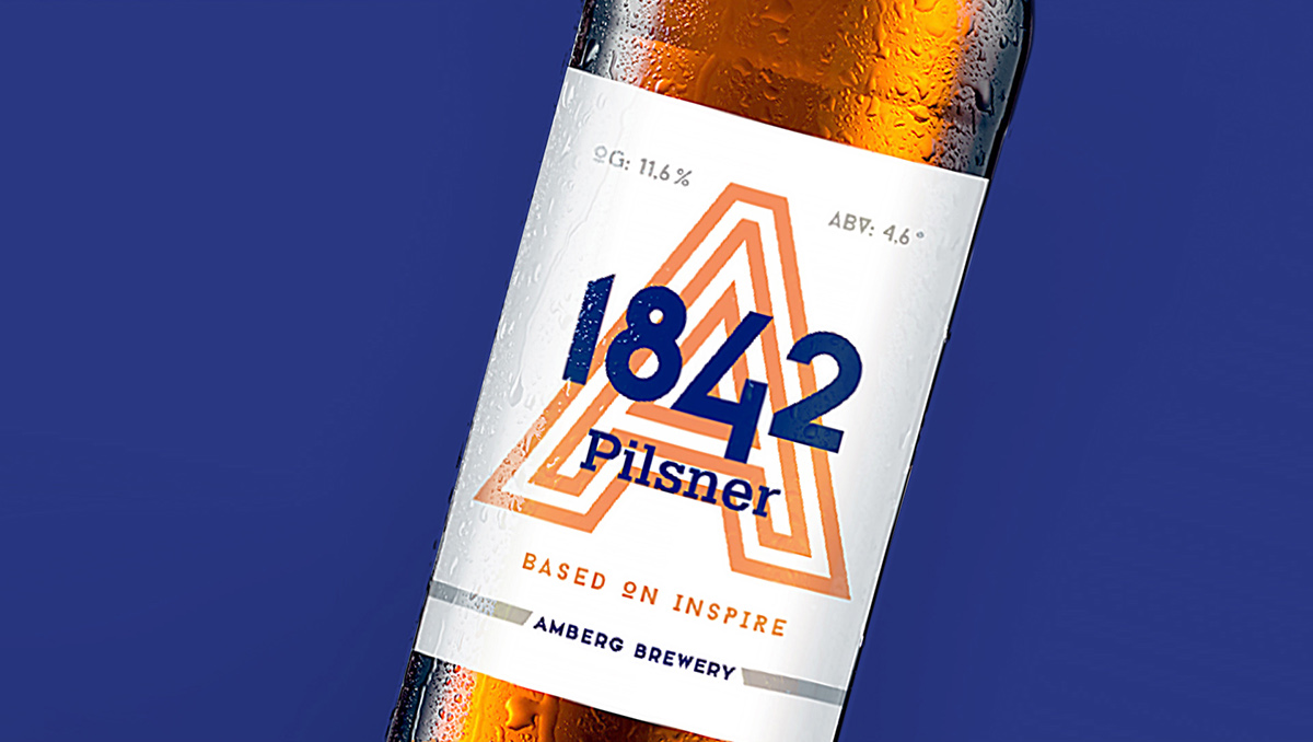

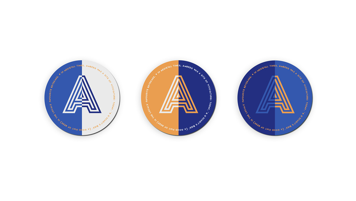
Перед студией встала задача найти идею и визуальный язык для создания бренда пивоварни AMBERG Brewery и разработать дизайн этикетки пива 1842 Pilsner. В своем поиске идеи мы обратились к истории. В Баварии есть маленький живописный городок Amberg. Одним из главных зданий является Ратуша (Rathaus Amberg). Со времен Средневековья ратуша – это знаковое место в городе, где заседает городской совет во главе с бургомистром и проходят важные мероприятия. Фасад XVI века с балюстрадой и арочными пролетами стал отправной точкой в создании логотипа. “Типографика — это двухмерная архитектура” (Герман Цапф), акцидентная буква А лучше всего передает эмоциональную связь современного шрифтового решения и узнаваемых элементов архитектуры.

