OPHTHALMIC EDGE
An educational edge for ophthalmic professionals and patients coping with vision loss.
Client Summary
Ophthalmic Edge (OE) is an award-winning online resource center that serves ophthalmic professionals, as well as patients coping with vision loss, with an evolving collection of educational articles and lectures from trusted, leading names in the field.
Scope of Work
Brand collateral design / UX Design / Admin Portal Development
The Project
Ophthalmic Edge (OE) is a nonprofit foundation that works closely with expert physicians and contributors to advance education and raise awareness in the field of ophthalmology. They requested new branding, as well as a redesign of their existing online resource center.
The challenge for our team was multifold. One of aspect was UX design. With hundreds of articles and lectures, the current website contained plenty of valuable content, but lacked organization. This made navigation confusing and unintuitive for visitors.
Content administration and management was the last hurdle. The current website was built in Drupal nearly a decade ago. The resource center needed to be regularly updated with contributions by multiple authors which required a tedious, manual content addition and approval process.
To tackle this complex challenge, we needed to brand and redesign the online resource center with careful thought to the unique needs of OE’s two core audiences: ophthalmic professionals and patients with vision loss. It was also important to upgrade the website to the latest web standards and technologies, while streamlining content management for site administrators and authors.
The Process
Developing clear branding and messaging.
To develop compelling branding and online experiences for ophthalmic professionals and patients with vision loss, our team needed insight into the unique needs of both key audiences. We communicated with OE to assess these different demographics, along with conducting our own research.
This led to the clarification of key goals for each audience.
Ophthalmic professionals were seeking an academic, professional online experience, as they pursued continued education through articles and video lectures. Patients were seeking an experience that was highly-accessible, relatable and empathetic, as they searched for health tips and insights.
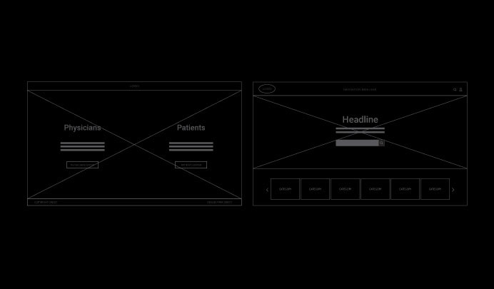
We transformed these discoveries into clear logo and branding concepts for both OE audiences. These ideas also shaped our website wireframes, prototypes and audience user flows.

Streamlining website navigation and content.
For an online resource center to be effective, we knew that information needed to be highly accessible and tailored to audience preferences.
First, we mapped out the main user flows for the website, which would be different depending on whether the visitor was an ophthalmic professional or patient. Both audiences needed a clear purpose from the moment they landed on the site.
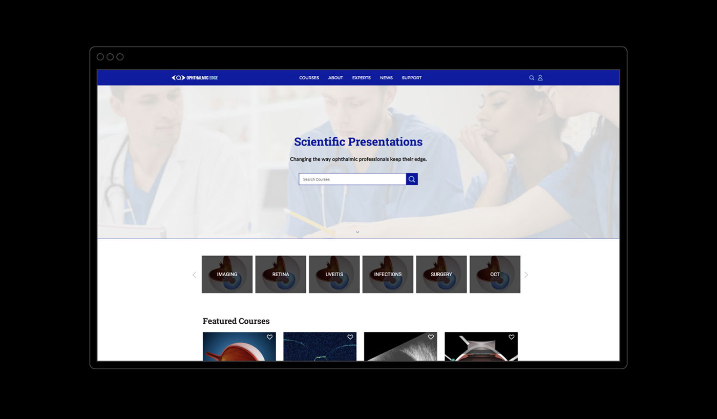
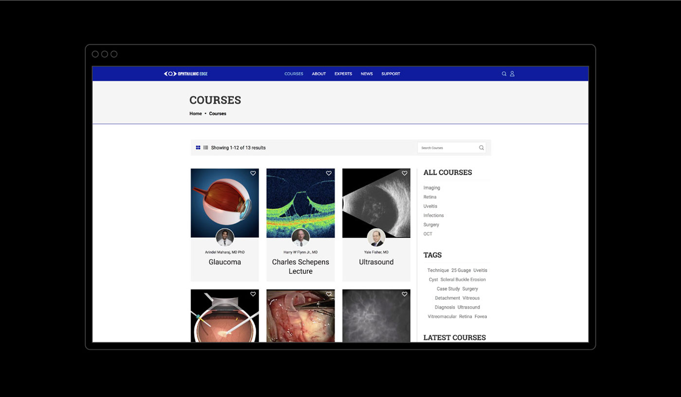
Next, we assessed the existing library of content, migrated it to the website’s new system, and organized it into three tiers: category, course and lessons. This simplified the way one found content. We also planned a range of multimedia presentation styles, from image lightboxes to video showcasing. This was a must for audiences, who needed appealing ways to absorb important information.
Identifying content management needs.
With OE’s team, we marked two major aspects of content management.
We first reviewed the step-by-step process for site administrators who needed to approve new articles by multiple content authors. This helped us to tailor an intuitive content management flow that could easily be carried out using the latest WordPress technologies that we were upgrading the site to.
The second aspect was deciding how the site’s content would be maintained. We developed a straightforward way for the OE team to log in, organize, and enhance content using an easy administrative interface.


The Solution
Impactful branding and creative.
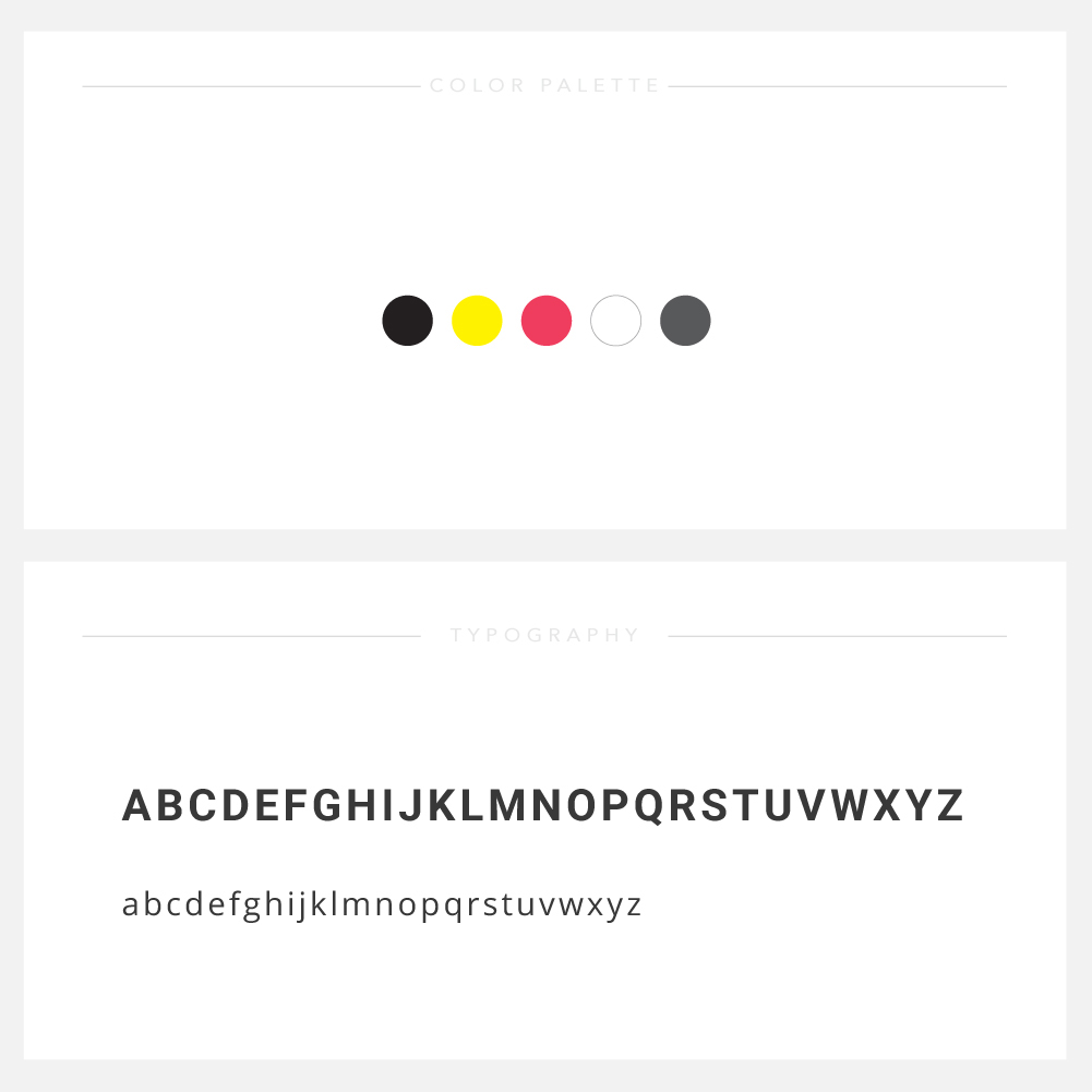
Our branding for OE was designed to be impactful and expansive enough to unite both ophthalmic professionals and patients with vision loss under one visual language, with subtle variations for each.
The core OE logo contains a magnifier within a pair of angle brackets. The symbol resembles the shape of an eye — this represents the quest for knowledge and insight by both OE audiences.
The logo also contains the full name of the organization, “Ophthalmic Edge”, in a block typeface that is a mixture of slab-serif and sans-serif, in an homage to the typeface of an eye exam chart. Meticulous attention was paid to type kerning, to make the name extra-easy to read.
The overall palette consists of bright blue, black, and magenta — colors that are striking and highly-accessible, especially for those struggling with vision loss. The logo variation for ophthalmic professionals variation has cobalt-blue and sky-blue accents, colors that traditionally relate to the medical field. The logo variation for patients has magenta accents, a color of vitality and energy.
Our team also designed a custom set of icons, tailored for each audience. The new branding and creative was an important step for OE to connect powerfully with their key audiences.


Clear, engaging audience-tailored online experiences.
We believe that a website is successful when it helps a visitor achieve his or her goals.
The OE online resource center needed to offer clear navigational paths for ophthalmic professionals and patients, to meet each audience’s unique needs. We designed a landing page that intuitively lays out each path, giving visitors the chance to pick one based on his or her role as a professional or patient.
After clicking through a path, the visitor then embarks on a specially-designed, individualized online experience. The ophthalmic professional enters a website that focuses on supporting continuing education with a range of industry-relevant articles and courses. The patient enters a website that focuses on supporting personal health management with physician-approved insights in areas such as vision loss, accessibility and well-being.
On the redesigned OE website, both audiences are able to satisfy their thirst for knowledge by easily navigating the organized library and consuming educational content conveyed in a range of engaging presentation styles.

Modern technologies combined with intuitive content management.
Using WordPress, we significantly upgraded the website to run on an up-to-date, easy-to-use content management system. Site administrators and authors now find it simple to navigate the website behind-the-scenes and to successfully fulfill their responsibilities in maintaining the online resource center.
We also developed a step-by-step plan for site administrators to intuitively review, approve, and then confirm or reject incoming contributors and articles.
The modernized system, together with revamped processes, ensure that OE website stays fresh and relevant with a flow of new content.
This, like the branding and individualized online experiences, makes yet another big step in OE’s overarching meaningful mission to advance education and raise awareness in the field of ophthalmology.