So the plan was to update my rather formal looking original logo with something which mixed formality with a more fluid and dynamic style. So this is my personal rebrand from the beginning issue.
My original identity below:

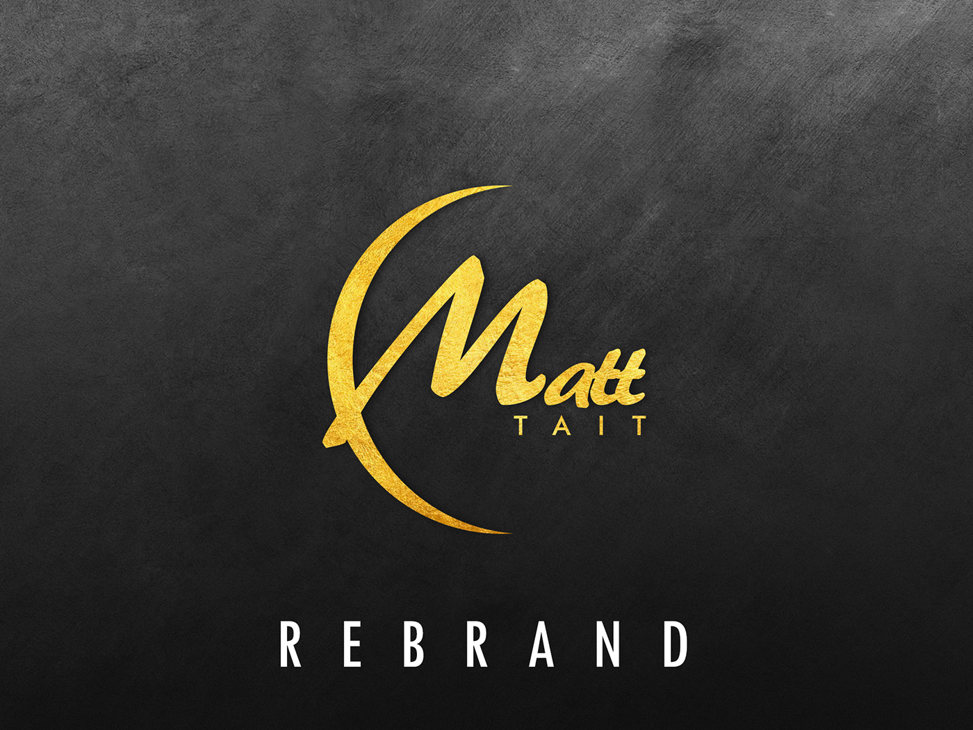
Not bad but a bit of a heavy logo with a watercolour texture which seemed like a nice idea at the time. I wanted the new brand to scale and be able to sit on multiple tones of background or within round or square shapes. The type I wanted to be quite fluid for my first name whist being formal and upercase for my surname.


Logo on dark or light backgrounds.

Thinking ahead...


