
Process Documentation for an App Prototype
Since learning the Section 508 and WCAG standards about coding for accessibility, I have become aware that many printed materials, as well as web sites, have not been designed with accessibility in mind. For instance, many charts and graphs have color-coded legends, but they lack a pattern to help color blind individuals differentiate between shades. I have a pet peeve around mass transit maps which show information with color alone. Section 508 states: "Web pages shall be designed so that all information conveyed with color is also available without color." Just imagine having to interpret a color-coded map or chart that has been printed on a greyscale printer (or a printer with no magenta ink left), and you'll start to grasp the problem certain color blind individuals face daily.
Step one in my process was storyboarding. I was taking a Coursera class called Human-Centered Design: an Introduction. The assignment was to storyboard a solution to a problem regarding any aspect of transportation.

Title: Color Blind Light Rail Rider.
Panel 1: "Tom is on the light rail and knows he needs to transfer to another line but he forgot which one."
Panel 2: "Tom strains to find a map. The closest one is too far away to read the legend. And Tom is red-green color-blind so he can't pick out the color of the line he needs."
Panel 3: "Let's add redesigned maps behind plastic protectors on the backs of seats."
Panel 4: "These maps will have shape signifiers to differentiate the route lines, and they will have a QR code for cellphones."
Panel 5: "Tom scans the QR code and the map opens on his phone. He can zoom and show a street overlay."
Panel 6: "Now Tom can find the letter and shape for the next train."
General Assembly UX Bootcamp
Months later, I attended a one-day UX Bootcamp at General Assembly. Our assignment was to whiteboard and sketch low-fidelity screens for any app idea we wanted. I chose the color blindness niche again and planned an app to help color blind people ride mass transit without having to ask anyone else to identify colors. Since the assignment did not encompass redesigning all of RTD's maps, such as in my storyboard idea, I focused on an app to help interpret colors of pre-printed material.
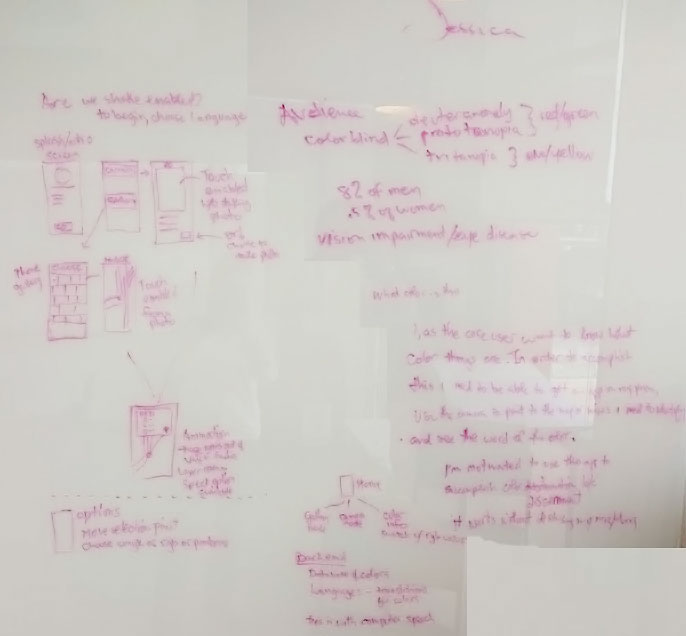
Here is my white board exercise. I know it's hard to read, but it's proof of process. After some initial research, I found that 8% of men and .5% of women have some form of color blindness. Deuteranomaly and protanopia are two forms of red/green color blindness and tritanopia is a form of blue/yellow color blindness.
I wrote out my user statement:
"What color is this. I, as the core user want to know what color things are. In order to accomplish this I need to be able to get an app on my phone, use the camera to point to the map or wires or chart I need to identify, and see the word of the color. I'm motivated to use this app to accomplish color discernment because it works without disturbing my neighbors."
Next I white boarded some screen wireframes to get an idea of what features would be needed.

Then I drew some wireframes with a sharpie and uploaded them into InVision to make a quick low-fidelity prototype that I called "Colors to Words." Here is an at-a-glance view of this first draft.

Higher fidelity Prototype
After the UX bootcamp was over, I went home and prepared a higher fidelity prototype using Adobe Illustrator, Sketch, Material Design, and InVision. I changed the name of the proposed app from "Colors to Words" to "Eye Assist" after a brainstorming session.
This prototype shows the use-case of trying to discern the rail color on a Denver RTD light rail map. The user clicks "camera," then positions the area of the map that needs discernment in the target crosshair near the bottom of the camera image. The user clicks to select the color in the crosshair and a layer opens with the color name, hex value, RGB value, as well as an option to speak the color name aloud. The user can then choose to either save or discard that snapshot and do another area of the map.
This prototype is an early-stage concept only.
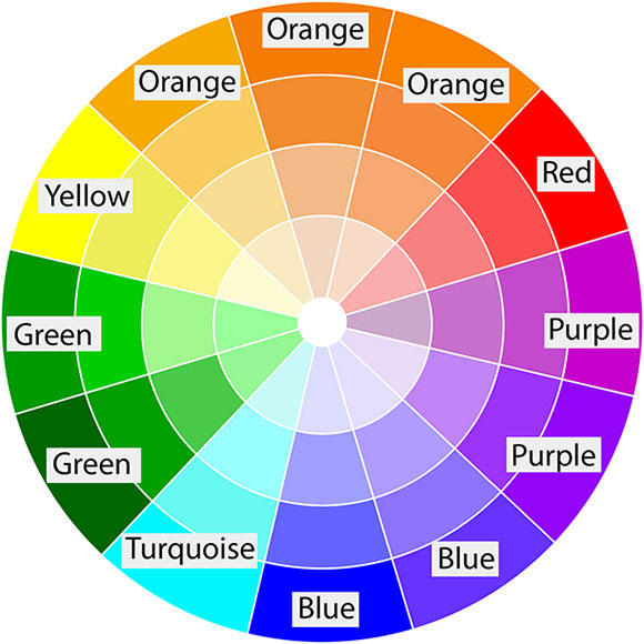
Take a look at the color wheel I created in Illustrator before and after I applied a "protanopia type" color blindness preview style.

Thanks for following along with my process! Remember to consider accessibility in your next visual design!


