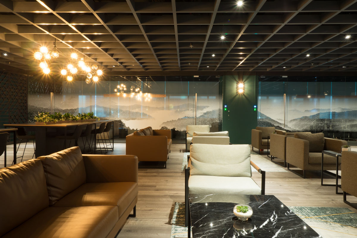
Spanning more than 30,000 square feet, LATTICE80 is the world largest and leading innovation hub for Fintech startups. A lattice is a patterned structure, a modelling technique used in the financial world, and an element common in Asian art and architecture. Combining that with the address of the space, we have the name, ‘LATTICE80’. The interior design component of this project was done in close collaboration with The Design Abode.
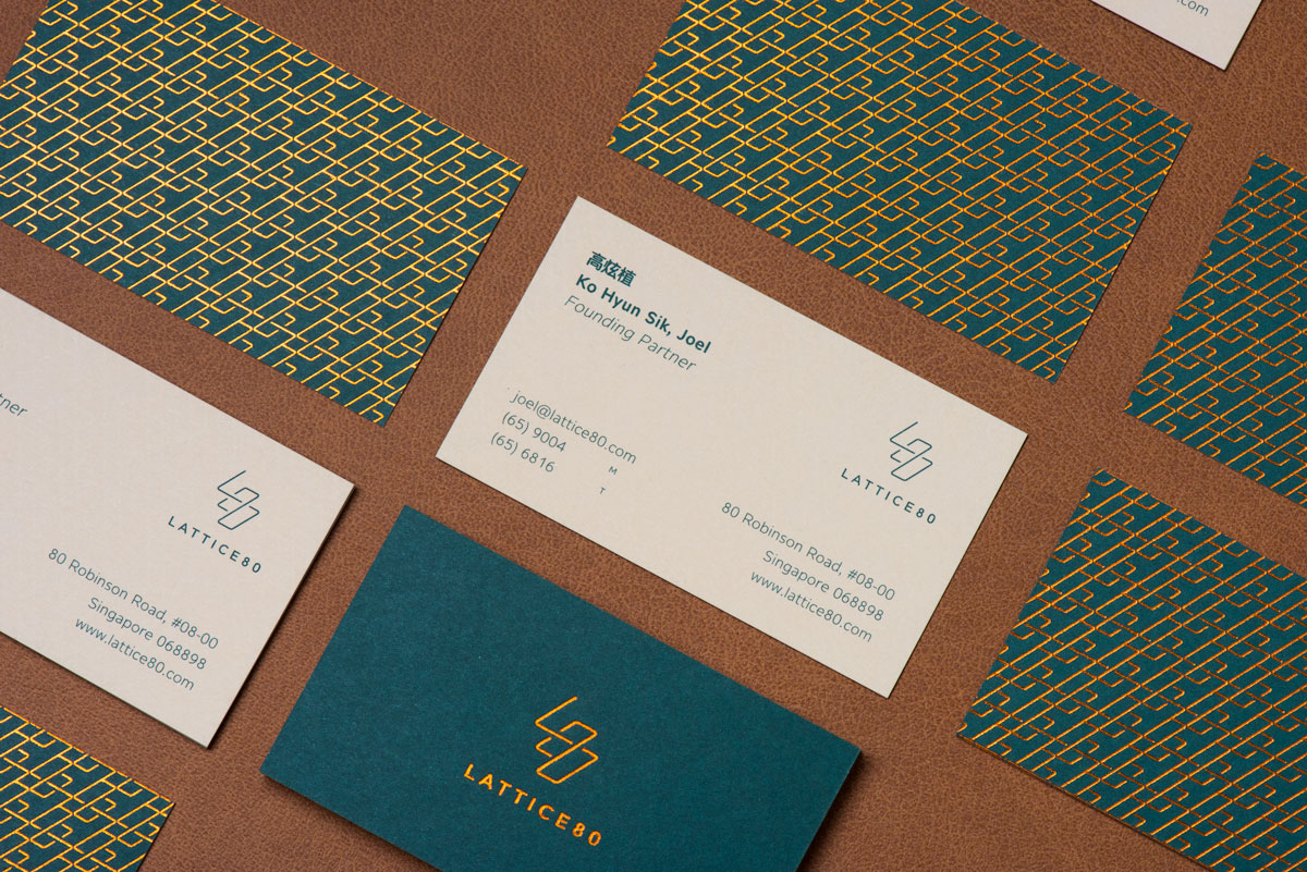
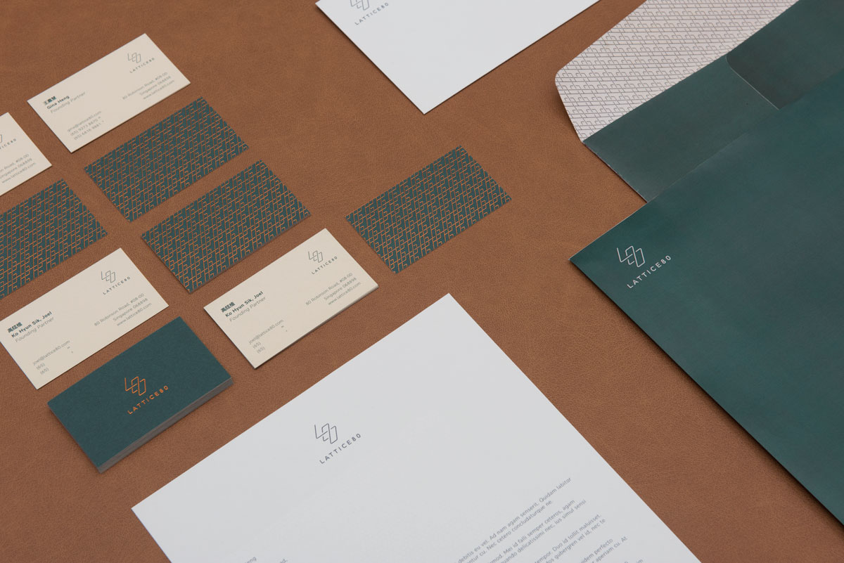
Branding
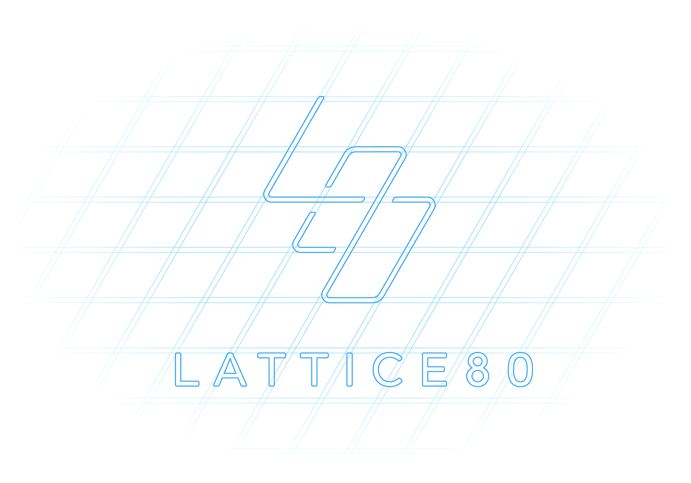
Logo
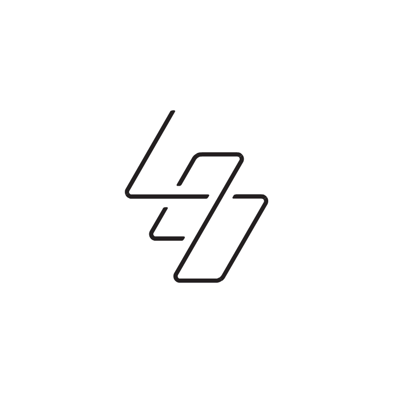
The initials 'L80' were stacked on top of one another in an isometric grid, giving the appearance of multiple layers, with each letter floating above the next.
The logo suggests a single continuous stroke that covers all three layers, to represent the collaboration and community aspect of co-working.
The logo suggests a single continuous stroke that covers all three layers, to represent the collaboration and community aspect of co-working.
Branding
Graphic Motif

The overlapping and intersecting points form the structure of a lattice, and the logo, when tiled, forms an interlocking pattern.

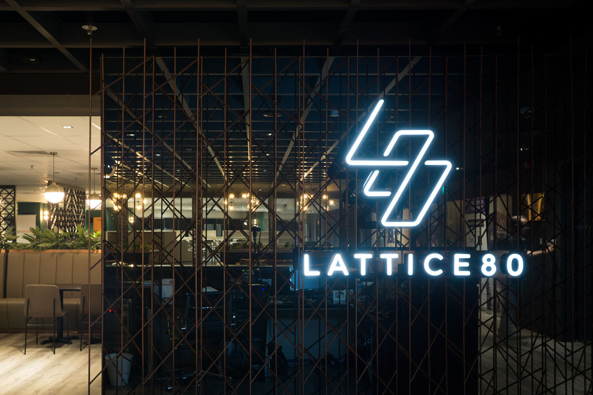
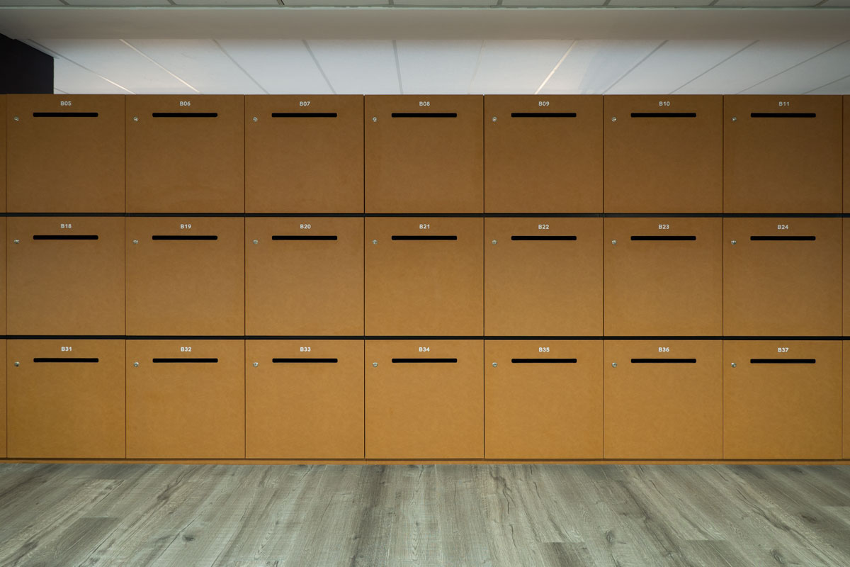
Interior Design


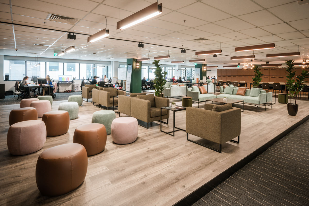
Branding in Space
Reception Signage
The reception signage lattice was custom-designed to transform as you walk across. This is achieved by intersecting multiple planes of lattices to form the illusion.


Branding in Space
Way-finding & Signages


Branding in Space
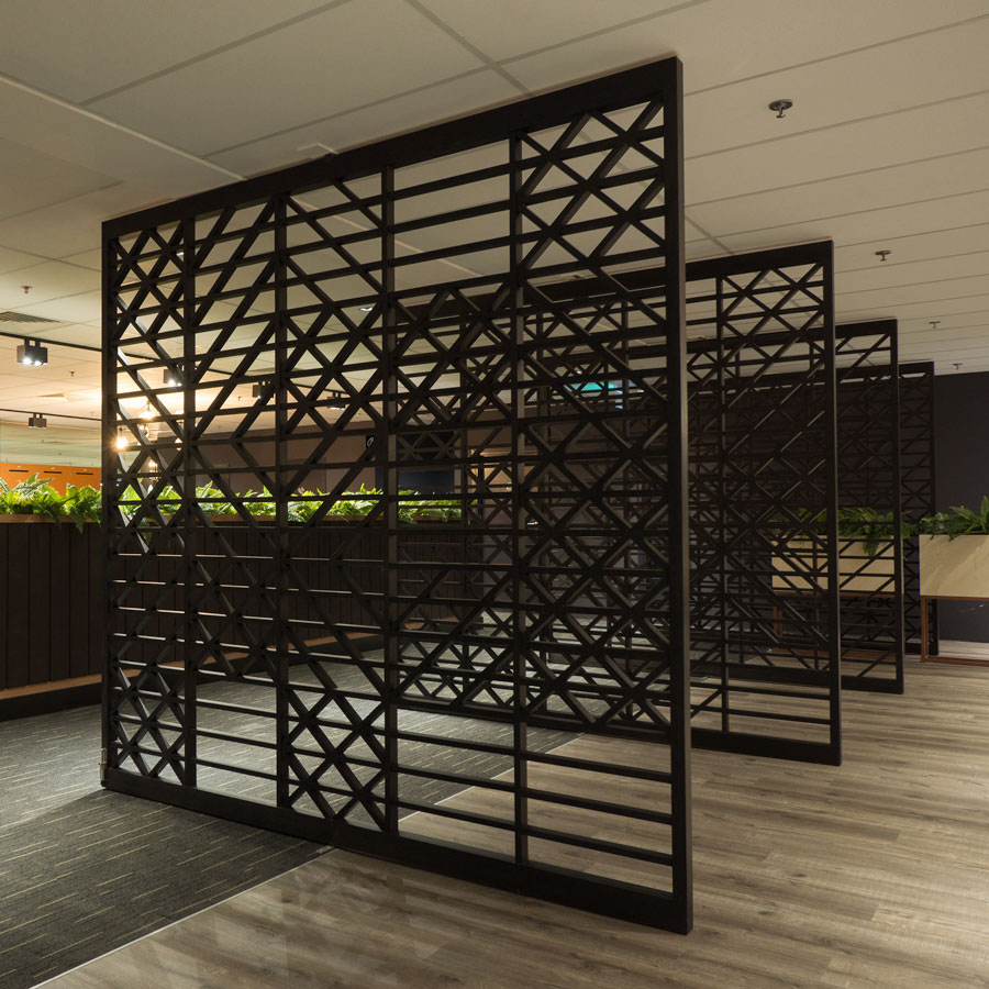
Lattice Doors
The space needed visual separators to segregate the public areas from the event space and the work areas. We derived a simple lattice-inspired graphic system that provides a visual metaphor for pixels.


Branding in Space

Taking the (fin)tech theme further, we dressed up a 30-metre stretch of glass wall with a massive panoramic vista of mountainscape, formed by graphic 'pixels' when you look up-close, adding a soft, elegant yet edgy touch to the space.