


標準字設計|Typographic
以黑糖碎塊的形體聯想到 8bit , 再以此手法延伸出標準字 、 輔助圖案到標貼的設計與刀模 。
Feature in brown sugar’s shape to think of 8bits. And then using 8bit style to deisgn standard word, auxiliary pattern, label and
die cut
die cut

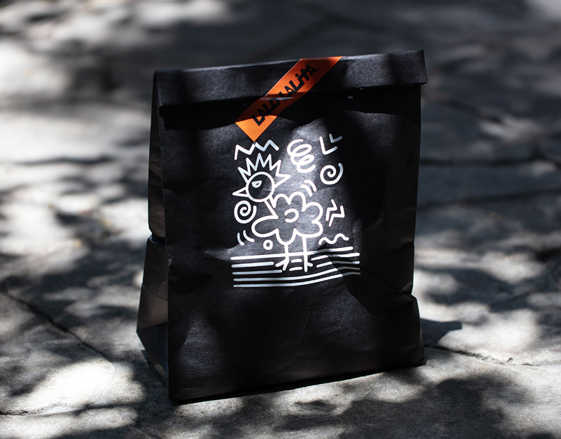
標貼設計|Label design
刀模設計上是從 8bit 概念延伸而出,在一些局部細節處添增,再搭配視覺與色彩計畫時,使之看起來更完整。透過瑞士格線系統,有效控制版面大小及比例,整合資訊讓購買者能清楚閱讀識別。
The conpect of die cut is extended from the 8bit. We add some color lump to local detail , with the visual design and color plan, make it look more complete.Through the Swiss grid system, effective control of the layout size and proportion.
Consolidate information so that buyers can clearly read and identify the information.


Clienct : Taiwan Zhang Master Brown Suger Grange
Design by Neil tien & Mark yen
Photo by jaochihwei
Design by Neil tien & Mark yen
Photo by jaochihwei


