
Klatertaal identity
Communication Art
Communication Art
Klatertaal Communication Art is Margriet Schreur. Klatertaal produces clear texts and transparant messages. Leading is the thought that a message is more powerfull when the stripped down to the essence. This sounds easy, but to many it's an art, the art of abstracting.
"Therefor we abstracted this identity, stripping the logo from the unnecessary details, leaving us with just the basic of the message we want to portrait. With this redesign process we helped the client making things easy and she helped us finding the right balance doing so. This project was in every way very pleasant."
"Therefor we abstracted this identity, stripping the logo from the unnecessary details, leaving us with just the basic of the message we want to portrait. With this redesign process we helped the client making things easy and she helped us finding the right balance doing so. This project was in every way very pleasant."

The Klatertaal logo in detail. The logo is lasered out of the letterhead. This is a metaphore for transparancy and openness.
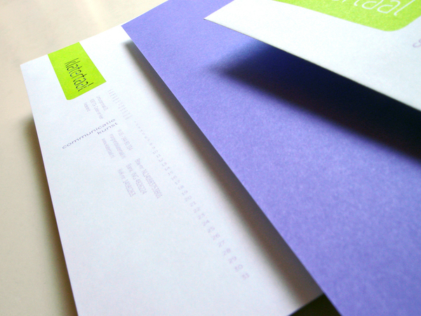
The data on the letterhead is positioned vertically, also containing a calender so the client can manually mark the sent date.
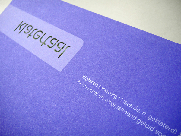
The back of the letterhead contains the description of the word 'klateren' as described in the dictionary.
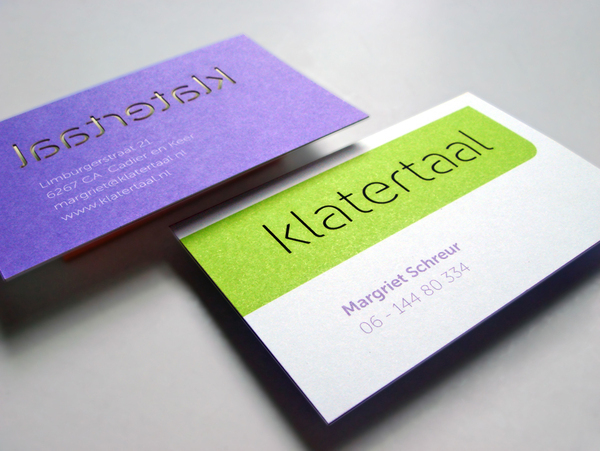
The business card, 400 gram thick paper and the lasered logo.
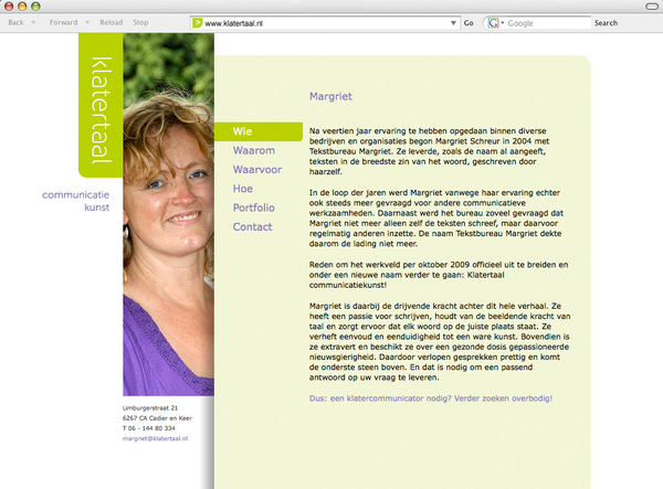
The website is stripped down to a minimum. It's mainly oriented vertically to keep a tight fit with the print identity.


