

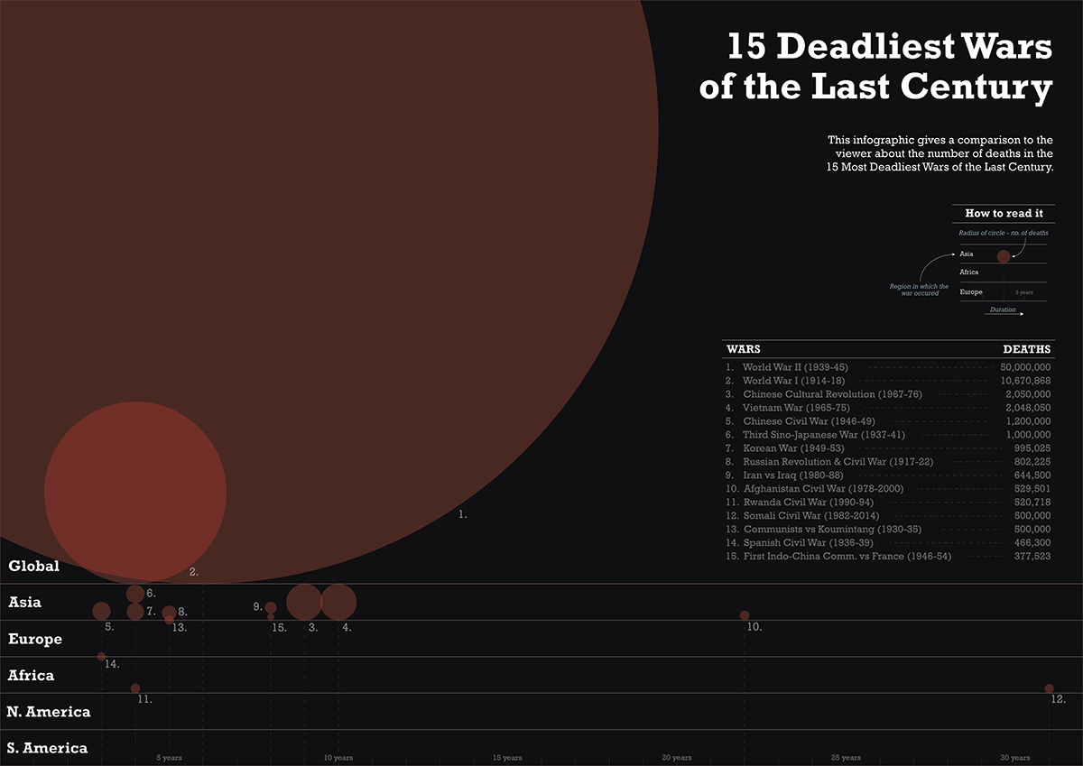
This infographic was created to spread awareness about how many deaths occurred during wars. It also specially focuses on the World Wars.
By this iteration, in my opinion, the color scheme matched the theme of the infographic.
A table was also created giving the specific number of deaths during wars. The x-axis represents the duration of the war. The numbers near the circles have a direct relation with the table on the side.
The different bars in the bottom part of the infographic represented the continents in which the war took place. You may notice that some circles overlap the bars, this was done as some wars occurred in between continents.
The only major problem with this infographic was that the circles were compared on the basis of their radii so it was difficult for the viewer to get an actual comparison between the deaths in wars. But this was done on purpose because the circles become incomparable when they are made on the basis of their diameters (only the WWII circle was big enough, the rest become incomparable).
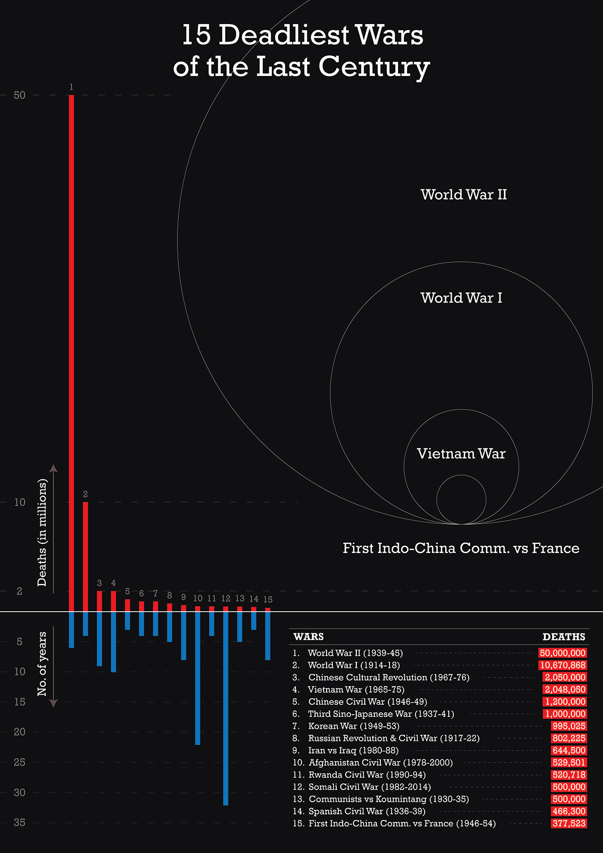
By this iteration, bar graphs were used as they were the easiest to compare. Also, the table was designed better so that it grabs a little more attention (as it straight away gives the specifics and which war stands where).
An attempt was made to keep the circle comparison idea. The number of circles were reduced and only some wars were taken to again show the magnitude of deaths in the World Wars.
But after some user feedback, I was told that the circles don't feel like individual circles, but a new shape altogether. Plus, it was difficult to tell the specific duration of the wars.

This was the final iteration in which the table was made more compact. The duration of the wars were made more clear than before (by adding those dashed lines). The placement of the circles were changed so that the data becomes more clear and more comparable.


