Project: design an 8-page catalog for a company of your choice, real or imagined, with an iPad app translation
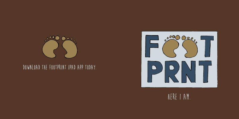
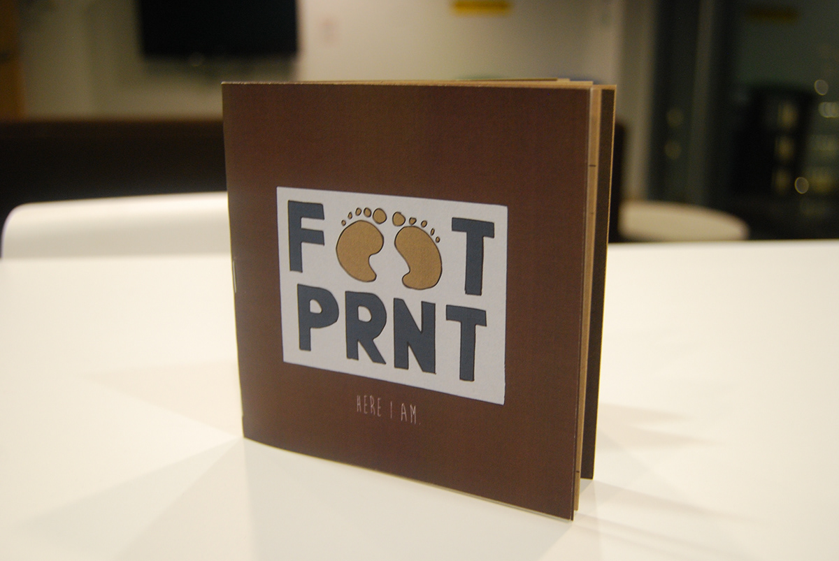
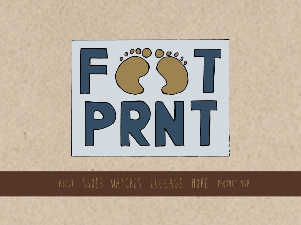
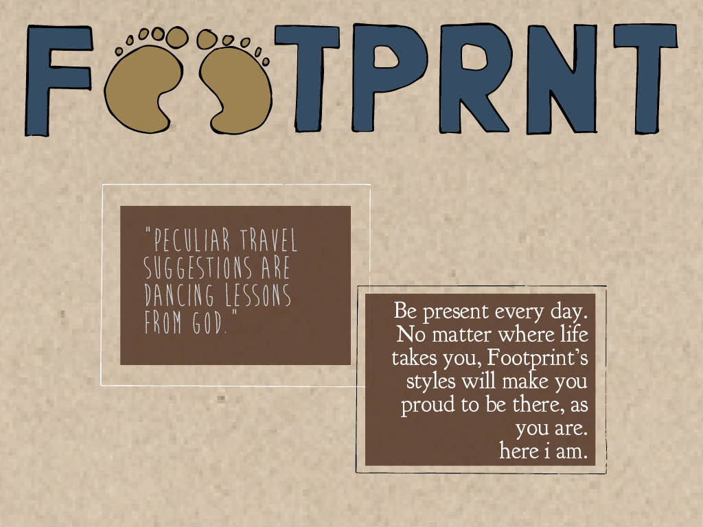
My entire catalogidea came from a sketch I drew months ago which I rediscovered while flippingthrough my sketchbook. I remember drawing the two footprints first and thenputting the text for the word “footprint” around it so it would create a squarefigure. From this drawing I thought of a vintage travel company, or some sortof company that married the two ideas of travel and vintage. I came up withFootprint, a vintage accessory company that focuses on travel items and findingunique items from all over the world that evoke a vintage or nostalgic feeling.
I knew the entire catalog had to have an earthy,vintage feeling to accommodate the logo, especially since the logo ishand-drawn. I chose neutral colors, with the exception of a few blues, for theentire design, and I also got special paper from the Paper Source to print thecatalog on. I was inspired by one of the catalogs we looked at in class—asmall, square accordion-fold catalog from Pottery Barn for tables and chairs. Iwanted to have the catalog look like it was printed on a paper bag or anotherearthy-looking substance.
Typefaces: Brain Flower, Goudy Bookletter 1911
I chose thetypeface Brain Flower because it’s organic and hand-written to match the logo,and I also liked how vertical the letters were, because I think that gives thetypeface a more authoritative feeling, rather than a hand-written typeface thatis small and diminutive. I ground the little bit of text that I have describingthe products, I chose an antique-looking typeface, Goudy Bookletter 1911. Ithink this typeface is wide enough and has thick enough serifs to give the bodytext the amount of weight and substance it needs to deliver readers descriptiveinformation.
Back and front covers
Inside back and front covers

Inside first page

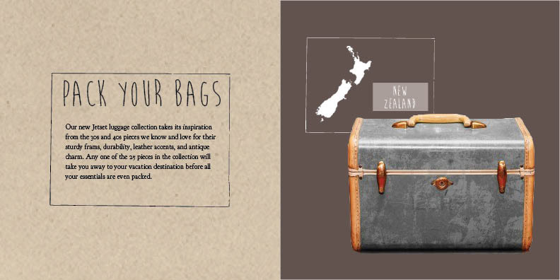
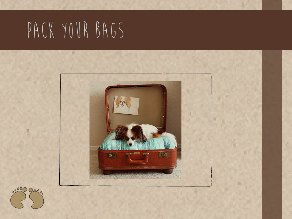
Luggage product spread
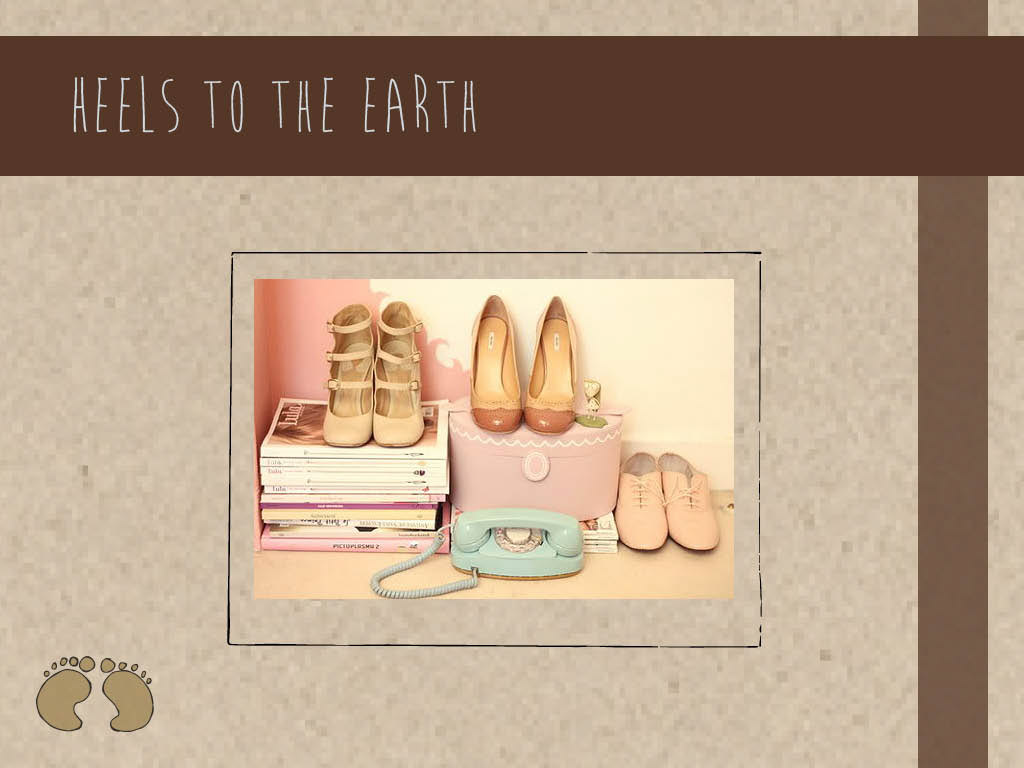
Shoes product spread

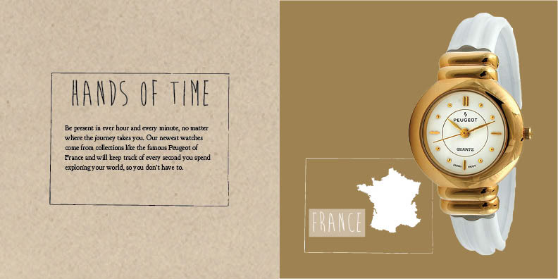
Watch product spread
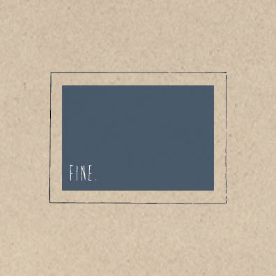
Last page
iPad app translation
Home page
About page
Shoes product page, with slideshow of shoes
Watches product page, with slideshow of watches

Luggage product page, with slideshow of luggage
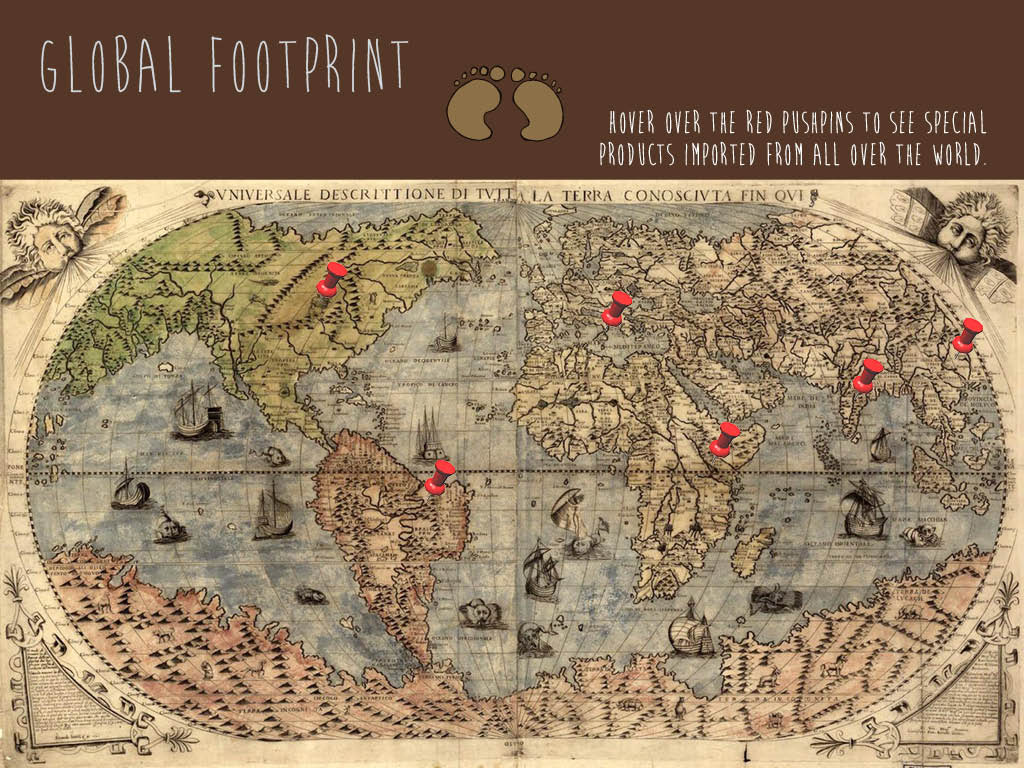
Product map page with hover-over red pushpins that reveal products from different countries.