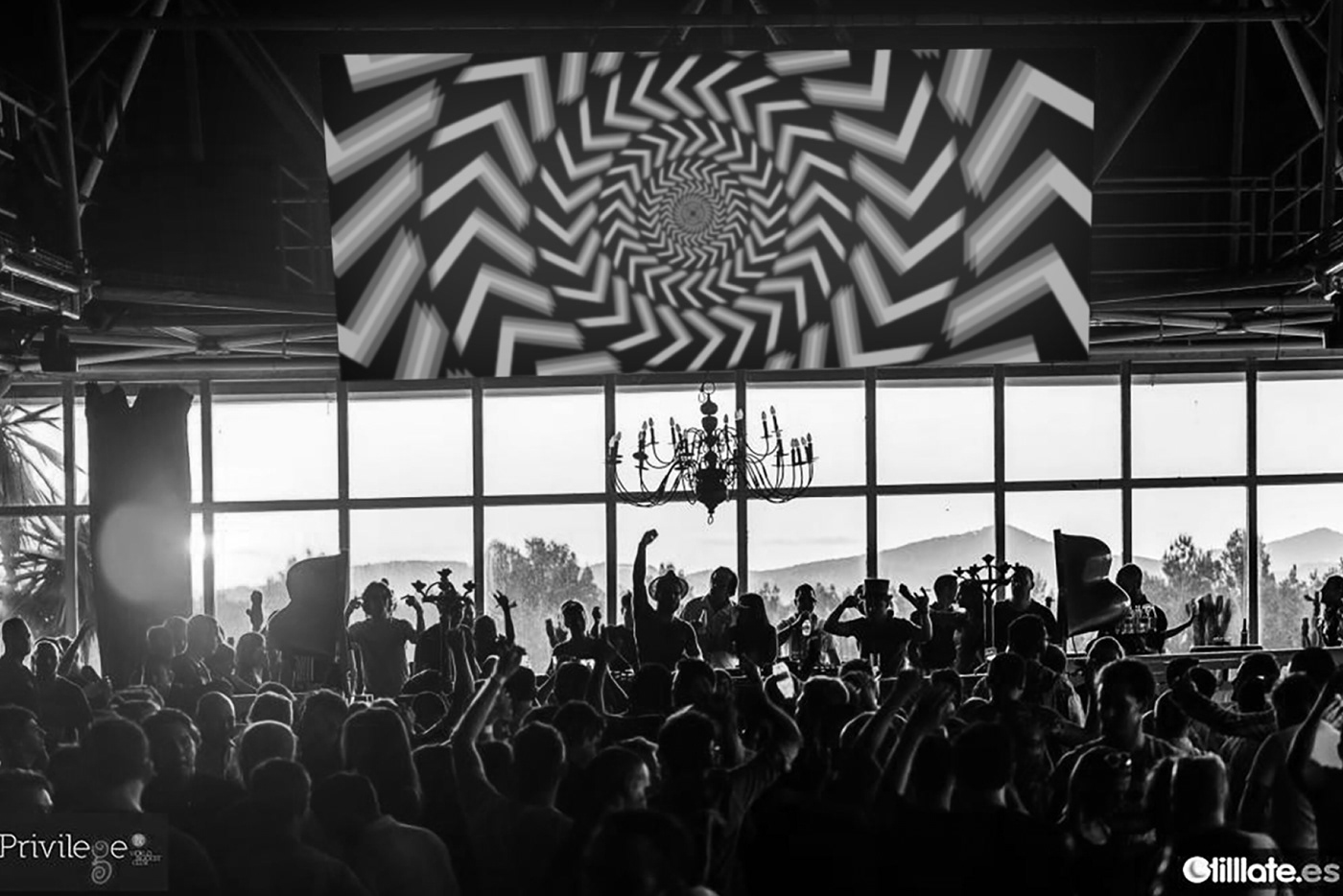
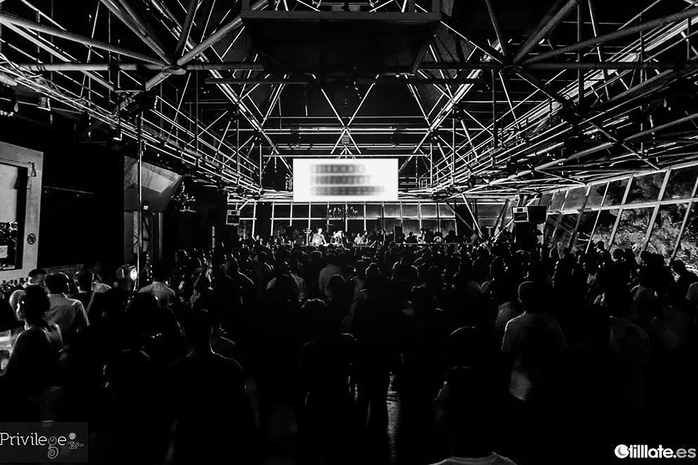
DO NOT SLEEP is a club night based in Ibiza.
The identity emulates the feeling of what it would be like to be at the night club by playing with distortion.
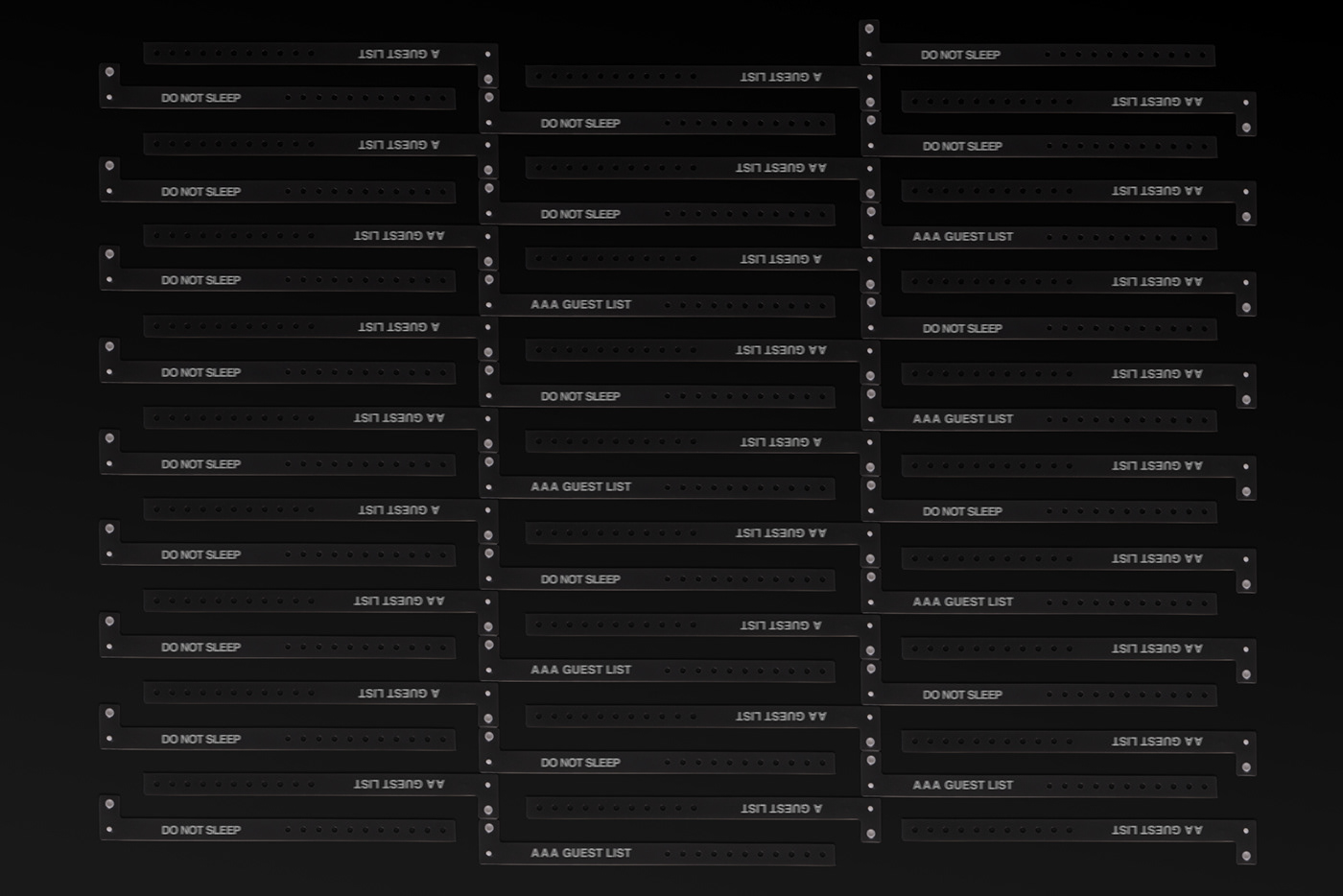
As DO NOT SLEEP plays and produces modern dance music I have aligned the brand to the modern manifesto by the use of a san serif typeface, alignment to the left, a bold colour pallet and avoiding repetition. The identity is jaded yet clean and instantly recognisable. By aligning type to the left and having it set in upper case the type naturally creates a 45° angle, so using this for inspiration I have created a way finding system using a arrow cut at 45°, from this I have also created a system of patterns using this distorted arrow.
Since its launch in 2014 DO NOT SLEEP have moved from running club nights in Ibiza to touring the globe, setting up a record label and continues to be a ever evolving brand.