A beginner's exploration of Type Design
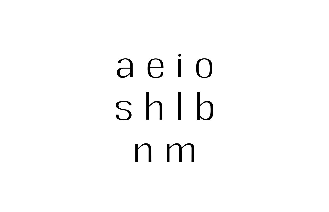
The last assignment for our module titled 'Type and Production' was to try our hand at designing a few letters by ourselves. Each student was given set standards for their font. I was given: Sans-serif; Regular; Low Contrast.
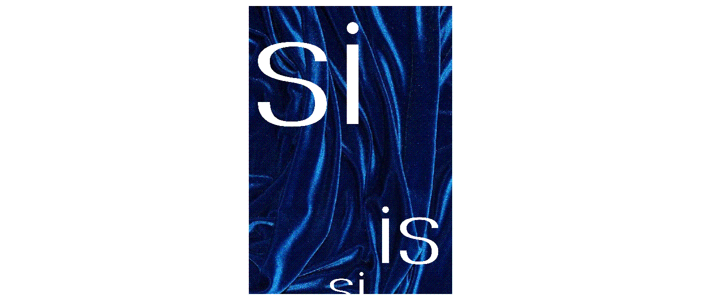
I went for a simple style, made for body-text font. The first letter I drew was 'n', and it had a squarish feel at the curves. I decided to run with it.
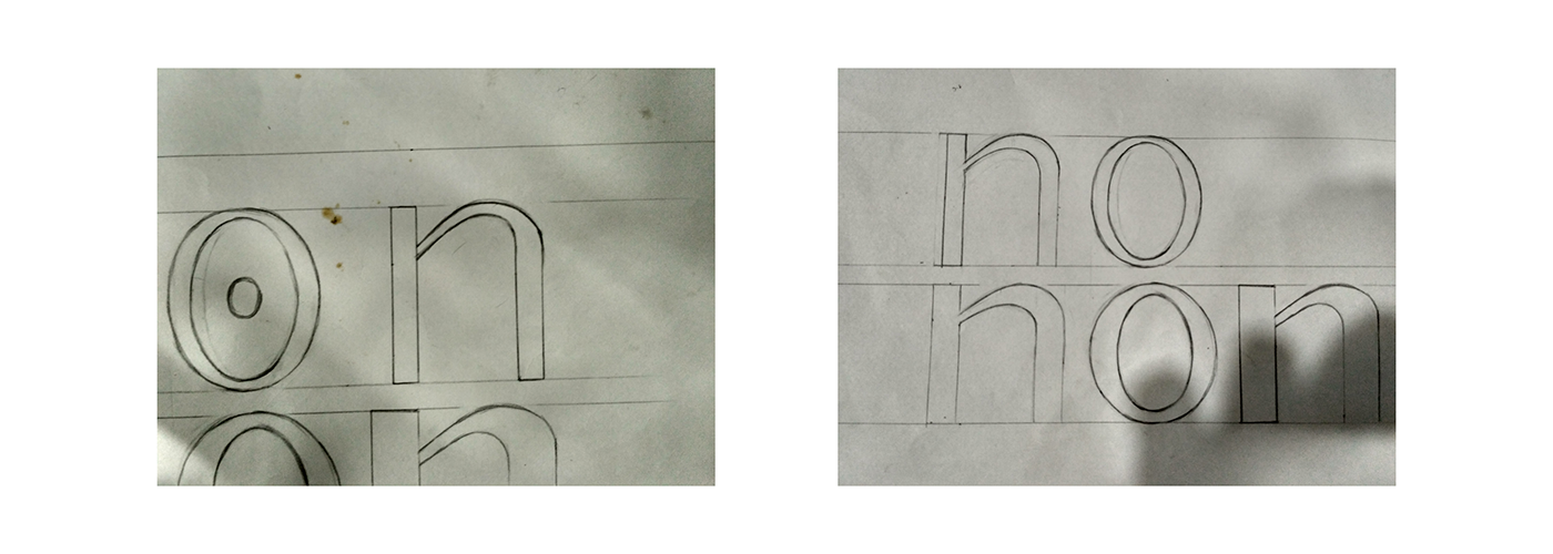
Next, I traced letters in Glyphs one by one. It was interesting to see how to dramatically the letters changed from what they originally looked like. The best example of this would be the letter 'o', and how it went from curvy on all fronts to something which matched the 'n' better.


Thank You!
