

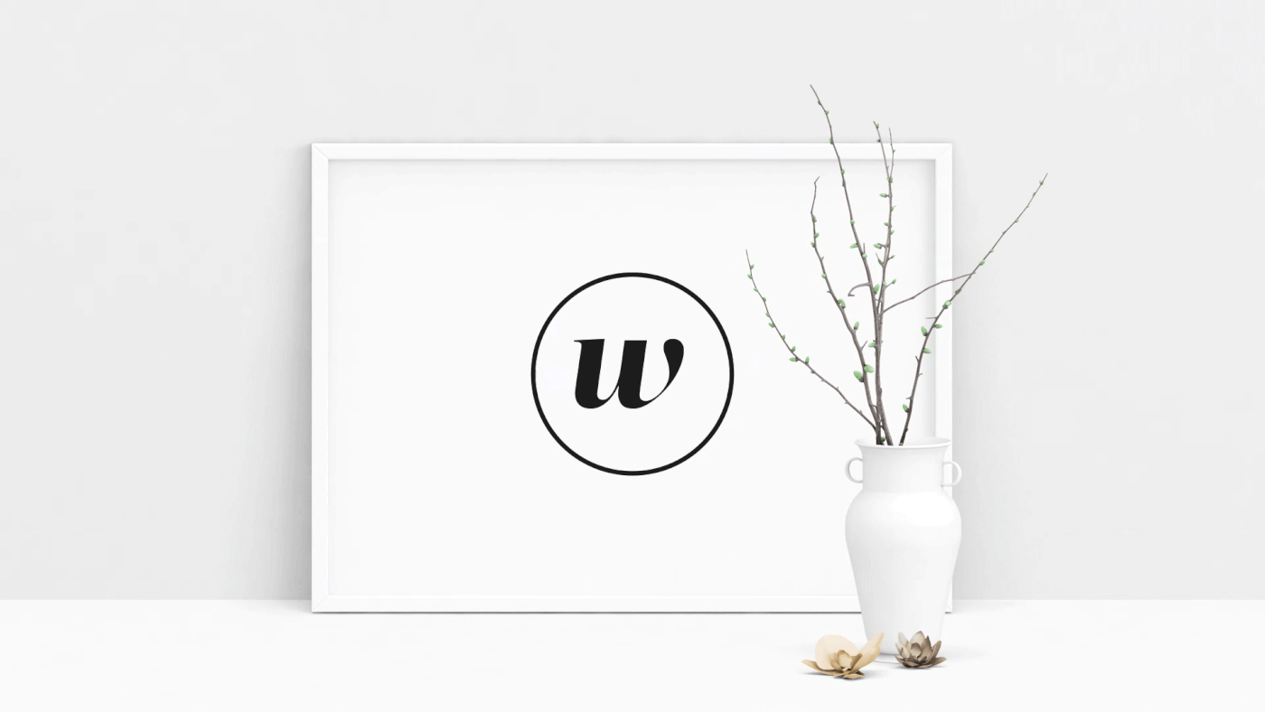
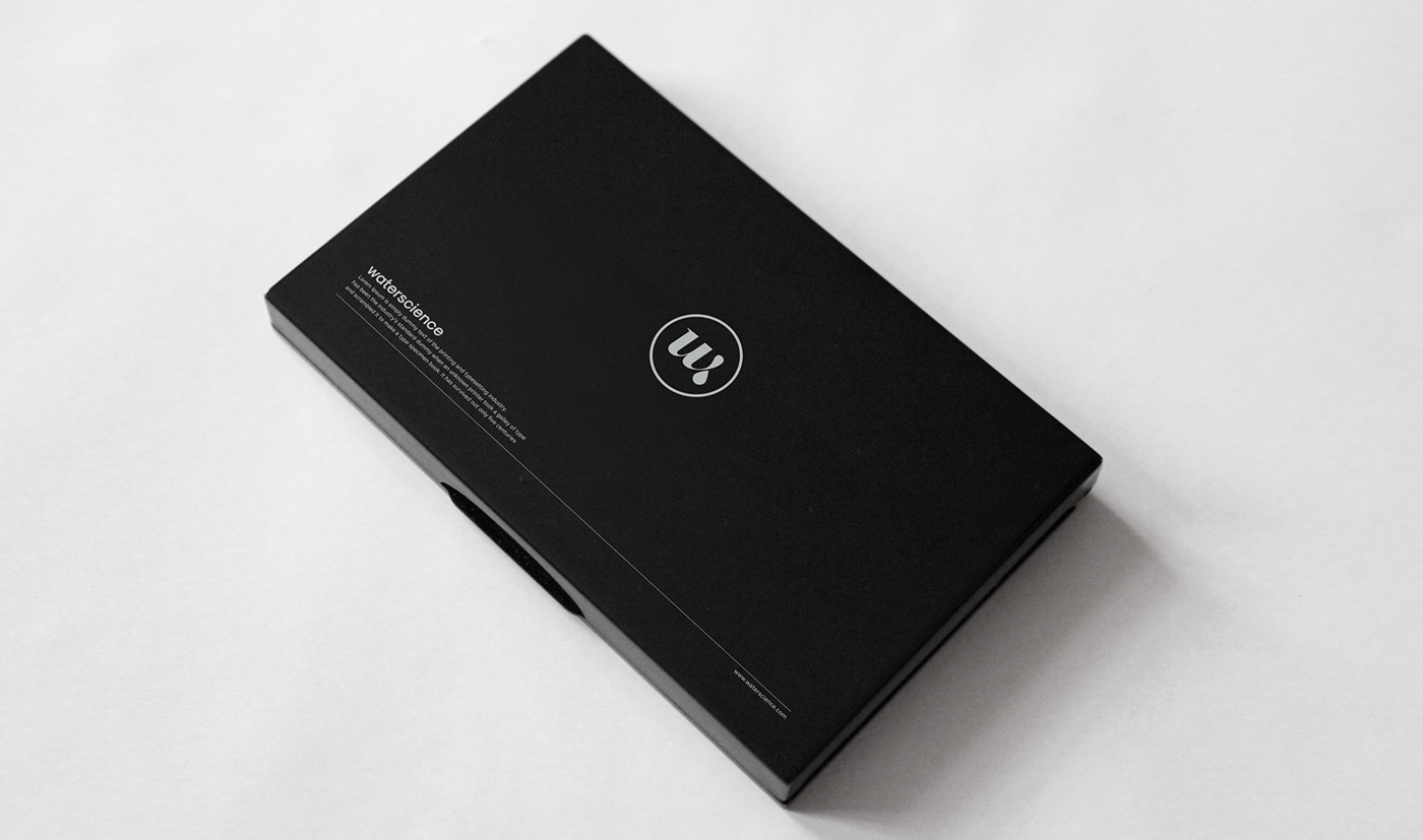
The Challenge: To design a logo for premium faucet manufacturer, Waterscience, we went looking for the simplest yet most elegant element that would capture the essence of the product - at the same time be suitable for the design of a monogram. Finally, we took as our starting point a drop of water.

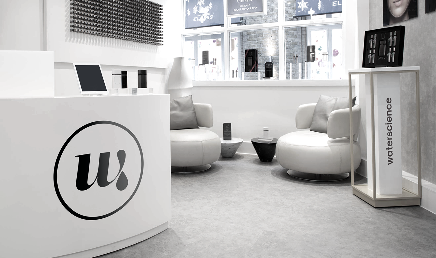
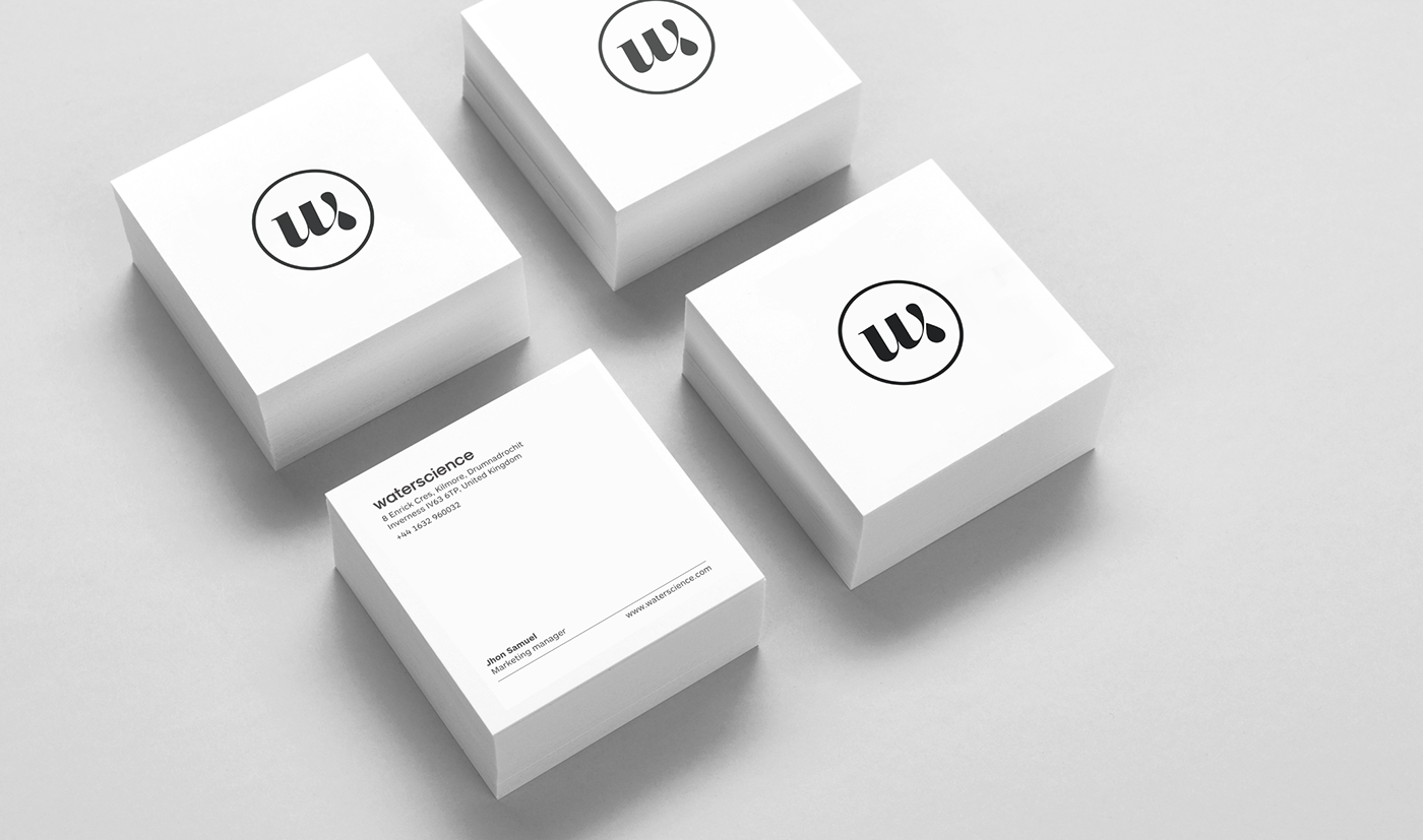
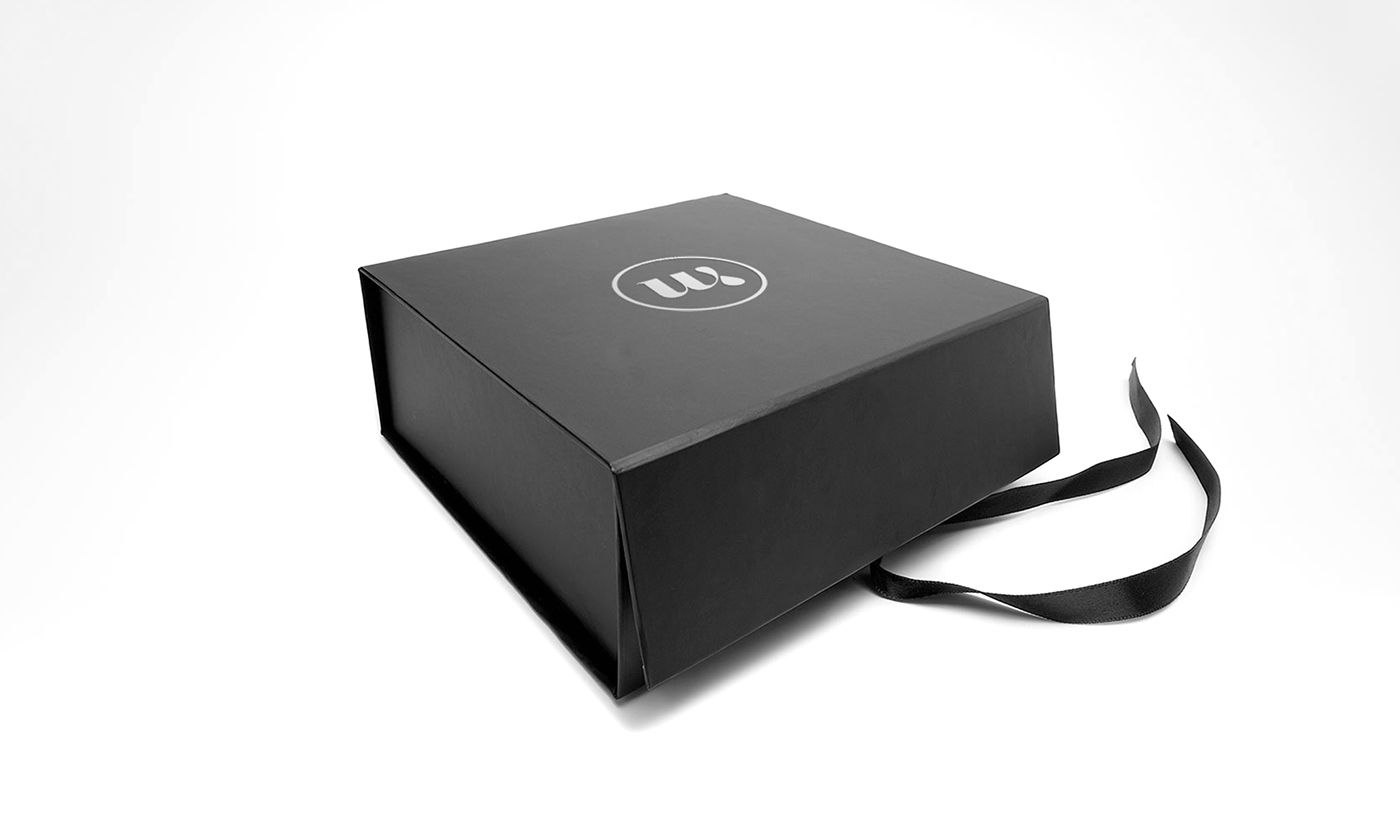
The Solution: The shape of the water droplet, suggesting fluidity, influenced and complemented our choice of the typeface for the initial W. The circle drawn around it completed the design, altogether evoking a classy feel when placed on the packaging and inside the store.


Thanks for watching