
thirty logos challenge
ThirtyLogos.com created a challenge for graphic designers. Participants are supplied with one fresh logo brief every day for thirty days. Every briefing contains a short description of an imaginary company and guidelines for the logo, you're supposed to work on.
In this project, I want to show my results of the challenge, starting with a more in-depth presentation of three of my favorites. Thank you for visiting!
showcase #1
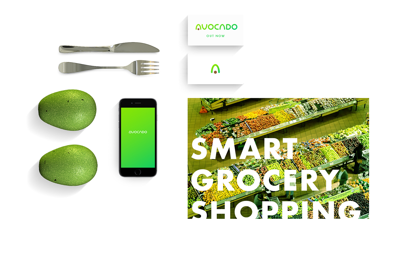
briefing: avocado
Hi!
Avocado is an upcoming app for smart grocery shopping! Our bundle includes a mount for your phone to attach to the handle of your grocery cart/buggy and will scan each item as you put it in your cart. This keeps track of all kinds of awesome data including total price, calories and other nutritional information, recipe ideas based on what's in your cart, and more!
We need the logo to include both an icon and text, please! We also ask that you provide what the app icon would look like with the logo. Thanks!
Zoey Pearson
Avocado

“Avocado” was the 24th briefing of the challenge. After multiple ideas and sketches, I settled for this solution. An ‘A’ constructed in a rather simple way, out of elements that illustrate a cut-in-half avocado, makes up the key element of the logo which can also be used as the standalone icon. For the complete wordmark, it is extended by custom-lettered type, which suits its appearance.
In the creation of the logo, I tried to produce a very clean and modern, maybe even futuristic look, to make it a fitting logo for an innovative mobile app.
showcase #2

briefing: sweets
Hello there!
Pleased to be working with you. I'm in the final steps of opening a candy shop in the UK called Sweets. Yep, a pretty awesome and straight forward name!
We'll offer a very wide variety of candy; just about anything you can imagine. I would love for the logo to capture the joys of candy whether it be with an icon, colors, etc.
You can try a lollipop, wrapped candy, chocolate, etc. There are really a lot of different things that could represent Sweets, so long as the text "Sweets" is legible from a far distance as this will be on our sign.
I would please ask that the words “Candy Shop” are below the main name "Sweets".
Jeffrey Young
Sweets Candy Shop

The Sweets briefing was task #11 of the challenge. For this logo, I created a combination of an ‘S’ with a candy cane. The resulting striped appearance utilizes a very balanced amount of whitespace and ultimately produces a strong, high-contrast look with an illusion of three-dimensionality.
showcase #3

briefing: sakura
Hey!
I own a sushi bar in downtown Los Angeles and I’m looking for a fresh logo!
The name of my shop is called Sakura. This means flowering cherry (blossom) tree, so I'd actually be cool with using a cherry blossom, but please don't feel that you need to use this, just an idea!
I am definitely open to any other kind of sushi iconography. I do require that the name Sakura is included in the logo. Thanks!
Kyle Dawson
Sakura
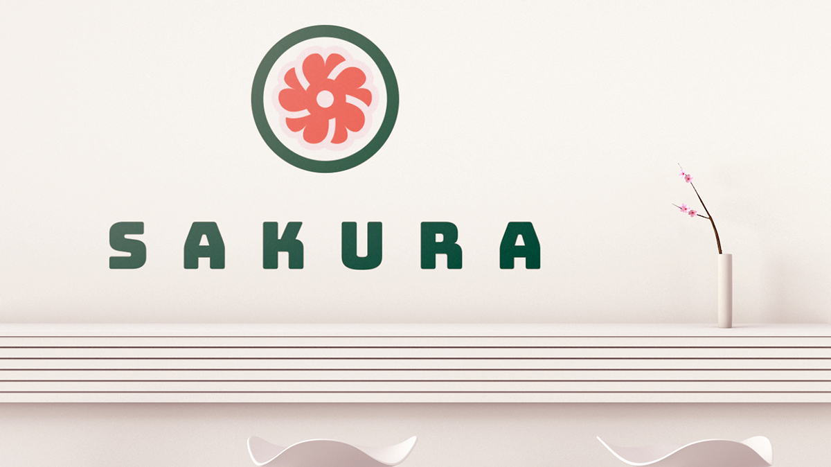
This was the eighteenth of the thirty logos. “Sakura” is the Japanese term for a cherry blossom. This is why — for this logo — I created a combination of a piece of sushi maki and a single blossom. The color of the blossom inside the dark green circle is more intense than the typical pale pink of a cherry blossom, making it look more like salmon inside the sushi roll.
This has been a really fun challenge. It was great to be able to get a feeling for your personal creative process and to be able to try your hand at different styles and techniques. Following this, you can see a b/w version of all the logos that I created as part of this challenge. For colored versions, visit me on Instagram @maiksymann.
Thanks for your time.


