


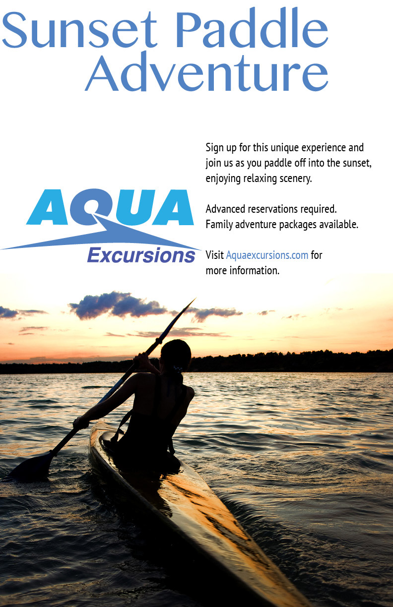
A campaign for a kayak tour company, including a two-sided trifold brochure, a standard magazine-sized poster ad and a larger format poster ad. The pictures and the shape of the logo were provided by the class, the layout and color of the logo are my own design choices. Layout work was completed in Adobe InDesign, though some of the coloring and shaping for the logo was done in Illustrator.
In the end, I decided a soft set of blues were a good choice for the logo colors. One of the draws of the company is a sunset kayak tour, and the photograph in the poster showed this off beautifully. The logo color provides a refreshing contrast without being too much of a clash. It also doesn't appear to be too intense on a white background. I like how the front cover of the brochure turned out. You'd almost think the Q and the arrow shape were transparent.


