LeadBoost offers a lead generation service, which means they are essentially helping their clients figure out who to target by providing the necessary data. The company has the lowest error rate in the industry and as opposed to their competition, who are very technical, LeadBoost emphasises on being human.
LeadBoost approached us in search for a more fun and human representation of their brand. The strongest area of interest was the development of friendly characters, which ended up being a focal point of the entire branding.
With our adaptations we successfully reached LeadBoost’s aim of
decreasing the website bounce rate.
Logo design
The previous logotype lacked approachability. The logo was not in line with LeadBoost’s human, honest and fun business approach. We also wanted to increase the visual weight of the logotype. It wasn’t legible in smaller sizes. However, those were exactly the sizes in which the logo was mostly presented.

Typeface research
Every time we look at a font we make an unconscious judgment about the personality of the subject. It happens automatically and is something we as designers have to consider when deciding on the logotype.
For inspiration, we looked at numerous existing typefaces to create the custom logotype.
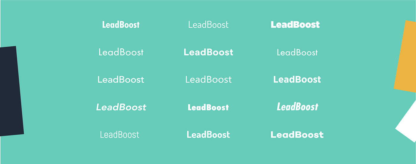
Design based on Galano grotesque
We made several modifications to the Galano grotesque font to achieve the right personality, impact and legibility tailored to LeadBoost.

Finalizing the logo
All the grids and measurements probably only make sense to designers. In any case, it is more than important to be absolutely exact to ensure that the final logo looks balanced and solid.
“Measure twice and cut once.”

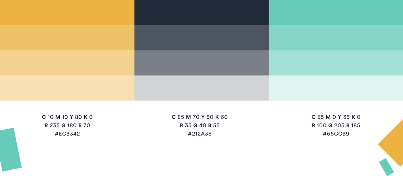
Colors
The old color palette lacked “life”. As LeadBoost wanted to take its branding to the next level, a more realistic representation of their fun and human approach, we quickly realised the limitations of the old color spectrum. So we tweaked the shades to make them more vibrant, fun and dynamic.
Applications Branding
It is important to ensure a consistent and well-rounded representation of the new design on all company platforms. Logo, colors and fonts need to be implemented company-wide. In each case, we want to establish a consistent ‘corporate image’.


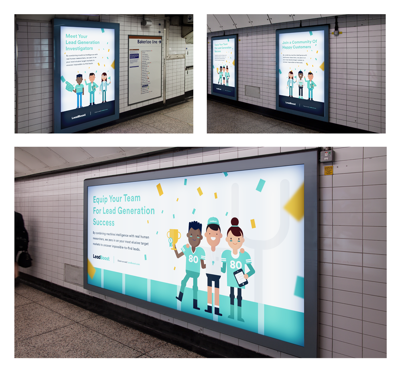
Street campaign
LeadBoost targets a niche market and we had to find out where exactly the target audience mingles. Using data research we found a subway line taken by a lot of people working for those companies that have a high potential interest in LeadBoost’s services.
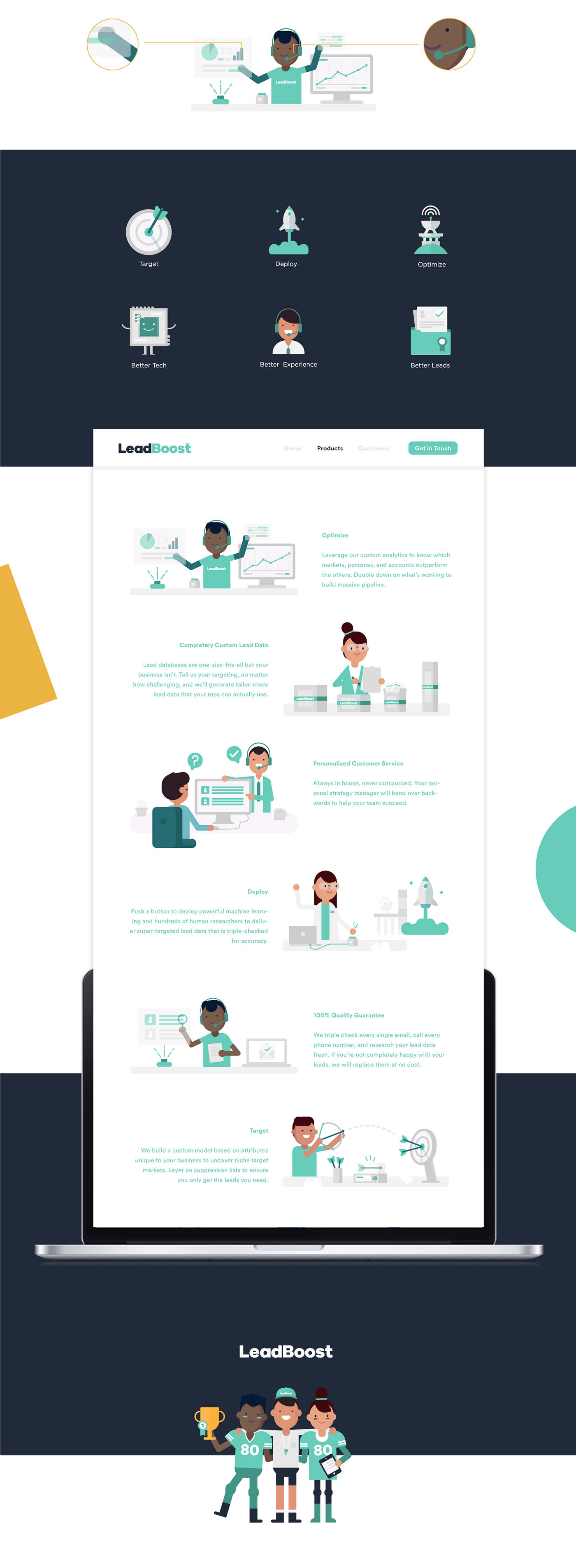
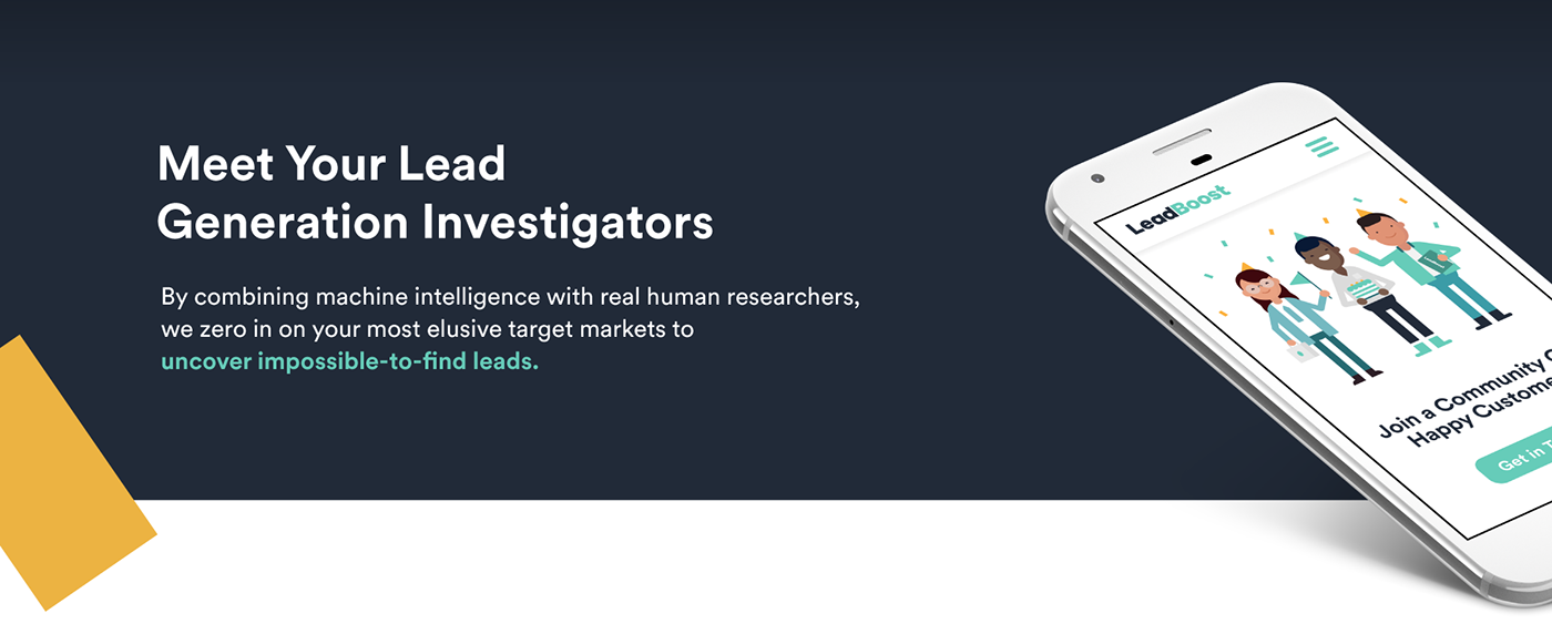
Brand illustration
To stay in line with the new branding and the general company feel, we decided to “humanize” the brand by developing fun and friendly characters. It was agreed that the illustrations will need to represent different genders and nationalities to bring across the company’s modern attitude and human approach. To summarize, we aimed to make the company more approachable through revised branding with focus on illustrations.