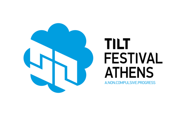
TILT.FESTIVAL.ATHENS
A.NON.COMPULSIVE.PROGRESS
Description
A.NON.COMPULSIVE.PROGRESS
Description
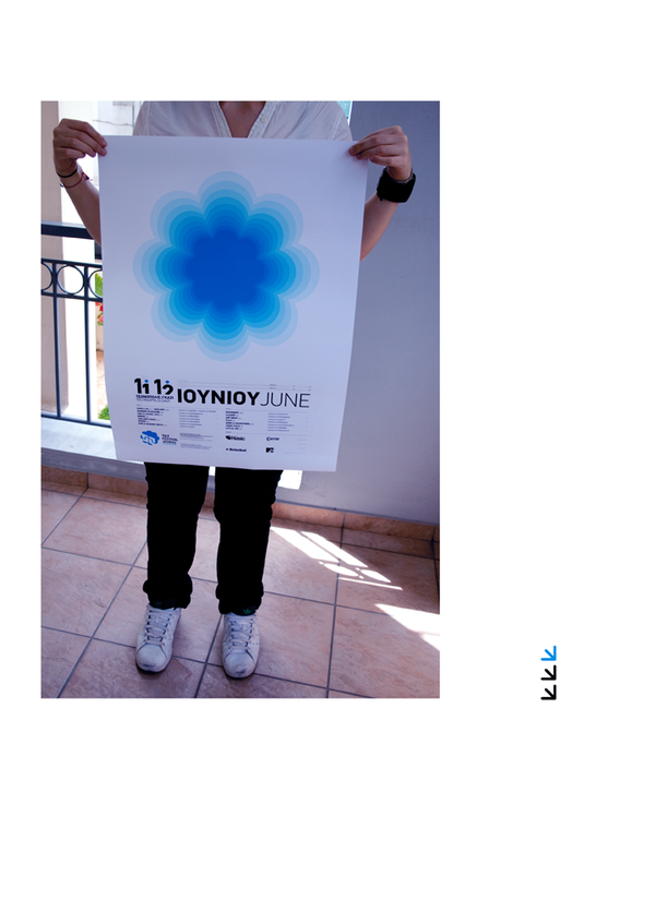
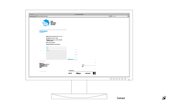
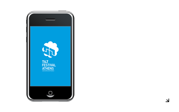
Through the creative procedure of the branding of a festival, the hardest thing was the one that I had to decide the way and the place that the logo should be, because the logo is the only thing that has to be on all the applications but without making brainwash to the viewer. The goal is to make people understand that the one thing they see at a time is part of the festival experience and not individual elements that bomb them with a logo, but of course every single application must stand alone as with all the others.
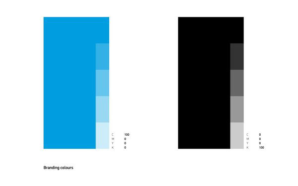
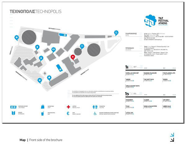
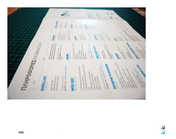
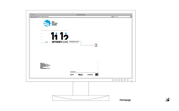
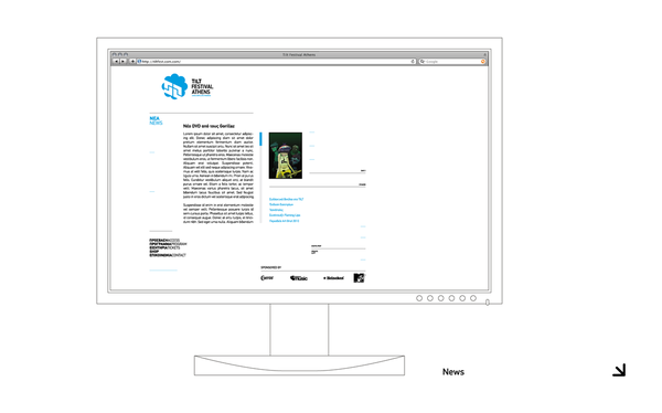
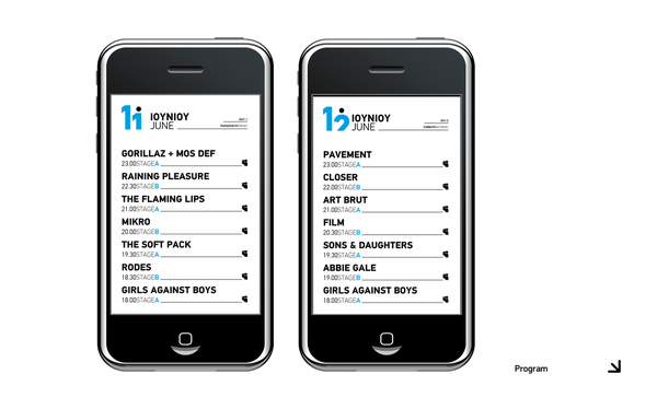
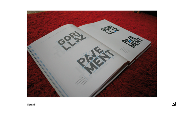
I also learned that intense colour contrast can highlight a branding but it must be supported differently every time using typography, illustration and photography. For all the applications that I designed, I used grid systems (different every time); this helped me to control the white space and make the layouts look very solid.
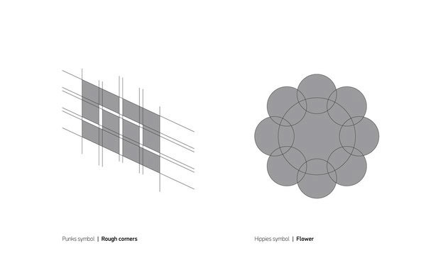
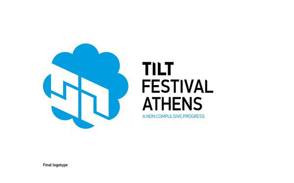
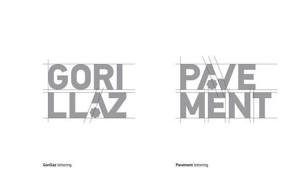
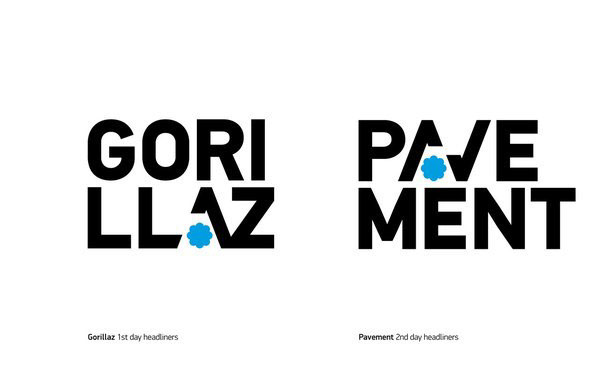
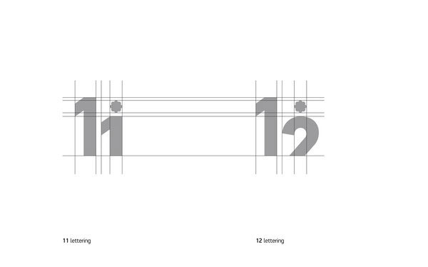
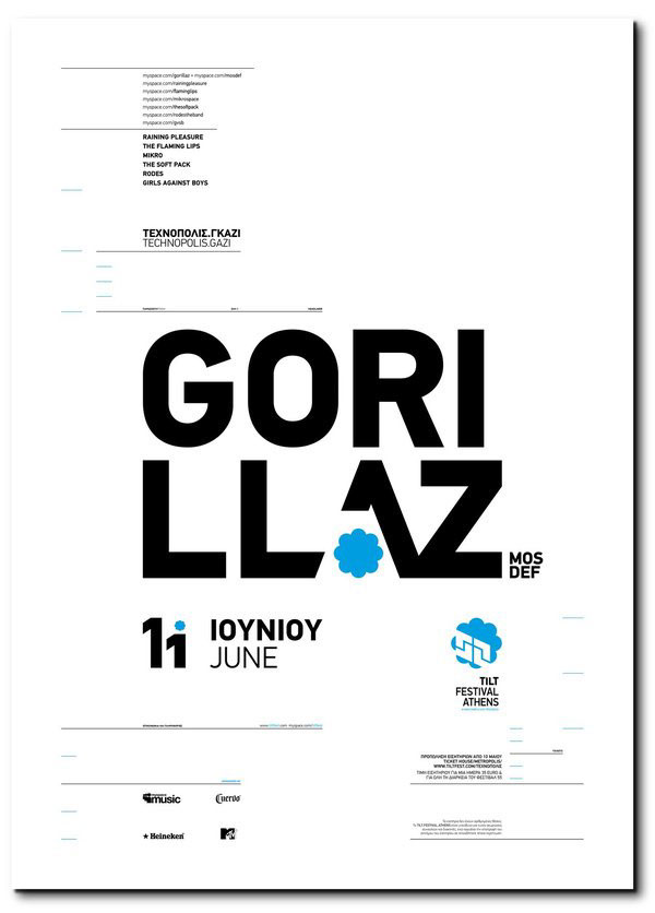
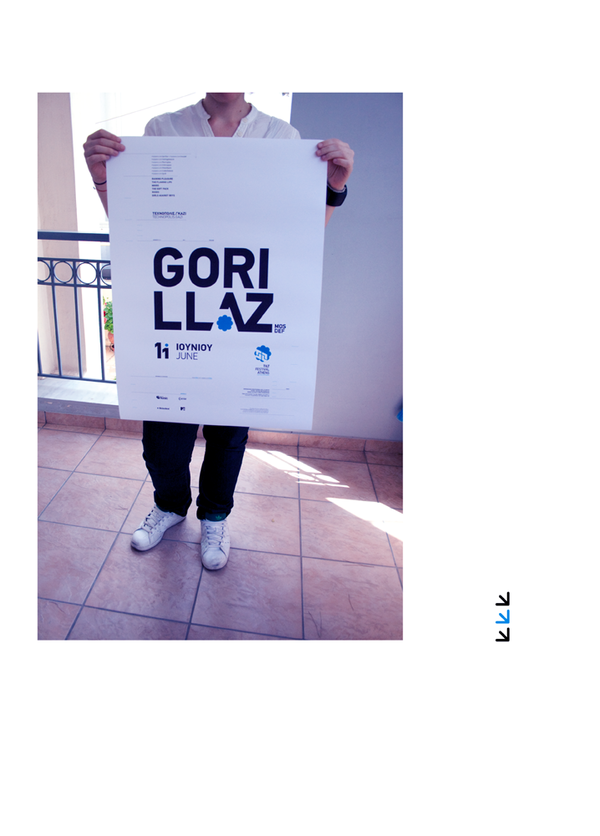
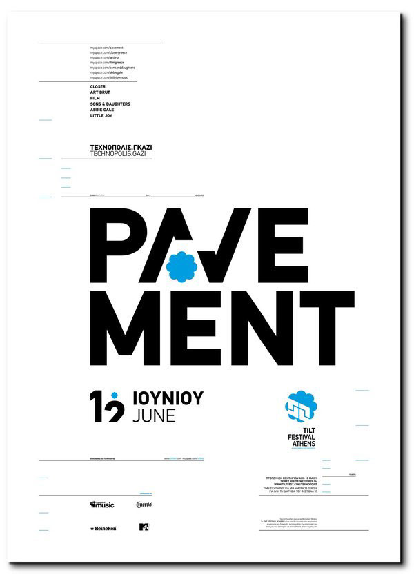
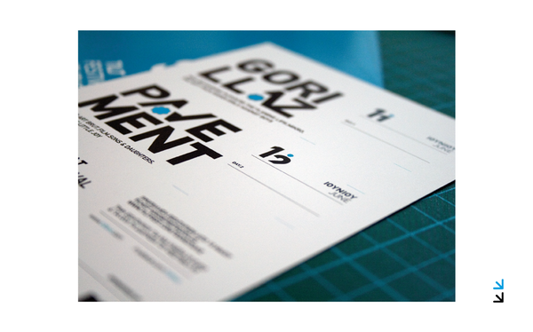
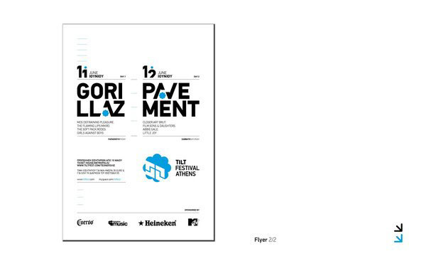
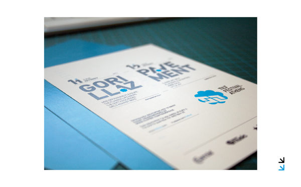
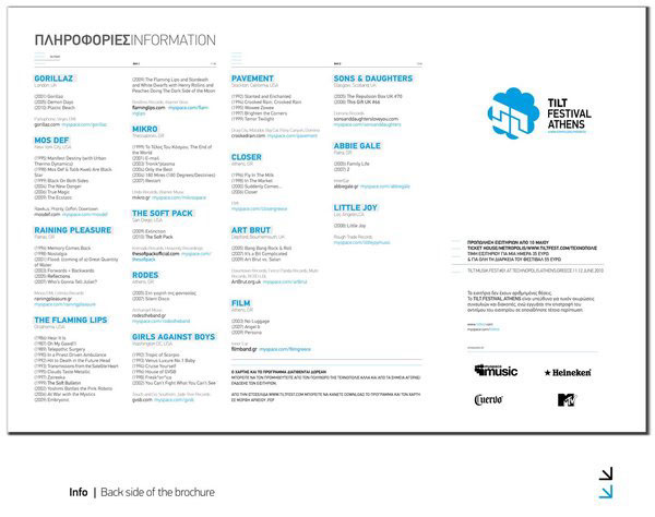
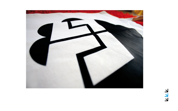
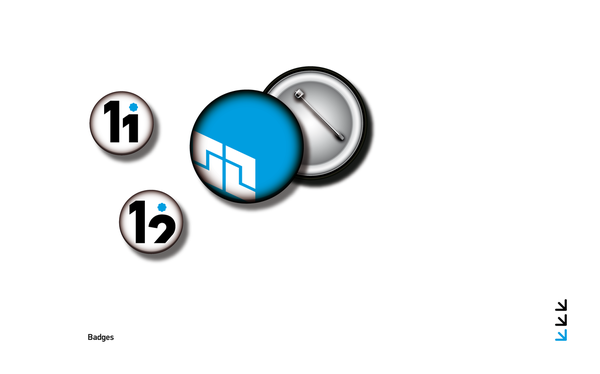
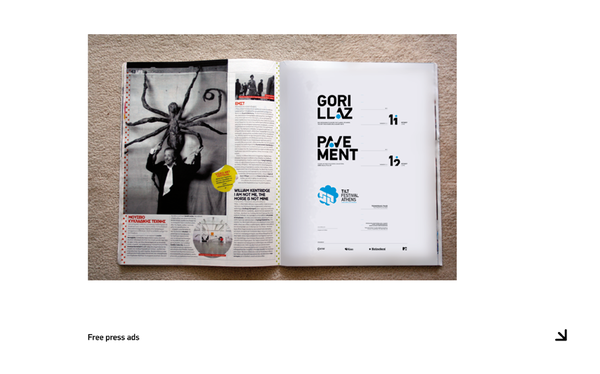
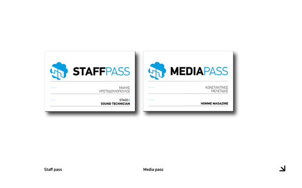
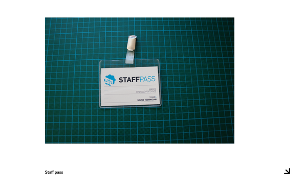
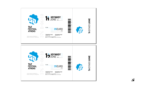
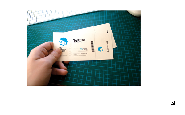
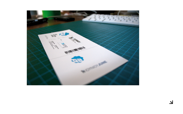
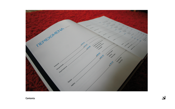
The whole emphasis on the branding of the music festival is based on typography; I used PF Din Text Pro in various sizes and styles. Apparently in some applications, like the logo, I used the forms of the letters based on PF Din Text Pro but I redesigned all the letters, so it is a combo of a typeface and custom -made lettering where the goal is to have unique style and aesthetics.
While designing typographically and without using unnecessary stuff that would make the work look amateur, I came to realize that it is hard to show intensity with so few things. When I found out that I could manage to show additional information taken from the sponsors it was critical, since they helped me to solve lots of problems and gave me the amount of info I needed each time helping me to define a style to the whole branding. The lettering with its unique style makes this project a live experiment, because every time I had to design a word I also had to make it look great and legible but not brighter than the logo.
I also learned that intense colour contrast can highlight a branding but it must be supported differently every time using typography, illustration and photography. For all the applications that I designed, I used grid systems (different every time); this helped me to control the white space and make the layouts look very solid.
The whole emphasis on the branding of the music festival is based on typography; I used PF Din Text Pro in various sizes and styles. Apparently in some applications, like the logo, I used the forms of the letters based on PF Din Text Pro but I redesigned all the letters, so it is a combo of a typeface and custom -made lettering where the goal is to have unique style and aesthetics.
While designing typographically and without using unnecessary stuff that would make the work look amateur, I came to realize that it is hard to show intensity with so few things. When I found out that I could manage to show additional information taken from the sponsors it was critical, since they helped me to solve lots of problems and gave me the amount of info I needed each time helping me to define a style to the whole branding. The lettering with its unique style makes this project a live experiment, because every time I had to design a word I also had to make it look great and legible but not brighter than the logo.