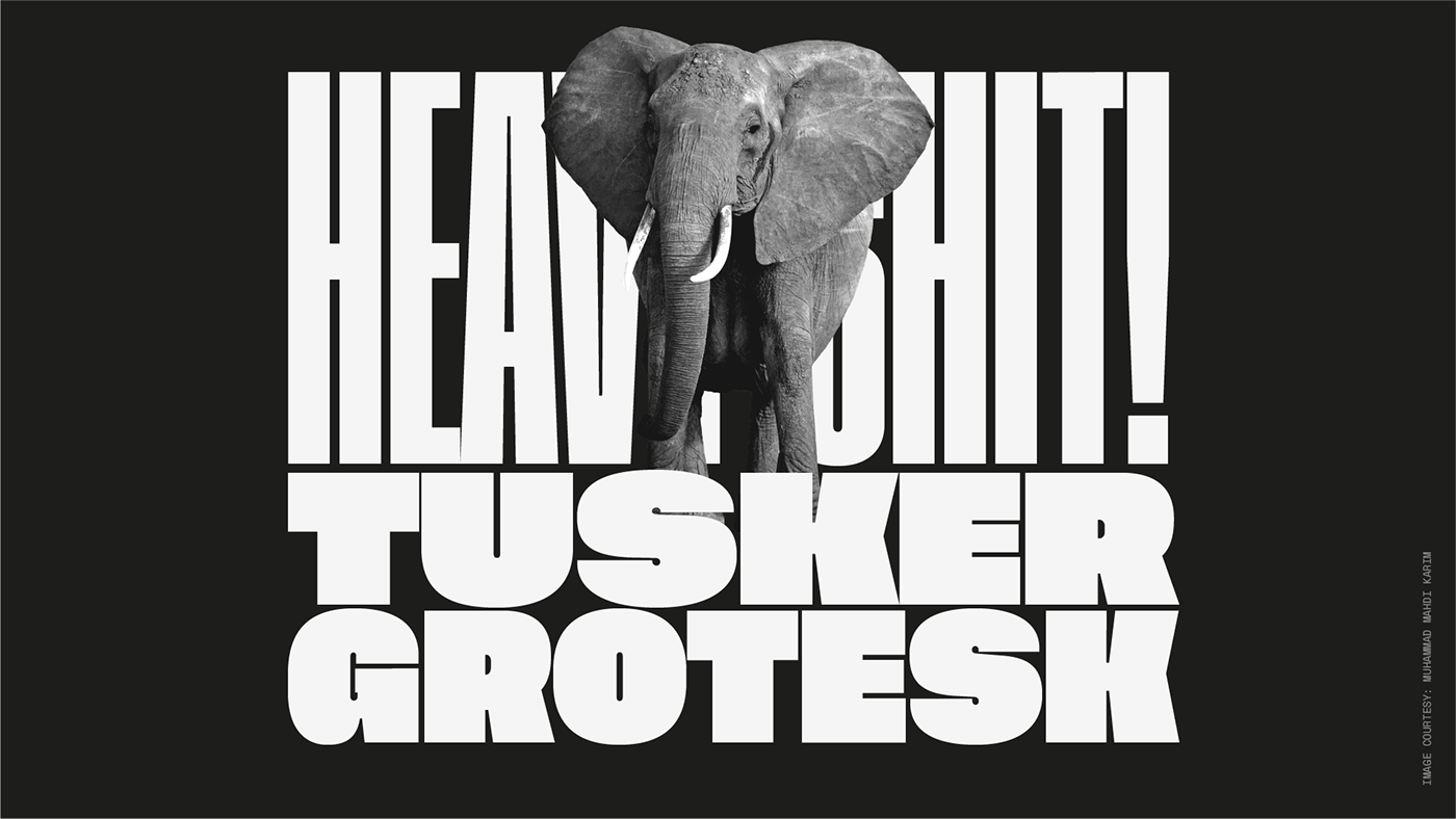
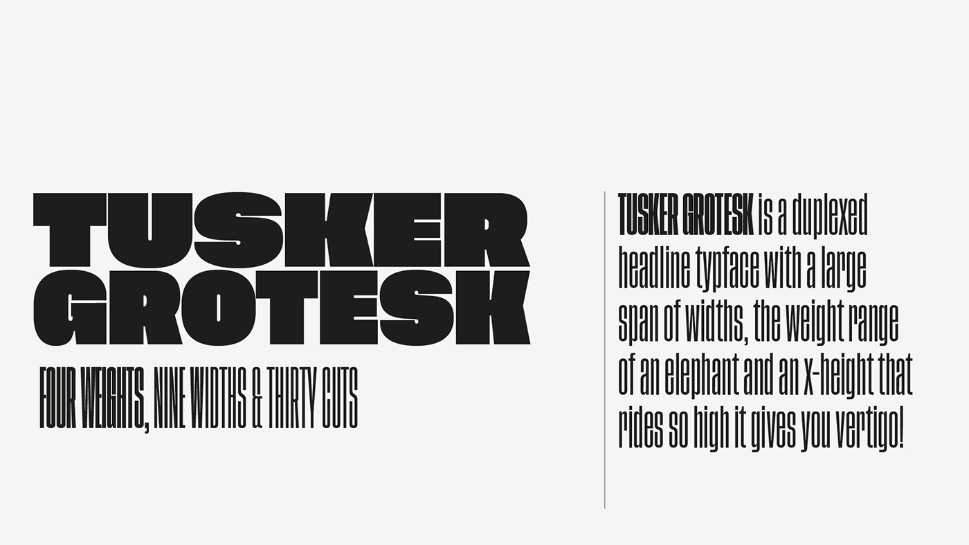
Tusker Grotesk is headline typeface designed for robust and high-impact use. The initial inspiration for Tusker came from post-war typefaces like Haettenschweiler, Impact and Helvetica Inserat which use very high x-heights.
While researching condensed sans and drawing test letters and samples for Tusker, a range of historical influences began to creep in to the process. The condensed end of the family is more related to old grotesques like Folio Extra Condensed, Placard Condensed and Stephenson Blake Elongated Sans No.1, with their closed apertures. Then as the widths in Tusker grow, the lettering takes more inspiration from gothic style sans such as Inland Type's Title Gothic No.8, while maintaining the optical weight established in the narrow end of the family.
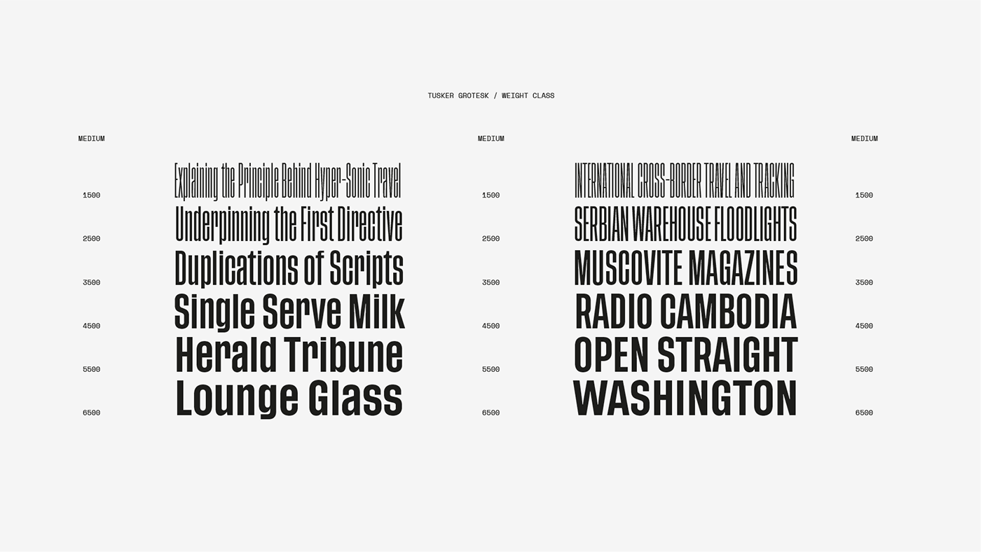
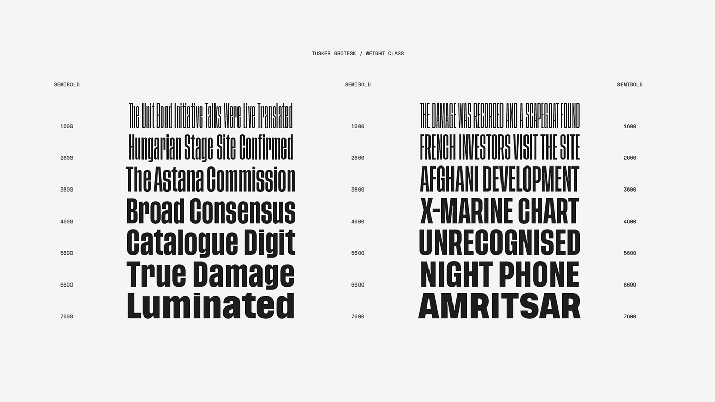
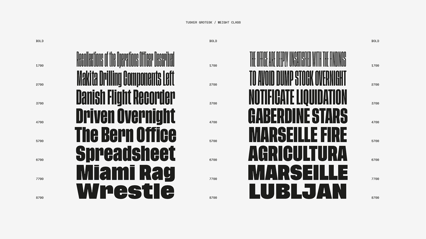
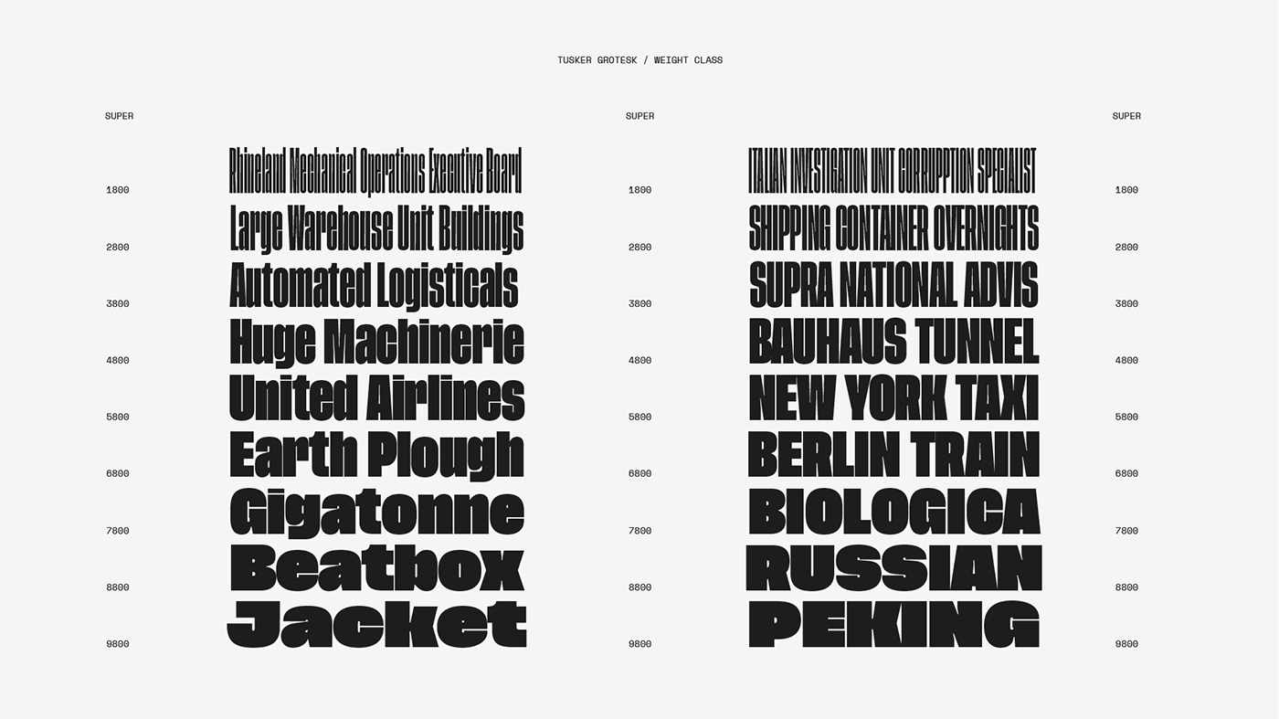

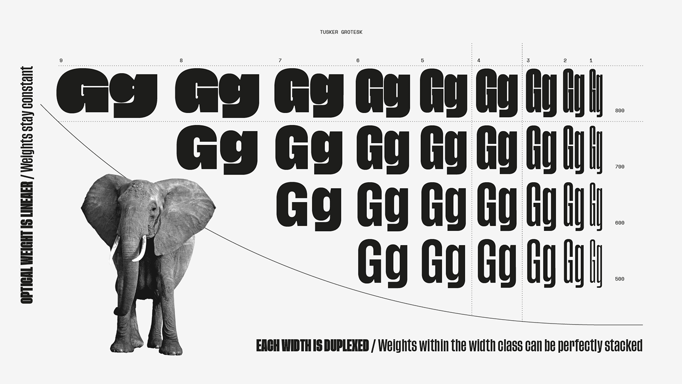
Tusker Grotesk has a nine widths and four weights. The weights have more range in the condensed end of the family due to each width being duplexed. (Duplexing means that a width's differing weight will not have an effect on the line-length. For example, a word set in 4500 Medium will be the same width as 4800 Super, and so on.)

Thanks for your appreciation!
Tusker Grotesk is available for download on
*NB Tusker Grotesk will also be available on MyFonts as soon as their current technical issues are resolved.
