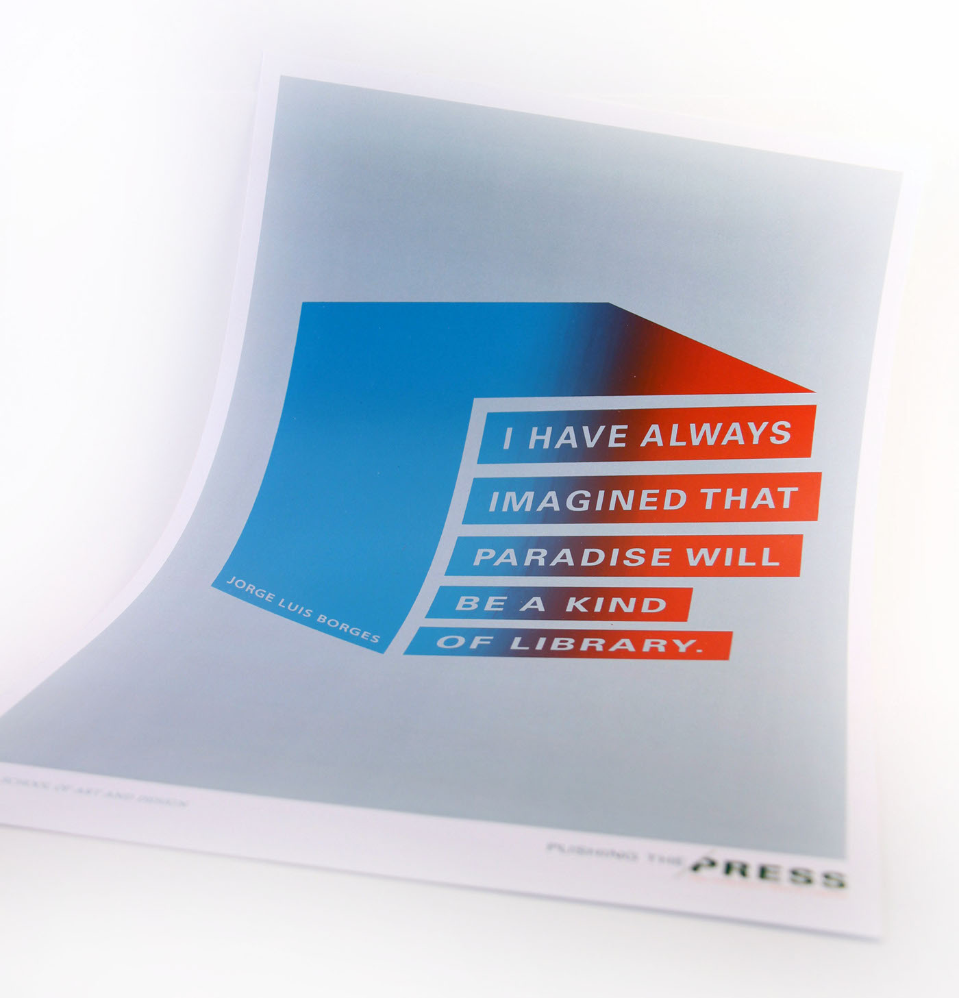
PUSHING THE PRESS
THE TYPECRAFT DESIGN LIBRARY
Curated by Steve Child and David Mayes
Exhibition design and promotion by the USC Roski Special Projects Class
As part of the Special Projects in Design Class at the University of Southern California, my peers and I were tasked with designing an exhibit that was the brainchild of David Mayes, a sales representative at TypeCraft - a favored designer-friendly printer who has worked with Southern California cultural institutions such as LACMA, MOCA, the Hammer Museum, CalArts, Art Center, and Otis, in addition to designers and artists such as Shepard Fairey, Robbie Conal, Michael Bierut, and April Grieman.
Named an AIGA LA Fellow in 2012, David has always harbored a deep appreciation and respect for the graphic arts and designers. Over the course of his career at Typecraft, he'd begun a self-initiated project of collecting an archive of all of the work from Typecraft's collaborations. After a few years, the sheer number of projects had overtaken his office wall and storage. Instead of just simply collecting and archiving these works, David came up with the idea of somehow displaying them to the public - ideally in a sort of library setting so that spectators could go up to and physically handle the work. Thus, the idea for the Typecraft Design Library - featuring over 15 years' worth of pieces - was born.

David Mayes' office wall
EXHIBIT CONCEPT
Speaking to David about his idea, it was clear that this was to be a museum exhibit, library, and celebration all rolled into one. It would celebrate not only the finished product/design but also the relationship between artists, designers, and printers - all of whom are necessary in the process from concept to design to end product. All of the works featured in the exhibit were the result of an entire dedicated design community that is always looking forward and pushing the limits to create new and interesting designs.
The first thing we set out on designing was the exhibit logo. Each designer in the Special Projects class came up with their own various designs which we then pitched to our clients, which included David as well as Tibbie Dunbar (the executive director of the A+D Museum), Amita Makdani (from M+R Studio, an interior architecture and design firm), and others who were involved in the production of the exhibit.
Although we initially worked individually, there were some core concepts/values that we all agreed upon. We brainstormed several qualities that we wanted the work to have or embody:
strong, crisp
bold
legible, minimal
contemporary
progression / movement
community
historical / technical (i.e. reference to printing techniques)

Initial logo design comps
CHOSEN DESIGN
After a few more rounds of revisions, I was fortunate enough to have my design chosen for the exhibit. This particular logo was inspired by the idea of motion (both in the printing process and in forward-thinking design), printing techniques such as die cutting, and the juxtaposition between the rich past of the printing process and the advancement of printing processes and technologies that have been and will be developed.
The logo was designed to complement the featured works and not overwhelm or distract from them; however, it is still bold and strong enough to stand on its own. The crisp and clean lines are contemporary and minimal, speaking to an attention to detail and precision, while the serif font evokes a sense of history, timelessness, and elegance. The color palette elaborates on this story of the meeting of past and future - the slate grey is neutral and modern; the soft black is bold, powerful, and timeless; and the punch of red is bright, lively, and vibrant.
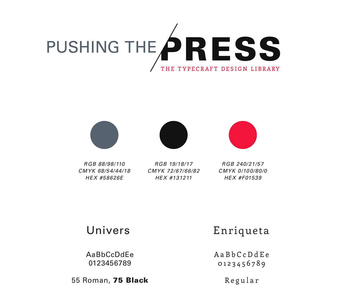
EXHIBIT IDENTITY
The concept behind the rest of the exhibit identity was showcasing the artists' work without focusing on a particular design as well as continuing to embody a sense of movement and forward-thinking. From the logo, we then went on to design the layout of the exhibit itself as well as all of the design collateral, including promotional materials (postcard, video, and email blast/announcement), a banner detailing all of the names of the featured artists, the front title walls, feature walls, and museum labels.
PROMOTIONAL POSTCARD / INVITATION


Exhibit Banner
features names of featured artists as well as a thank you to various individuals/organizations

PROMOTIONAL / TEASER VIDEO
features the works included in the exhibit
EMAIL ANNOUNCEMENT / INVITATION

EXHIBIT DESIGN & LAYOUT
Because of the large number of works featured, we had to devise a system of classifications in order to organize all of it. A core aspect of the exhibit was to showcase and educate visitors about all of the various printing processes and technologies available, so we decided to organize the works by process of special techniques - embossing, foil stamping, die cutting, split fountain, special papers, binding, etc. However, because many of these techniques are tactile, we also wanted to allow visitors to walk up to and physically interact with the work. Thus, a library setting was designed where works were filed according to the artist/designer's names and grouped according to printing technique. Small tables and seating areas were also provided in order to facilitate deeper exploration into featured works.
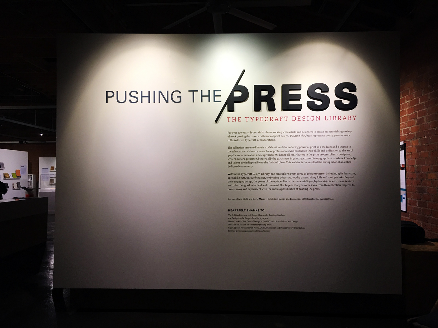
FRONT TITLE WALL

Installing the front title wall
CURATORIAL STATEMENT
For over 100 years, Typecraft has been working with artists and designers to create an astonishing variety of work proving the power and beauty of print design. Pushing the Press represents over 15 years of work collected from Typecraft's collaborations.
The collection presented here is a celebration of the enduring power of print as a medium and a tribute to the talented and visionary ensemble of professionals who contribute their skills and dedication to the art of graphic communication and expression. We honor all contributors to the print process: clients, designers, writers, editors, pressmen, binders, all who participate in printing extraordinary graphics and whose knowledge and talents are indispensible to the finished piece. This archive is the result of the loving labor of an entire dedicated community.
Within the Typecraft Design Library, one can explore a vast array of print processes, including split fountains, special die cuts, unique bindings, embossing, debossing, toothy papers, shiny foils and multiple inks. Beyond their engaging design, the power of these pieces lies in their materiality - physical objects with mass, texture and color, designed to be held and treasured. Our hope is that you come away from this collection inspired to create, enjoy and experiment with the endless possibilities of pushing the press.

Closeup of 3D type treatment on front title wall
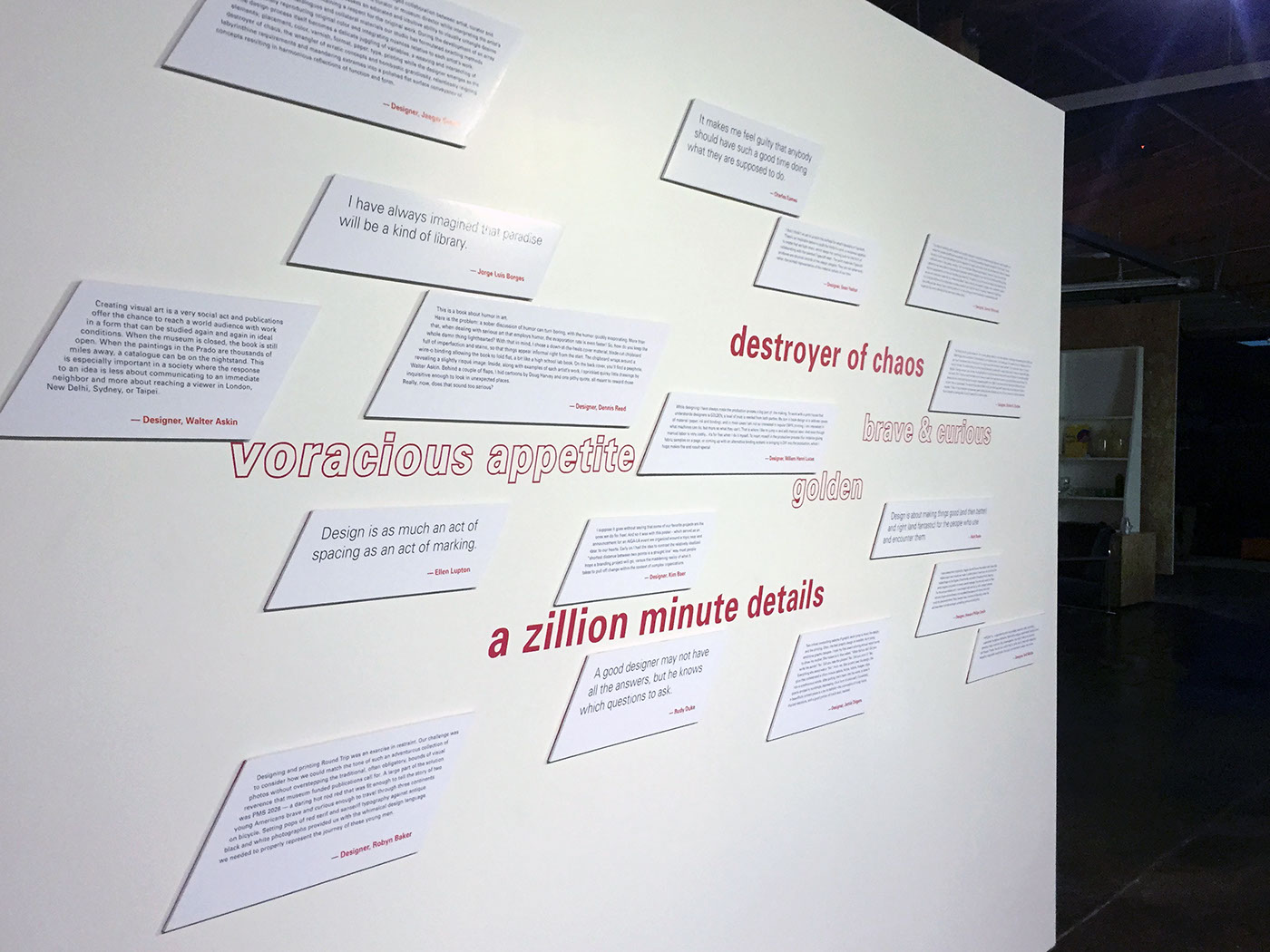
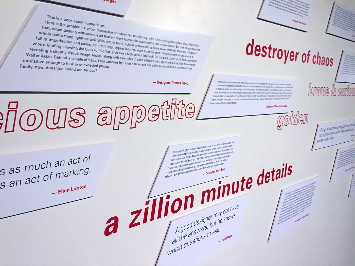
COMMENT WALL
features comments and quotes from artists on their own works featured in the exhibit, design, the printing process/print design in general, as well as their collaborations with Typecraft
FEATURE WALLS


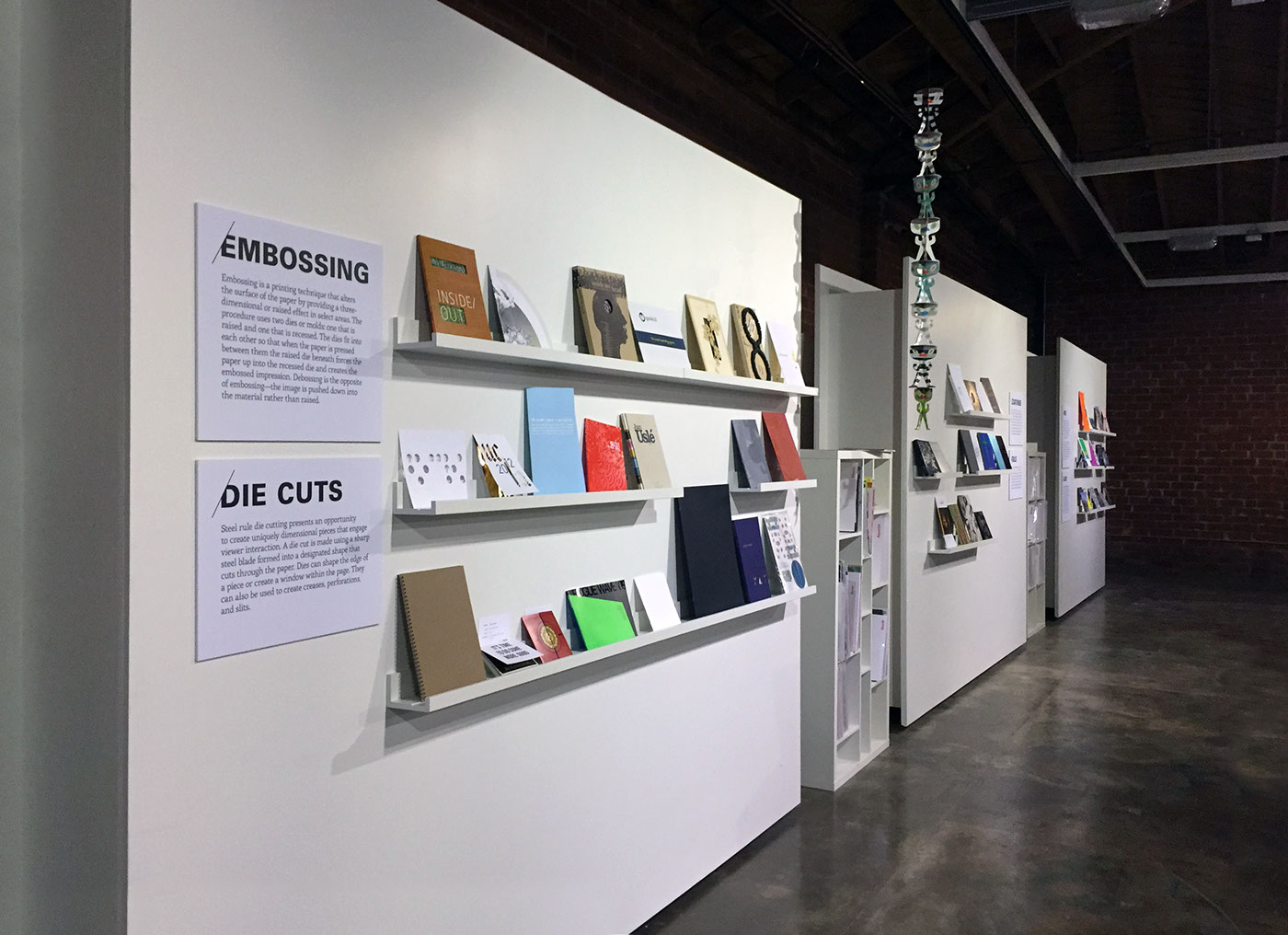

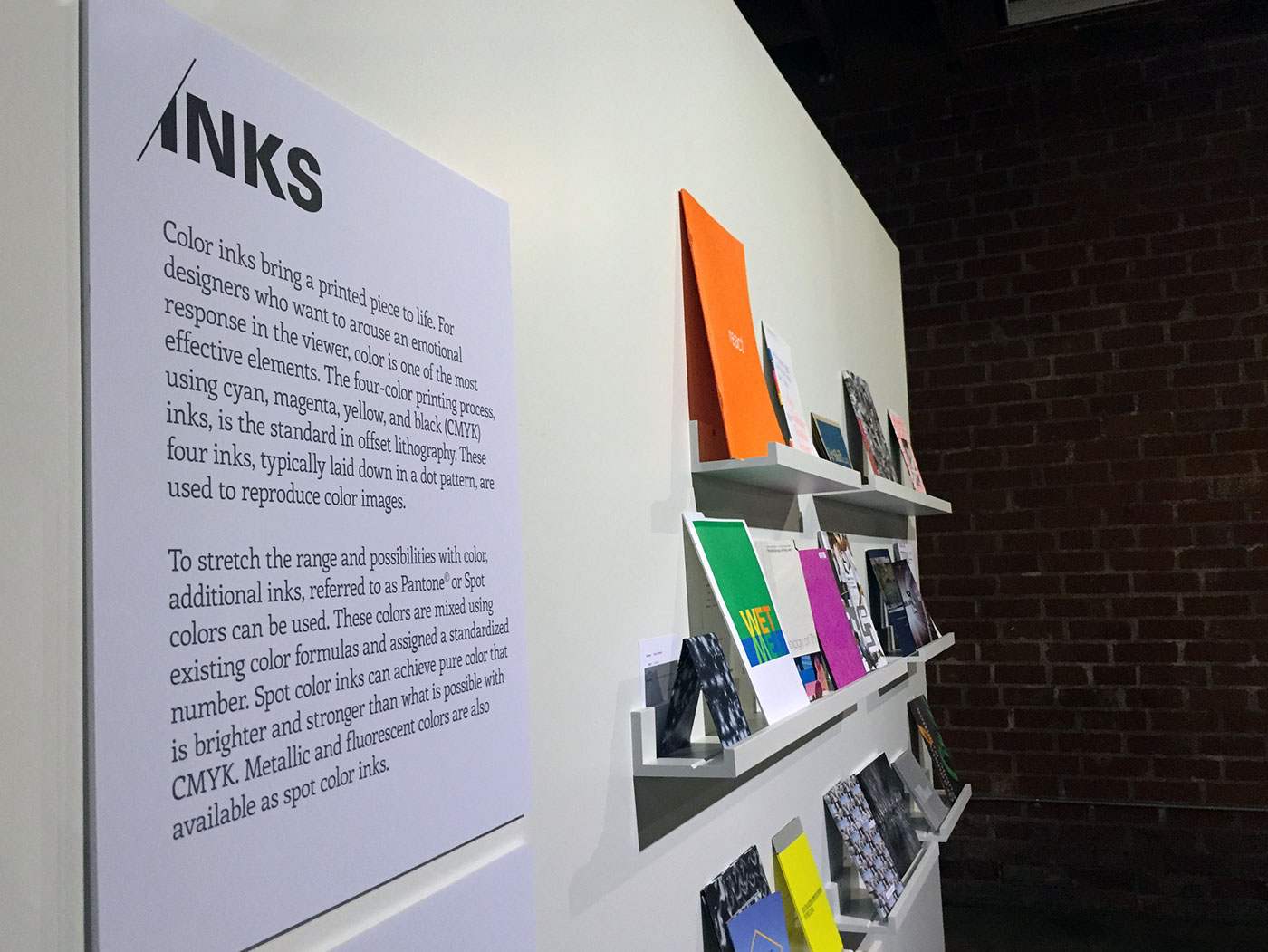
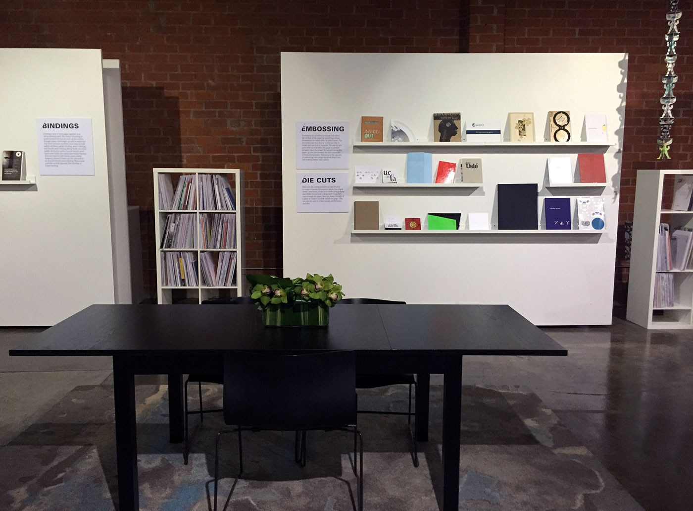
Table and seating area for visitors to sit down and enjoy the pieces
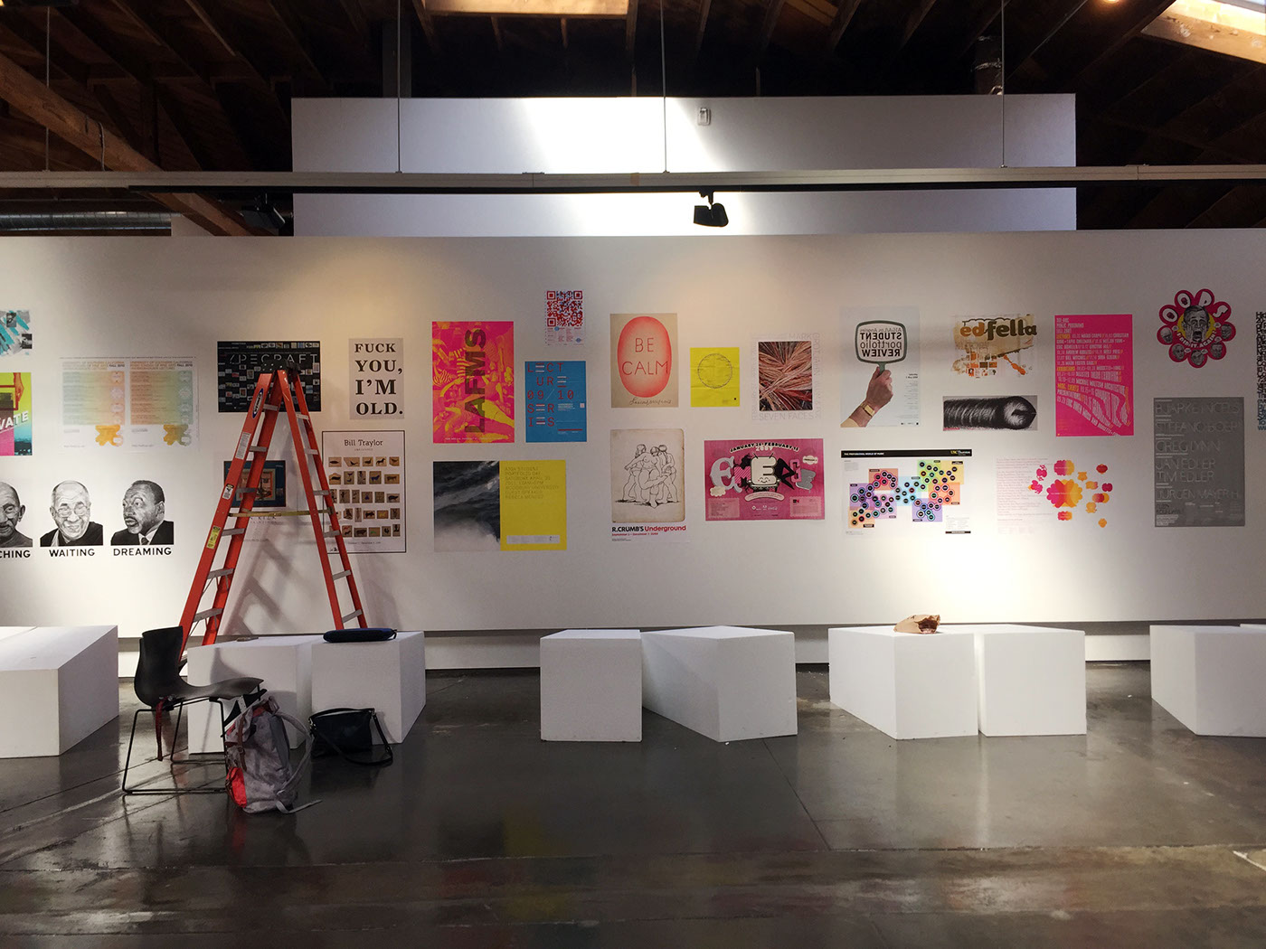
Installing one of two poster walls

Museum labels for each piece
OPENING NIGHT RECEPTION


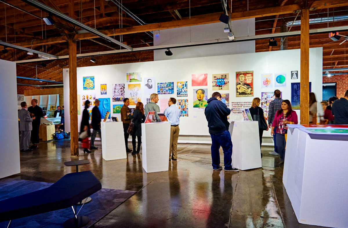


Live Screen Printing by Hit + Run
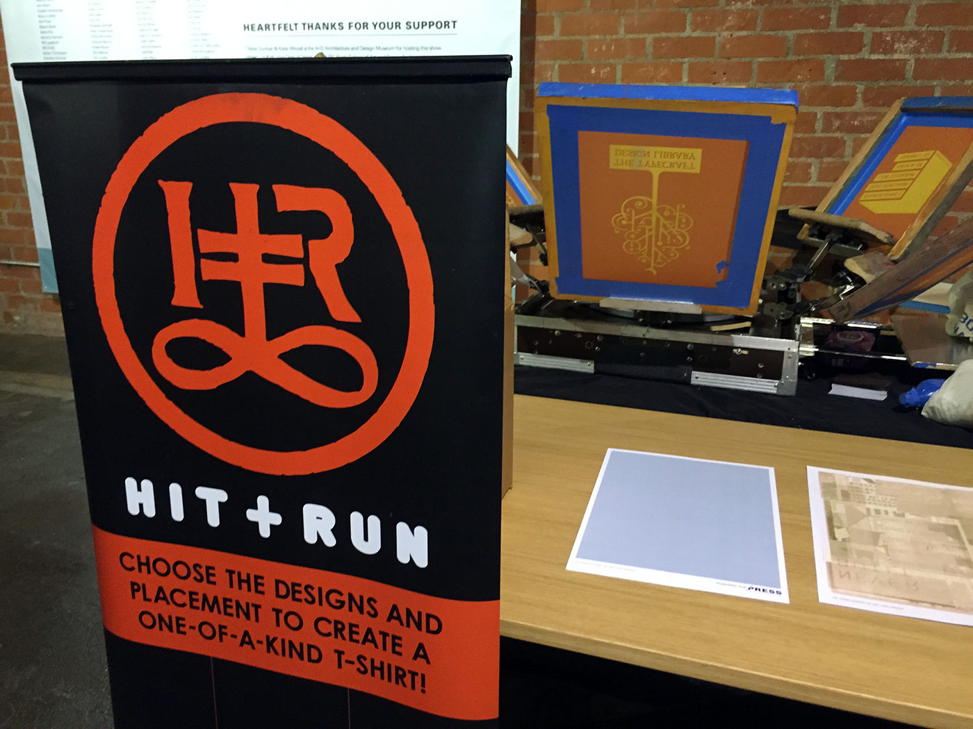
www.thehitandrun.com
The live screen printing portion of the exhibit gave guests a fun activity that allowed them to experience firsthand some elements of the printing process. Attendees personally interacted with the screen printing process on-site, mixing and matching pre-made designs to create unique pieces of art.


