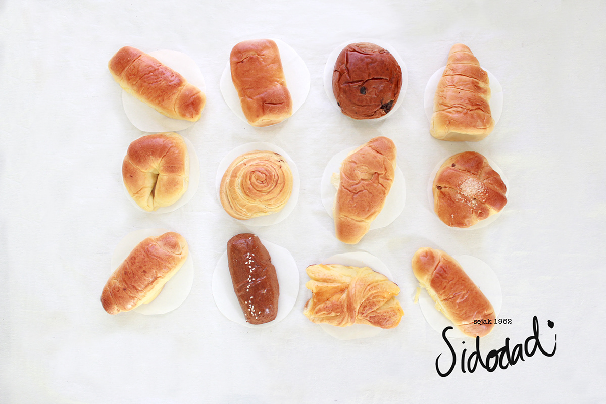
The quality still in the first place of what people are looking for the bread.
And Sidodadi bread is all about. Thus, I keep its simplicity and ageless of the brand.
And Sidodadi bread is all about. Thus, I keep its simplicity and ageless of the brand.

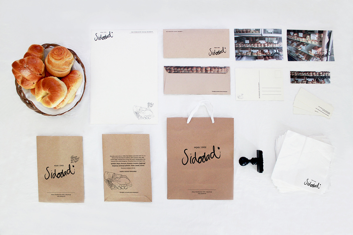
The handwritten font of the logo represents the timeless, homemade bread, and dynamic.
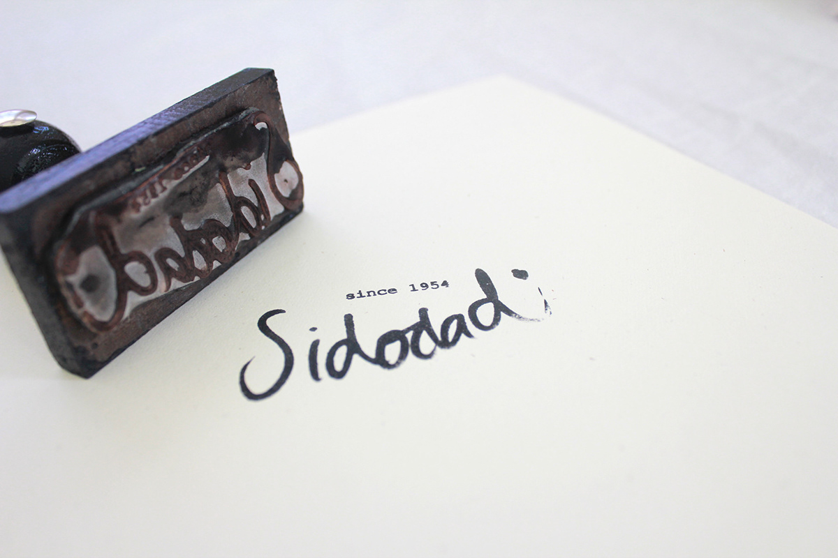
A stample as in an ancient device to show the brand. It still uses an ink.

For the sandwich bag, I choose recycle paper, which is safe for food
and environmental friendly, just like the brand that considers about the environment.
* There’s short history in the back side of the bag as well as the slogan “Buanglah sampah pada tempatnya” or “Jadilah peserta KB” that has became a SIDODADI’s sandwich bag trademark.
and environmental friendly, just like the brand that considers about the environment.
* There’s short history in the back side of the bag as well as the slogan “Buanglah sampah pada tempatnya” or “Jadilah peserta KB” that has became a SIDODADI’s sandwich bag trademark.