Radio-Canada is a Canadian federal Crown corporation that serves as the French national public radio and television broadcaster in Canada. In early 2017, I was mandated to design their official typeface. It was to be used across all their digital media platforms (Web, broadcast, apps, etc.). Therefore, it truly had to be a versatile and contemporary typographic solution.
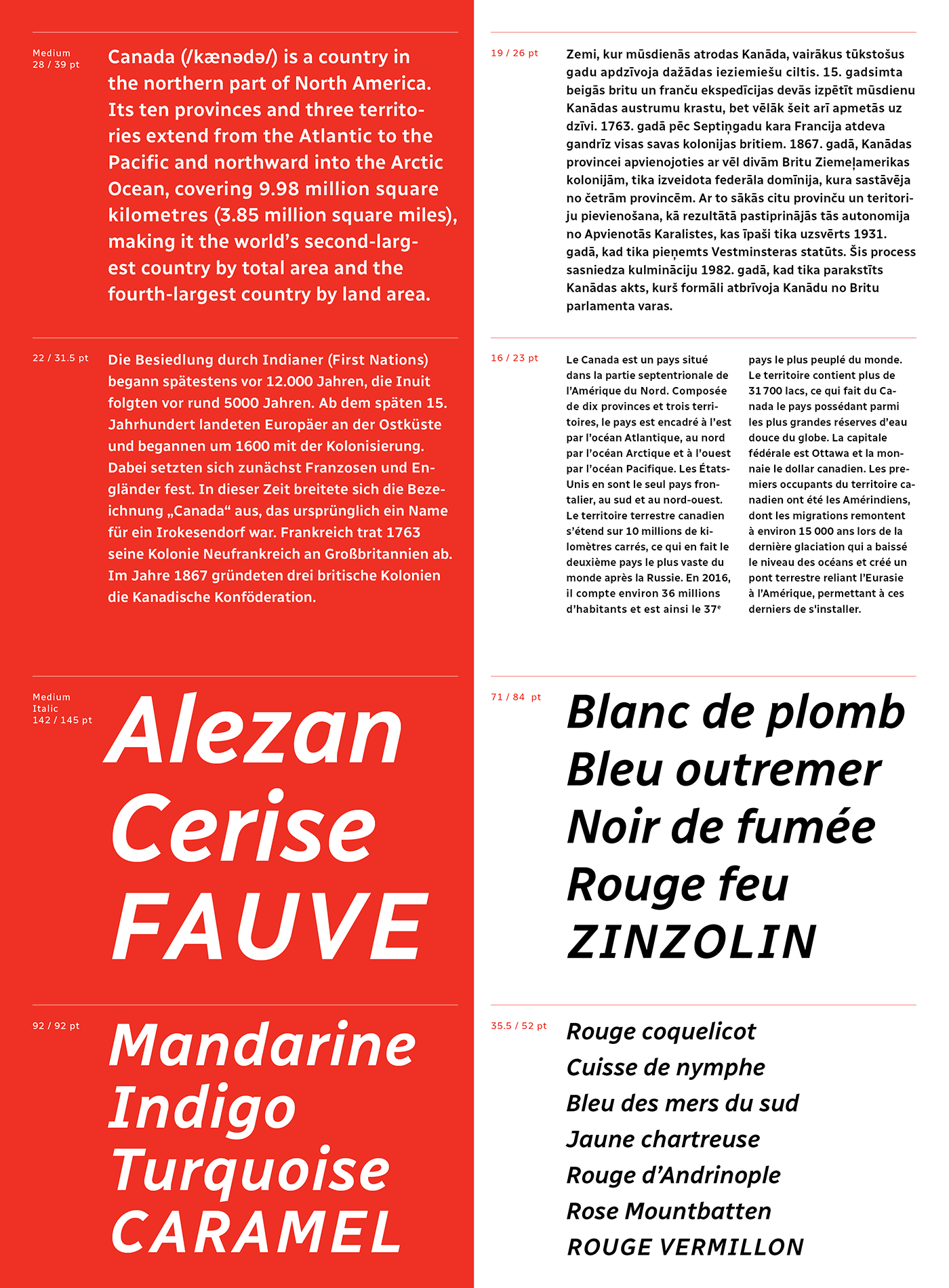
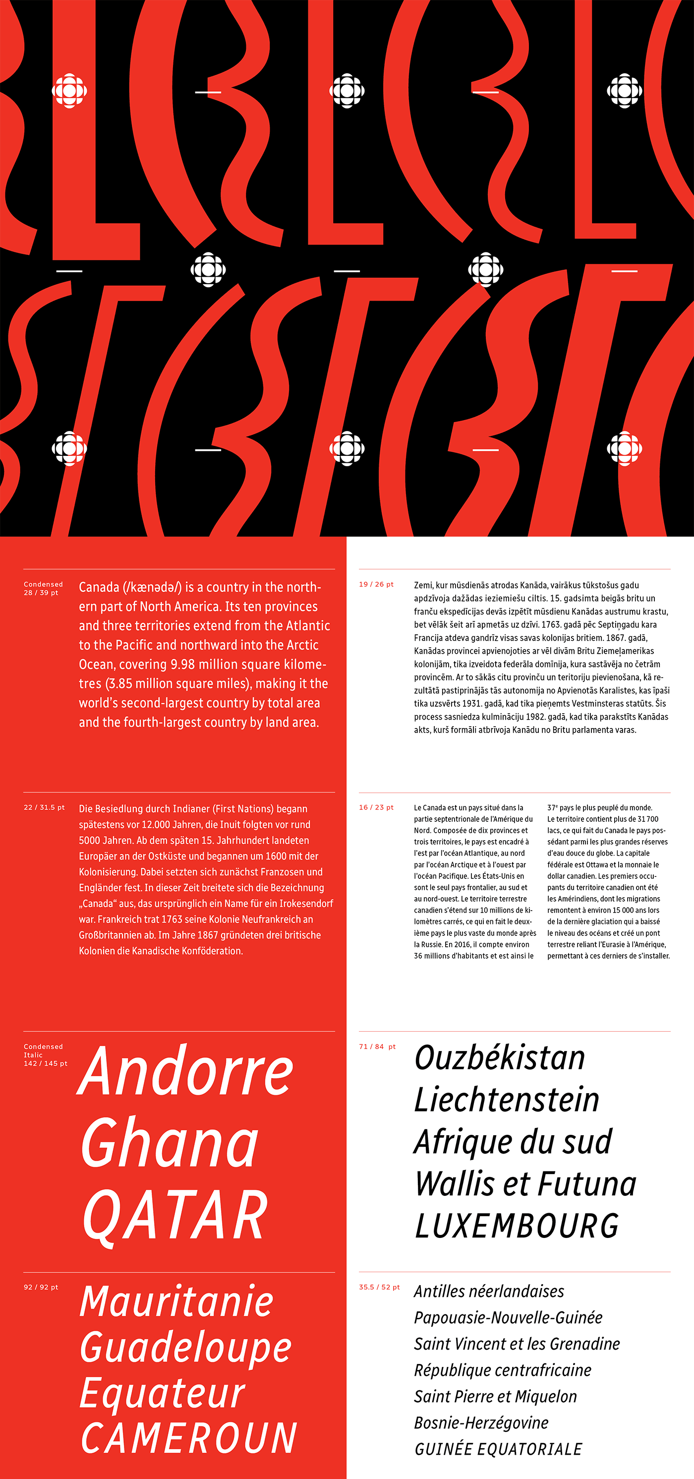
With the help of Coppers and Brasses and Alexandre Saumier Demers, we created a humanist typeface that was specifically designed for superior legibility. The typeface features many subtle details such as angled descenders (p,q) and ascenders (b, d) as well as distinct serifs (I, J).
The typeface’s x height guarantees excellent readability while respecting accessibility norms. Its character set supports well over 200 languages. The Radio-Canada typeface also offers multiple OpenType features such as proportional and tabular lining as well as a few stylistic alternates (I, J, a, u) and stylistic sets.
The typefamily is currently available in the following styles: Light, Light Italic, Regular, Italic, Medium, Medium Italic, Bold, Bold Italic, Condensed Regular, Condensed Italic, Condensed Bold et Condensed Bold Italic.
This project has been selected as a winner at the 2018 Communication Arts Typography competition in the Typeface Design category.


+ + + + + + + + + + + + + + + + + +
Follow me on Facebook Follow me on Twitter
Thank you for your time. I hope you appreciate our work!
Follow me on Facebook Follow me on Twitter
Thank you for your time. I hope you appreciate our work!


