SERVICE FOODS – REBRAND
The original brief for Service Foods was simply to refresh their dated chef image in the current brand-mark to make him more modern and relevant. However after initial research, we went back to Service Foods and challenged the brands positioning, which resulted in a major overhaul of the brand. The new identity was designed to better communicate what the company actually offered – ingredients for chefs. Very few customers were aware of their diverse product offering and for Service Foods to grow their business, communicating this was paramount.
It was no easy task, having started out as a Christchurch grocer back in 1983, investment in branding was very new. The process of getting the identity across the line with the family took about six months and a whole lot of conversations with current and potential new customers to pave the way in having them understand there was very little equity in the current brand, which visually looked more like an out-of-date catering service.
The idea behind the identity and assets was quite simple, it was about getting back to basics and visually illustrating what Service Foods did… they sourced a broad range of products and delivered them promptly to chefs around the country. Although a large percentage of their product portfolio covers everyday items, there is huge array of specialist products which are sourced directly from local and international producers. Service Foods philosophy was all about service. Being able to source the best products, from the best suppliers, at the best prices. This combined with family values and thirty years of experience is how the man with the cart came into to be.
The man & the cart is a flexible design system that enables ingredients and produce to change out depending on the communication. The mark was executed in a mono-tone woodcut style as it is representative of their simple philosophy of craft and care, while the typography is purposely kept simple & modern to compliment the illustrations.
The hospitality industry sets the bar for expectations and Service Foods has to deliver to that. Which meant the brands imagery had to be strong, delicious, real & inspiring, so we commissioned photography to capture a broad range of visually inspiring products from each of their core categories. Once again pushing the client to take that leap and invest - because we didn’t feel confident that their original brief of stock imagery would deliver a strong enough or consistent feel across this fleet.
One of the key deliverables was to brand their fleet of 65 trucks and then extend that across stationery, events, sales and trade material.
PROJECT OUTPUT
Brand identity, vehicle livery, advertising, stationery, events, trade marketing, printed communications.

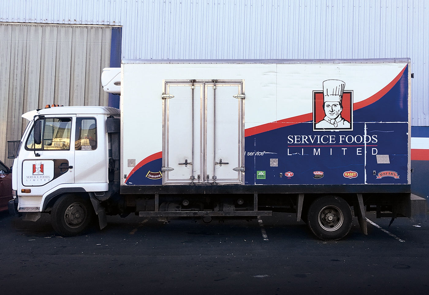
Before


contact us at andrew@triedandtruedesign.co.nz or prue@triedandtruedesign.co.nz
see us at www.triedandtruedesign.co.nz


