UNITED FISH CO. – Rebrand
United Fisheries is a family owned business that was established in 1974 and had never really invested in branding. They had an amazing story, set up by the father KK who came out to New Zealand from Greece as a young adult to work in his brothers fish’n chip shop. From humble beginnings, KK has built a legacy which is now managed by his four sons in Christchurch, New Zealand.
The problem United Fisheries faced when we first met was that other exporters had invested in branding & packaging and they were starting to miss opportunities and be over-looked. They had an export brand that was perfectly OK to ship in large volumes to overseas distributors but it didn’t visually live up to its expectation and it wasn’t appealing to consumers. United Fisheries wanted a brand they could take direct to consumers as well as their existing export customers but it had to retain the United name.
We spent a lot of time with the team in Christchurch and Auckland understanding the business and their story, which is very much one of doing the hard yards, respect for the fisherman and making sure the guys that are out on the boats get a fair price for the work they do. The brief was very much to capture this ’salt of earth’ personality, fresh, NZ caught seafood, brought to you as though the fisherman had cooked it himself in the gully, or down at the wharf.
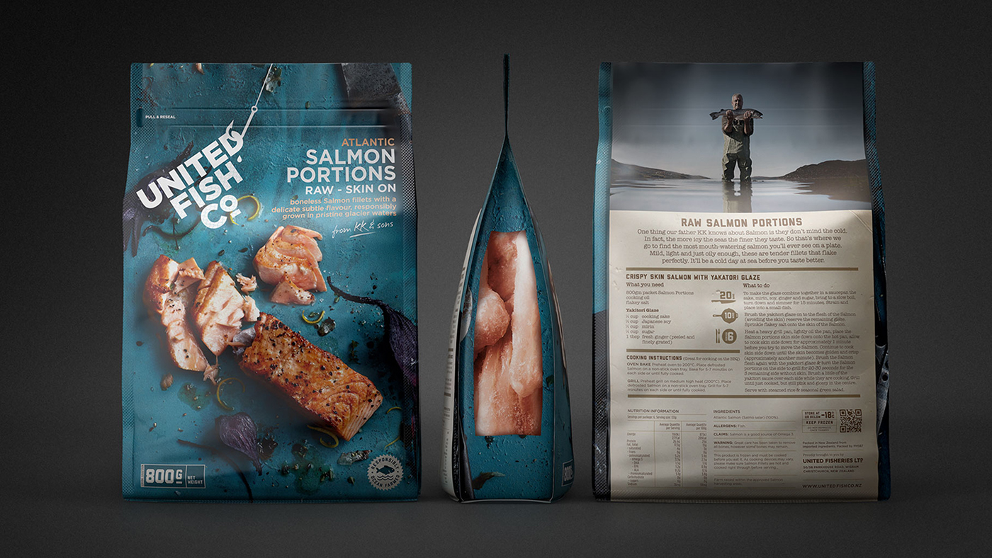
We renamed United Fisheries Limited to United Fish Co. so it would become a stronger more memorable brand name. The word-mark caught on the hook and pulled up through the water, tells the story of freshly caught. So fresh that drops of salt water are still falling off it.
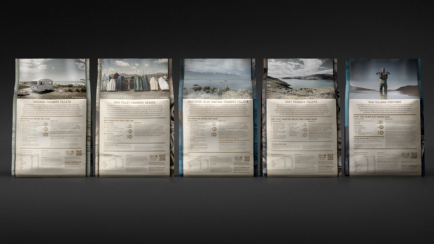
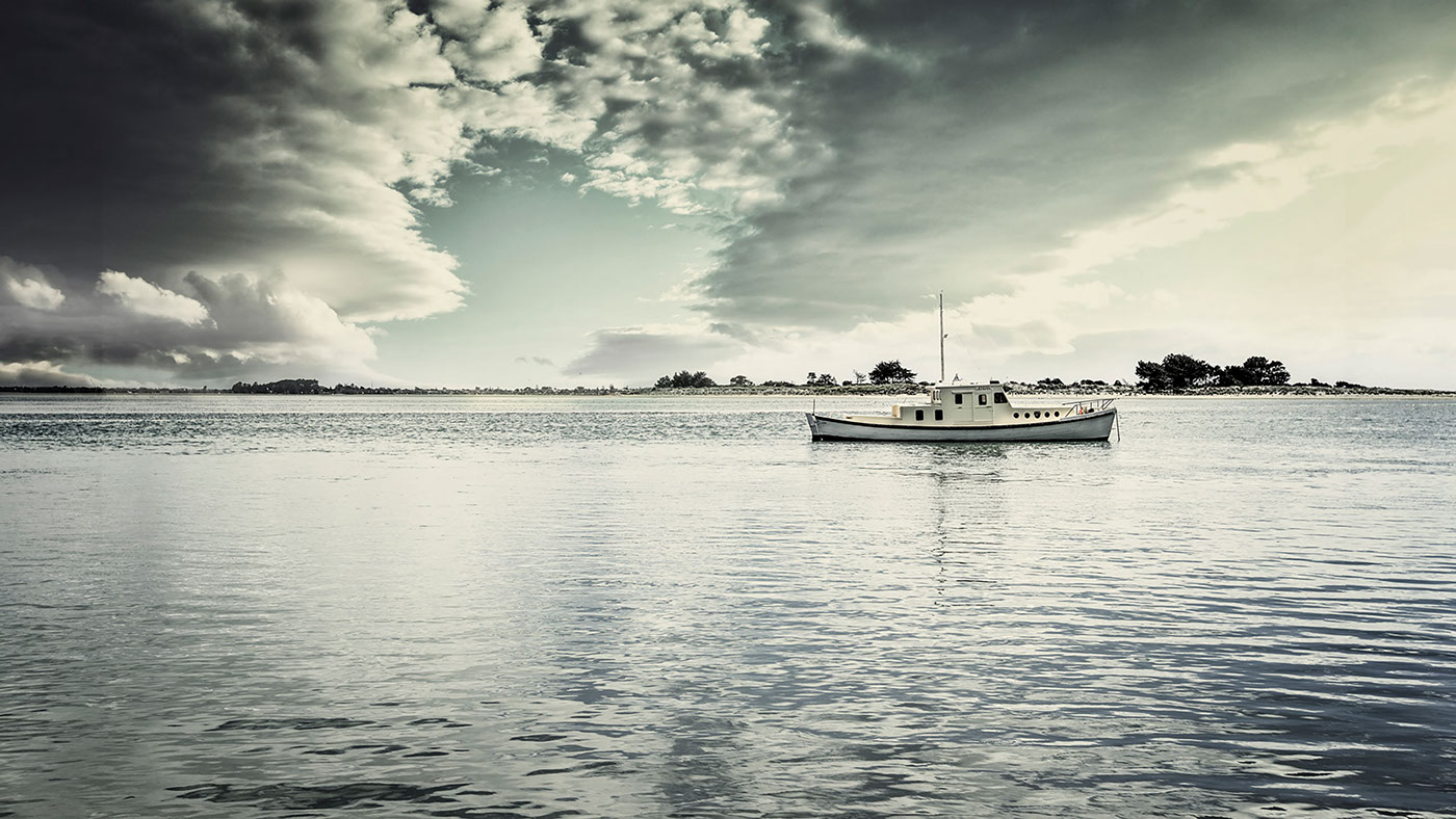
The design of the packaging was built off the brands ’sea believers’ positioning, respect for the ocean & everything in it, nothing too fancy, good tasty seafood captured in a naturally rugged environment, much like stretches of New Zealand's coastline. Backgrounds and props were sourced from a multitude of locations to ensure each was different and authentic. Local South Island landscapes were photographed for the back of each pack, visually telling the story of United Fisheries home.
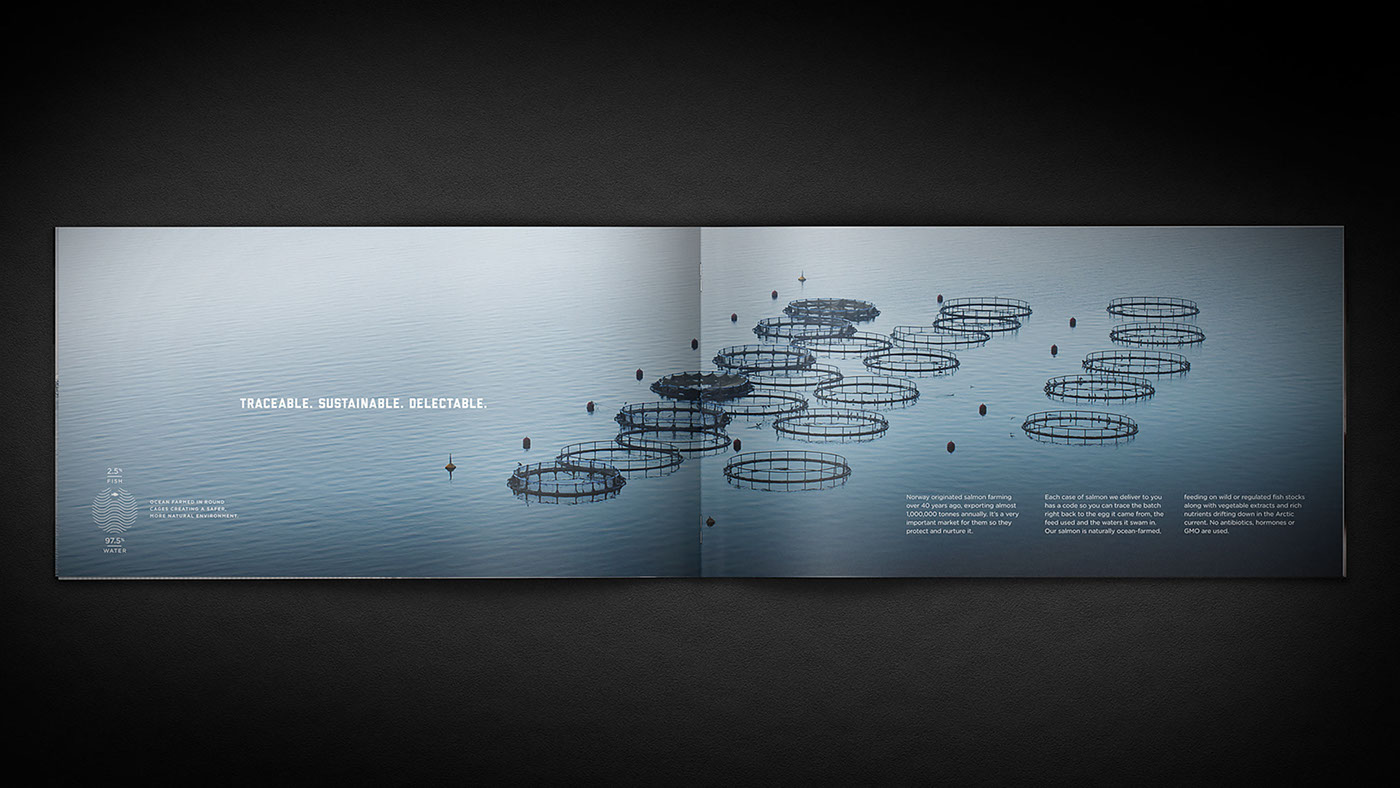
The rich brand elements have been taken across trade marketing material, livery, events, brochures, presentations, advertising, trade advertising & stationery.
The problem United Fisheries faced when we first met was that other exporters had invested in branding & packaging and they were starting to miss opportunities and be over-looked. They had an export brand that was perfectly OK to ship in large volumes to overseas distributors but it didn’t visually live up to its expectation and it wasn’t appealing to consumers. United Fisheries wanted a brand they could take direct to consumers as well as their existing export customers but it had to retain the United name.
We spent a lot of time with the team in Christchurch and Auckland understanding the business and their story, which is very much one of doing the hard yards, respect for the fisherman and making sure the guys that are out on the boats get a fair price for the work they do. The brief was very much to capture this ’salt of earth’ personality, fresh, NZ caught seafood, brought to you as though the fisherman had cooked it himself in the gully, or down at the wharf.
We renamed United Fisheries Limited to United Fish Co. so it would become a stronger more memorable brand name. The word-mark caught on the hook and pulled up through the water, tells the story of freshly caught. So fresh that drops of salt water are still falling off it.
The design of the packaging was built off the brands ’sea believers’ positioning, respect for the ocean & everything in it, nothing too fancy, good tasty seafood captured in a naturally rugged environment, much like stretches of New Zealand's coastline. Backgrounds and props were sourced from a multitude of locations to ensure each was different and authentic. Local South Island landscapes were photographed for the back of each pack, visually telling the story of United Fisheries home.
The rich brand elements have been taken across trade marketing material, livery, events, brochures, presentations, advertising, trade advertising & stationery.


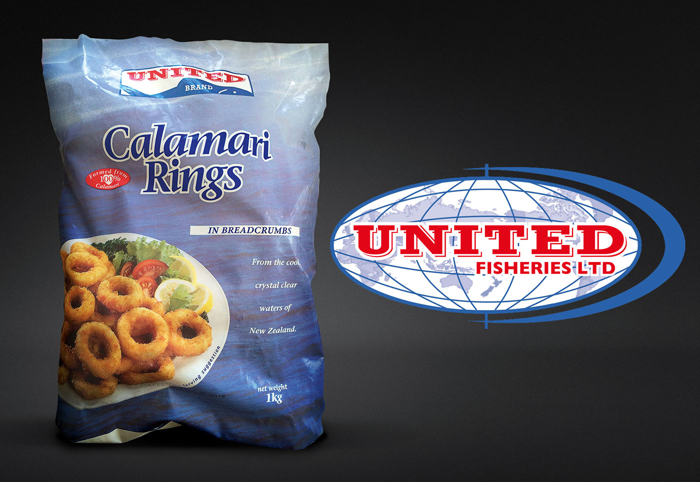
Before


contact us at andrew@triedandtruedesign.co.nz or prue@triedandtruedesign.co.nz
see us at www.triedandtruedesign.co.nz


