

This is Part 1 of a 4 part post on the logo graphics I created for a huge new candy emporium in Hollywood, California called “Sweet!”
This first post in the series will cover 2 of the 5 logos—“Peace of Candy” & “Lollywood”. Come back soon for Part 2.
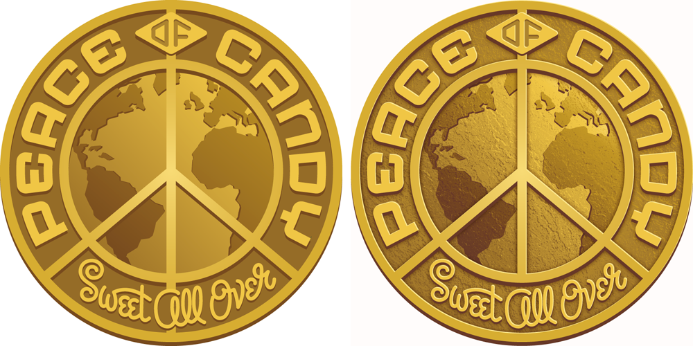
Peace of Candy
The theme of Peace of Candy is that we all may have our differences, but all the peoples of the world can come together through the mutual love of candy. Inspiration for creating a graphic was not hard to come by. Medallions extolling the virtues of Peace and Goodwill may easily be found. So it was not much of a stretch to take our design cues from some of these many and varied metallic coins:
This first post in the series will cover 2 of the 5 logos—“Peace of Candy” & “Lollywood”. Come back soon for Part 2.
Peace of Candy
The theme of Peace of Candy is that we all may have our differences, but all the peoples of the world can come together through the mutual love of candy. Inspiration for creating a graphic was not hard to come by. Medallions extolling the virtues of Peace and Goodwill may easily be found. So it was not much of a stretch to take our design cues from some of these many and varied metallic coins:

The first pencil sketch pretty much summed up the direction I wanted to go…but then it was decided that we needed to add the tagline “Sweet All Over”:

Once the direction was approved I needed to start fleshing out the look of the medallion, giving it depth and life. At the beginning, everything was pretty flat. Then I added dimension and texture—all done in Adobe Illustrator:
We tried different iterations of how to treat the “Sweet All Over” tagline panel:

And the final selected version:

I’m told that they’re actually going to make chocolate medallions with this design in relief!
For a more detailed account of Peace of Candy, please visit my BLOG.
Lollywood
As far as anyone knows, Lollywood will be the only, first ever store in the world that features only Lollipops . . . and they will have lollipops of every shape, size, taste, and description.
As far as the logo was concerned, the obvious way to go was, of course to reference that darned Hollywood sign. To my mind it’s been overused to the point where it’s lost any design relevance. So I felt I had to bring something fresh to it, while still maintaining that recognition factor. So the direction I decided to go may seem obvious, but I think it actually works pretty well. I decided to embed those letters inside giant lollipops, and have this scene appear inside a giant Cinerama shaped screen in front of an even larger lollipop swirl:
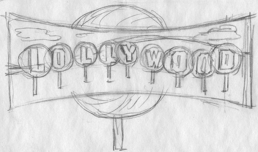
This was how I presented the idea. At this point I didn’t know how I was going to render any of this (especially those hills). but I felt inspiration would come to me:

Getting the go ahead was easy. The hard part was figuring out how to do it! Here is one of the early stages in Illustrator.

Then I had a brainstorm (or at least I thought so): I’d take a photo of the Hollywood sign, then I’d manipulate it in Photoshop making it really flat and graphic. I’d use only the portions of the photo that were the actual hillside under the sign. Why go to this extreme when I could probably take any hillside photo and make it work? I’m just a sucker for “the real thing”, I guess:

I thought this was working pretty well, so I put it into the art . . . and voila:

I had already been working on the lollipops—my thought was to make the letters kind of like large prehistoric insects caught in amber.
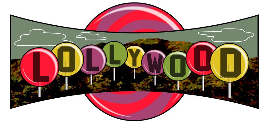
But with some further development, I still wasn’t thrilled. It didn’t seem colorful enough—in fact it was feeling downright gloomy.

This is one thing that I love about working digitally—you can almost design “on the fly”. If the colors aren’t working the way you want, just keep shifting things around until you get to where you want to be.
For a more detailed account of Lollywood, please visit my BLOG.
For a more detailed account of Lollywood, please visit my BLOG.

Award-Winning Typeface Designs for every taste from Alphabet Soup Type Founders


