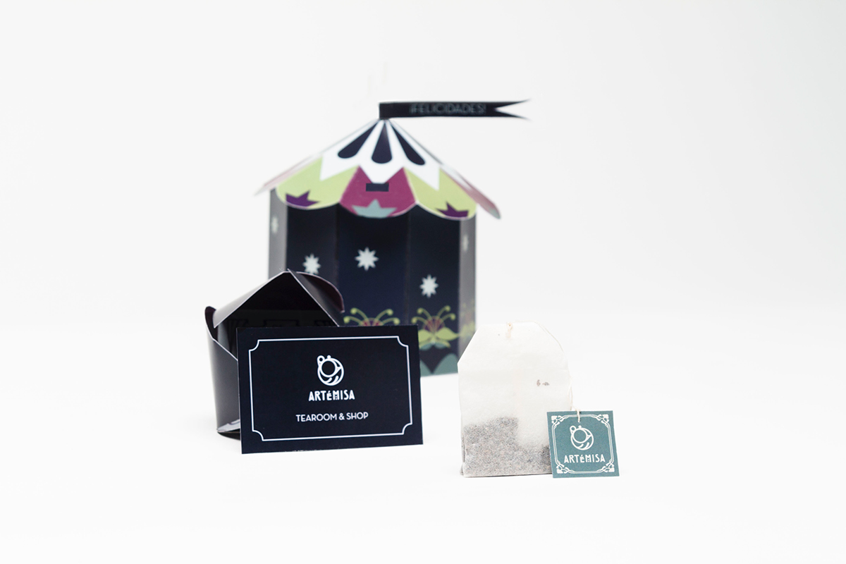
Artémisa
This projects’ aim was the creation and development of a graphic identity for a catering establishment. All the elements of this corporate set are born as the answer the demands of a name, a story and a series of graphic elements that could be present in an ordinary establishment, adapted to the style of our dream place. That’s how Artemisa is born, an art-nouveau style tearoom. Its name and its logo are inspired by a series of tea-related characteristics, and also by art and mystic beings.
In Greek mythology, Artemisa is the goddess of the moon and hunting, but her name also applies to a plant with which infusions are made. Besides that, in the very same word we find the letters “te”, that easily reminds us of the drink based on boiled leafs. Lastly, it’s interesting to mention that the name Artemisa contains the prefix art-, that we associate to the term art-nouveau.
The building of the brand is based on a series of choices, such as a typography inspired by the style of Charles R. Mackintosh (predecesor of the modernist style), a color palette extracted from samples of the Artemisa plant, an ornamentation characteristic of the art-nouveau aesthetic or a brandslogan that says “We want to serve you”.