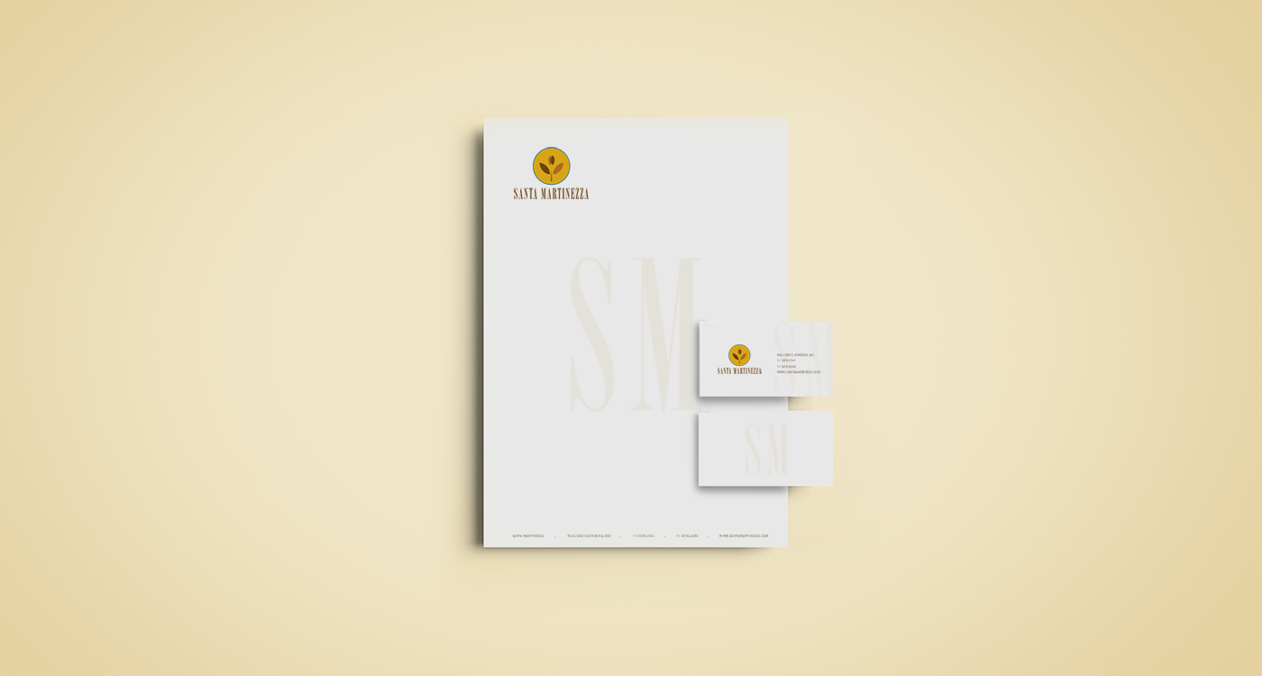
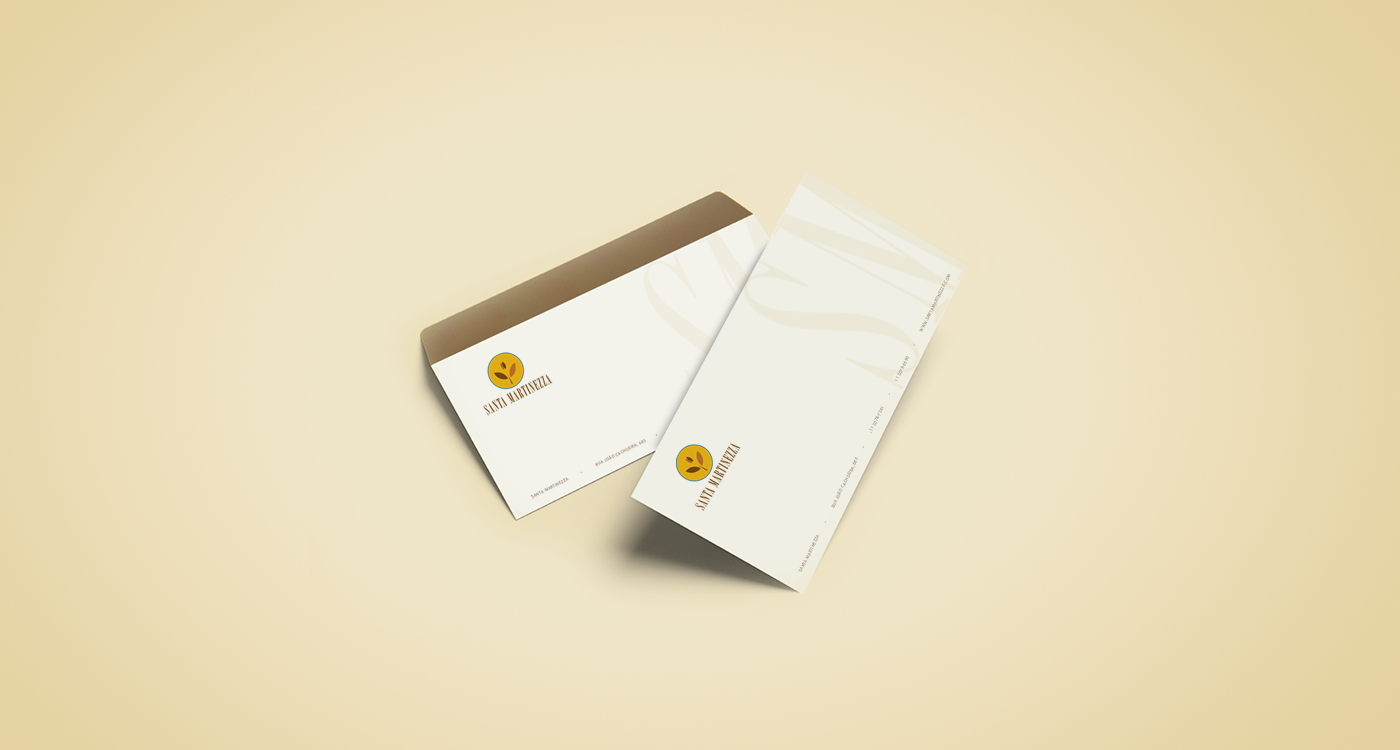
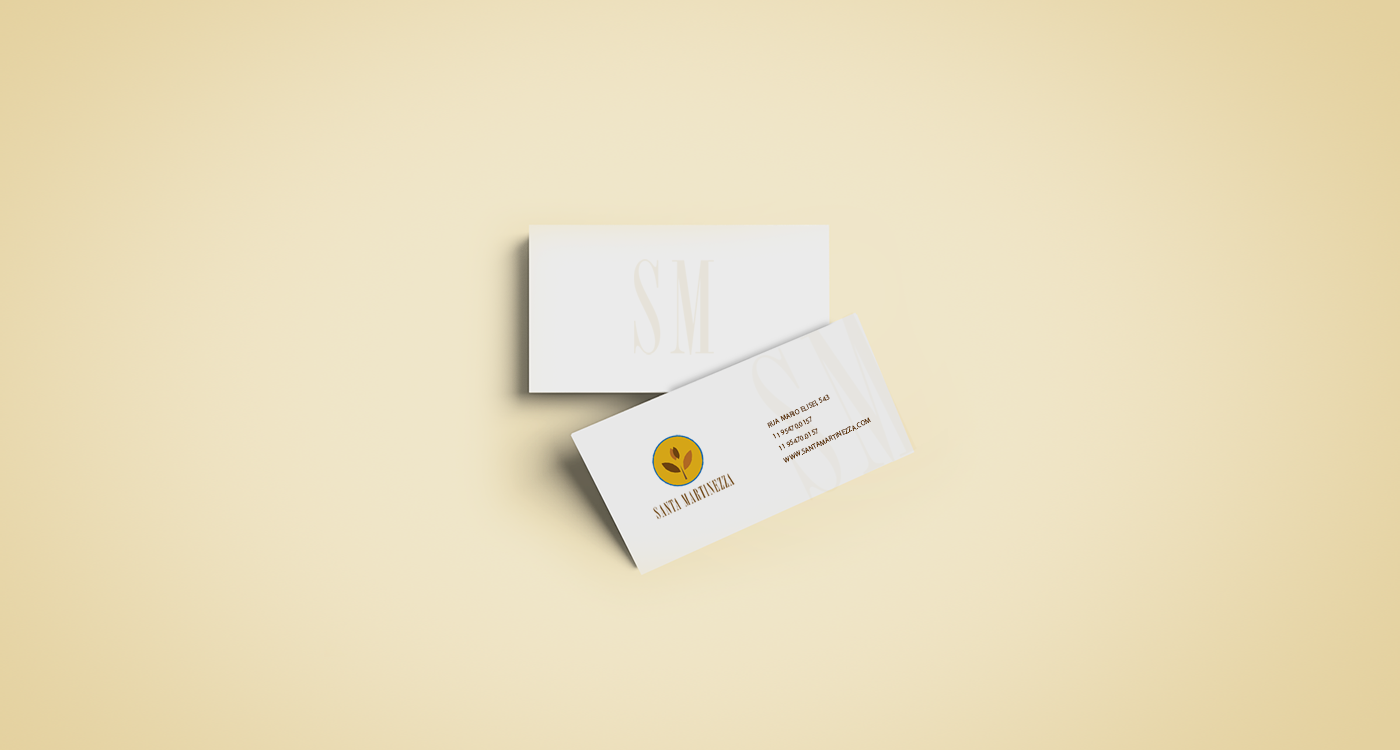
SANTA MARTINEZZA
The challenge of this project is to create a harmonious brand with elements of nature, involving the Holy Spirit without religions.
I have isolated the elements of the Holy Spirit and used the elements which are basically composed of the white dove and the olive branch.
In the create I stylized the two symbols of the Holy Spirit (dove + branch of olive tree) and applied the golden ratio in the structure, which made a lot of sense in this case. I was able to unite both a dove and olive branch in a logo, with elements of nature and the colors according to briefing. The final result was a brand with brightness, with elements of the sun, concept of divinity, positivism, security, serenity, etc.


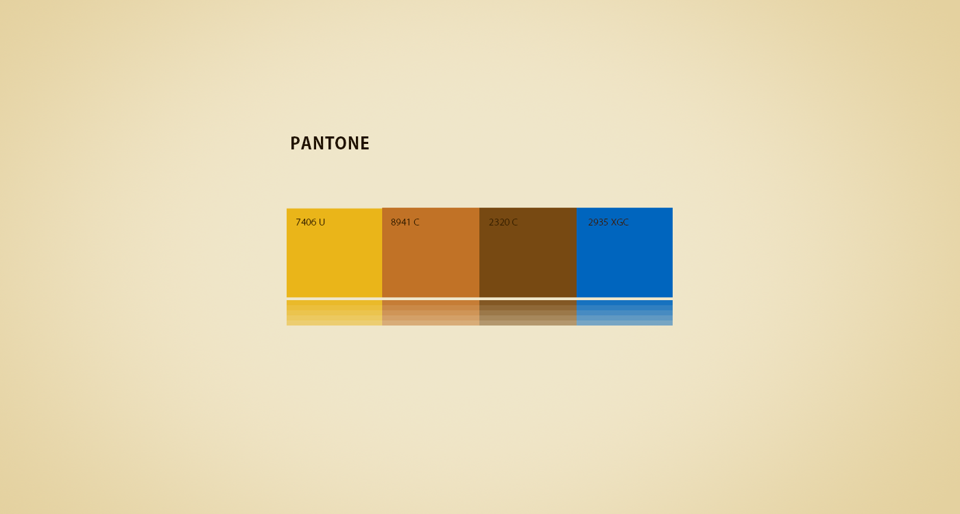
The following customer briefing colors:
PANTONE
7406 U = Yellow Tone: Color of the Sun, bright, symbol of divinity in some cultures.
8941 U = Brown / orange tone: Optimism, confidence, positivism.
2320 C = Brown tone: Solid, safe, durable, constant.
2935 XGC = Blue tone: Serenity, tranquility and good energies.
8941 U = Brown / orange tone: Optimism, confidence, positivism.
2320 C = Brown tone: Solid, safe, durable, constant.
2935 XGC = Blue tone: Serenity, tranquility and good energies.