


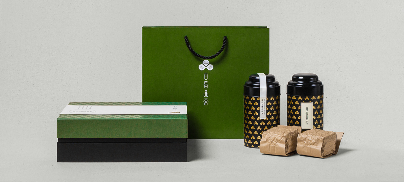
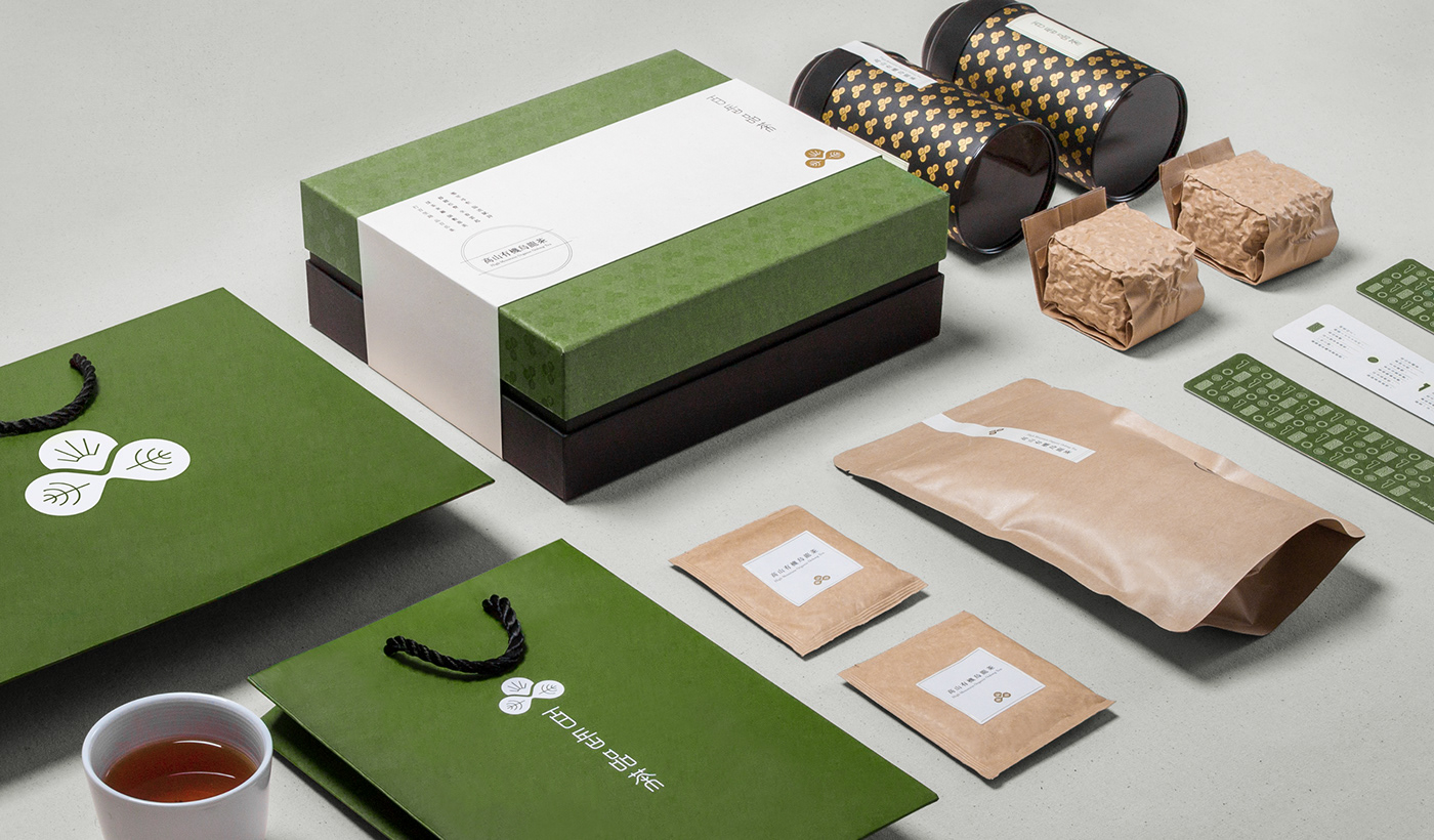
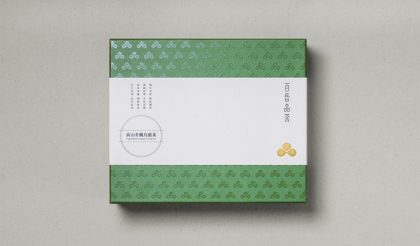
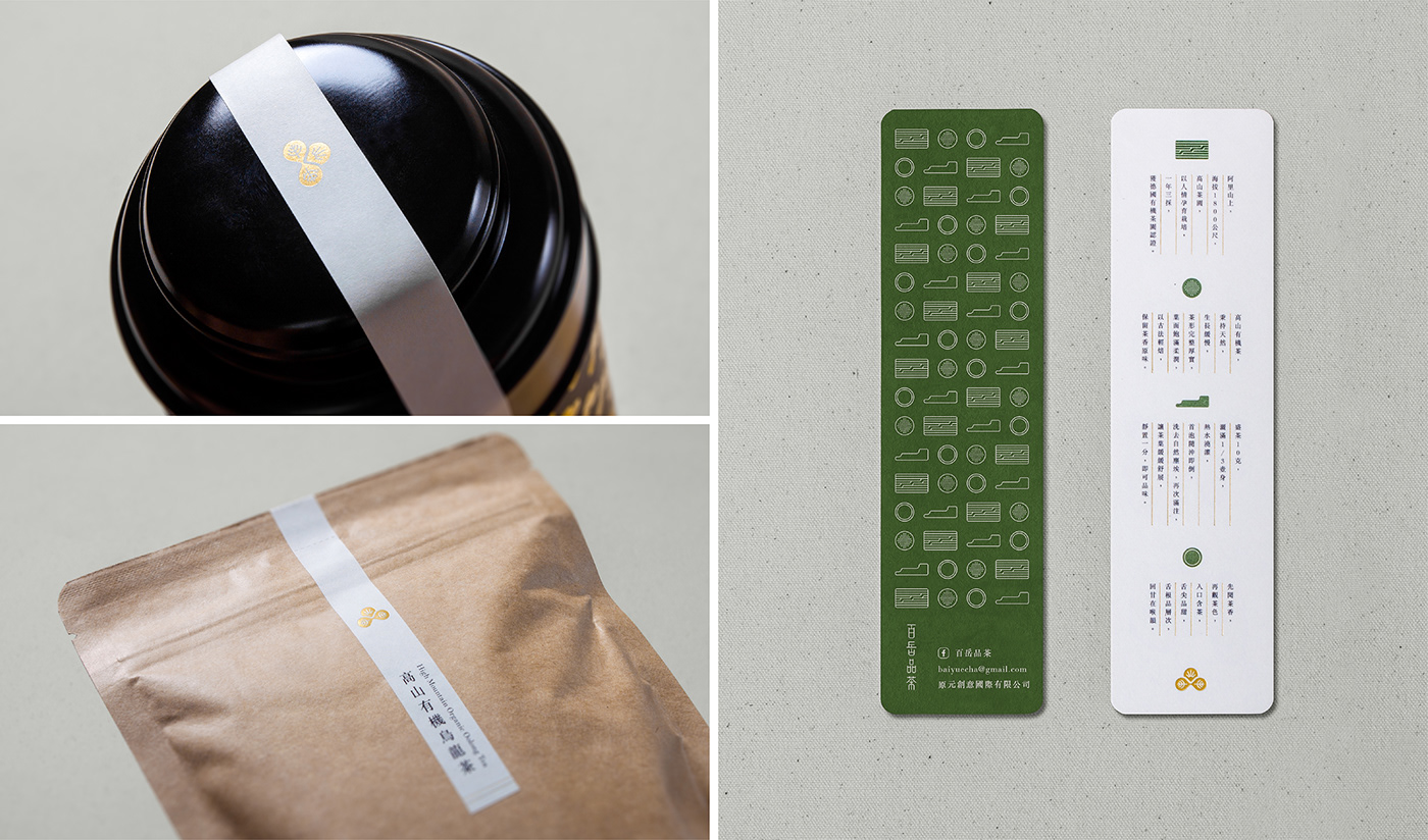
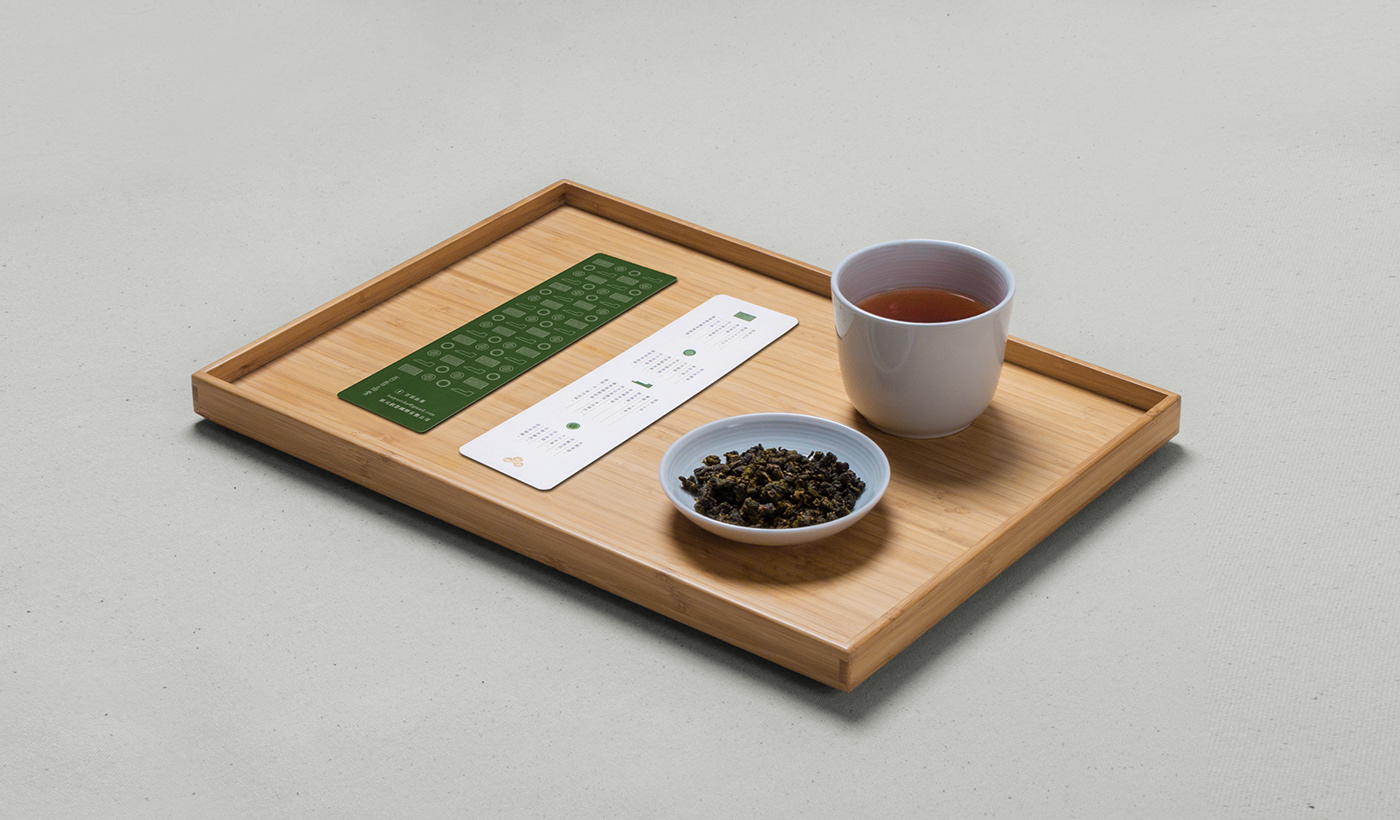
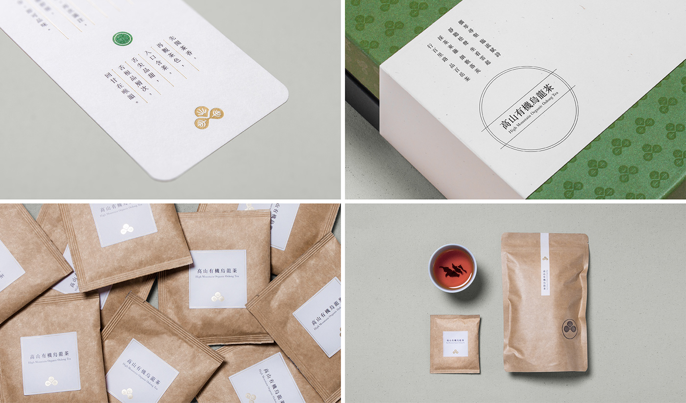
百岳品茶 BAIYUE TEA
「行百里路,品百岳茶。」
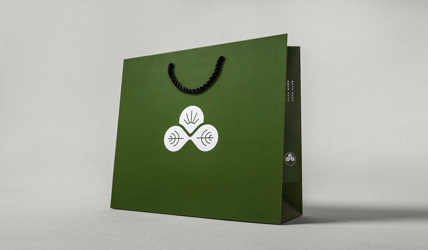
標誌取「品」字作為視覺結構,融入了旭日及茶葉元素,並以中央的山陵線勾勒出日出意象,
葉脈則暗喻兩只茶杯對飲情境,以此概念塑造品嚐百岳茶的視覺意境,也帶出百岳品茶以高山茶種為特色主打。
葉脈則暗喻兩只茶杯對飲情境,以此概念塑造品嚐百岳茶的視覺意境,也帶出百岳品茶以高山茶種為特色主打。
The logo is basically inspired and structured by Chinese character “PIN” (品) which means tasting.
BAIYUE TEA focus on producing hight quality high-mountain tea, the logo combines three key elements, Leafs, sun and mountain, to image the mood of being in the mountain and tasting the high-mountain tea.
BAIYUE TEA focus on producing hight quality high-mountain tea, the logo combines three key elements, Leafs, sun and mountain, to image the mood of being in the mountain and tasting the high-mountain tea.

Type: Branding
Year: 2017
Year: 2017
Design Agency: 不毛 nomo®creative
Creative Direction: Yu Chien Lin
Art Direction: Chi Tai Lin
Graphic Design: Chi Tai Lin / Yu Chien Lin / Wun Siang Huang
Project Manager: Chi Tai Lin
Client: BAIYUE TEA
Client: BAIYUE TEA
Copyright © 2017 nomo®creative. All rights reserved.


