BOLD MEN®
Strong, brave, BOLD. These are the characteristics that describe our customers. We were to create the concept and packaging of fully handcrafted beard care products line.
In the base of the concept laid the naming that we got immediately after the whole idea and the products were presented to us with passion and strong love by the brand owners. Name “Bold” also did dictated massive, brutal, weighty style. The main colors are classy and trendy black and white which are complemented with other bright colors that differentiate the product types and flavors from each other.
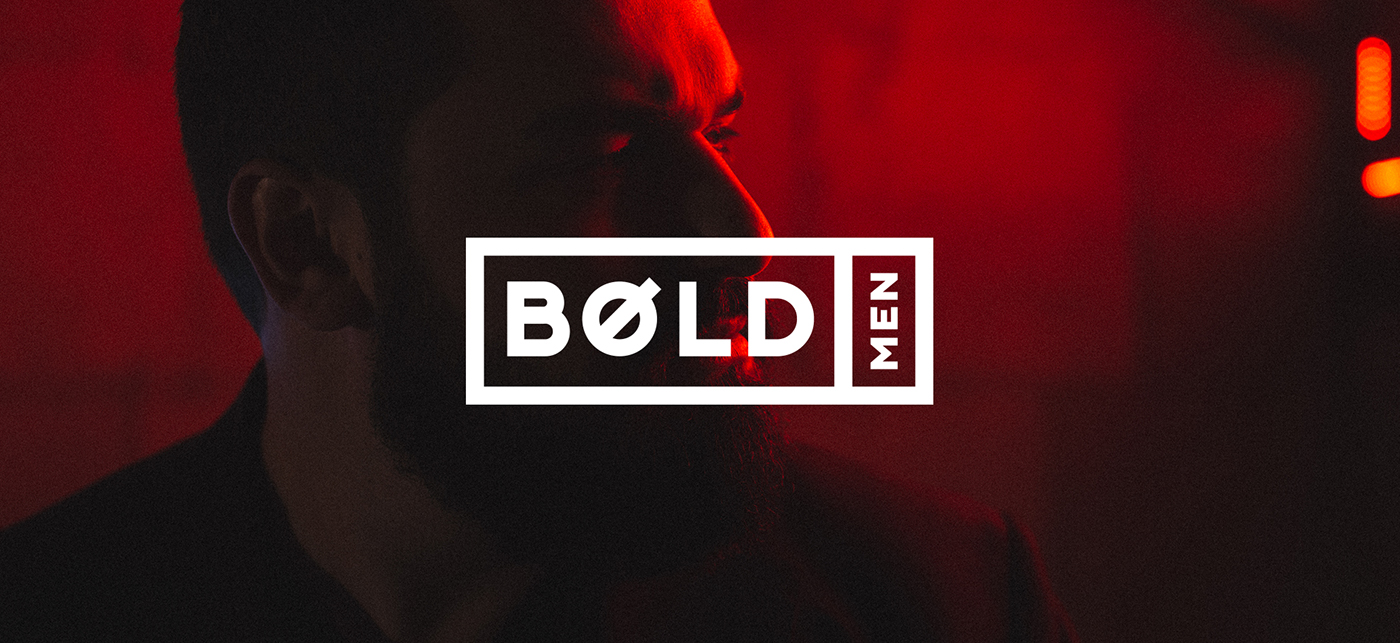
The logo every real man would appreciate is the writing “Bold” that has the symbol of masculinity instead of letter “O”. So we took “Bold” and put in the frame which bind all the elements and finalized the image. We made the second element of the logo, word “men”, smaller and moved it to the second framed cell to keep bold accent on “BOLD”.


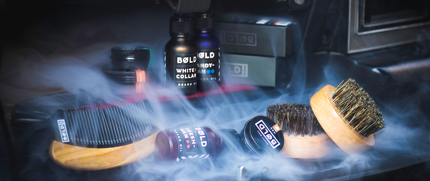
As you could already notice the core design is reflected in the packaging of the products such like the beard oils, balms, shampoos, soaps and special combs for beard.
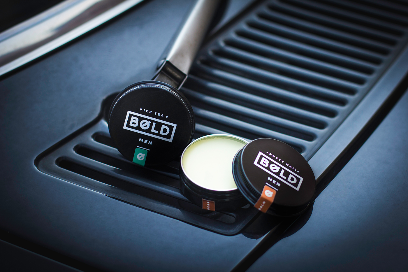


In case of beard balms, we placed and printed the logo in the very center of the circle little metallic can. Every balm has different unique handcrafted scent that pushed us to create awesomely different names and colors that hint the bearded guy or his girlfriend which to choose to find perfect match for his personality.
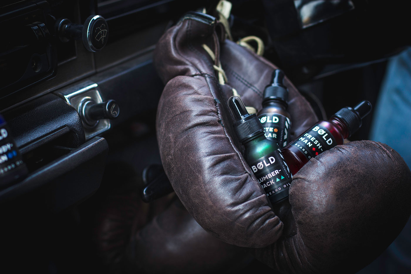


Every little bottle of beard oil is made of colored glass so that the dark label we designed creates contrast and looks awesomely emphasized. Besides the color spot every scent has its unique geometrically shaped symbol that we tied with the name and aroma.
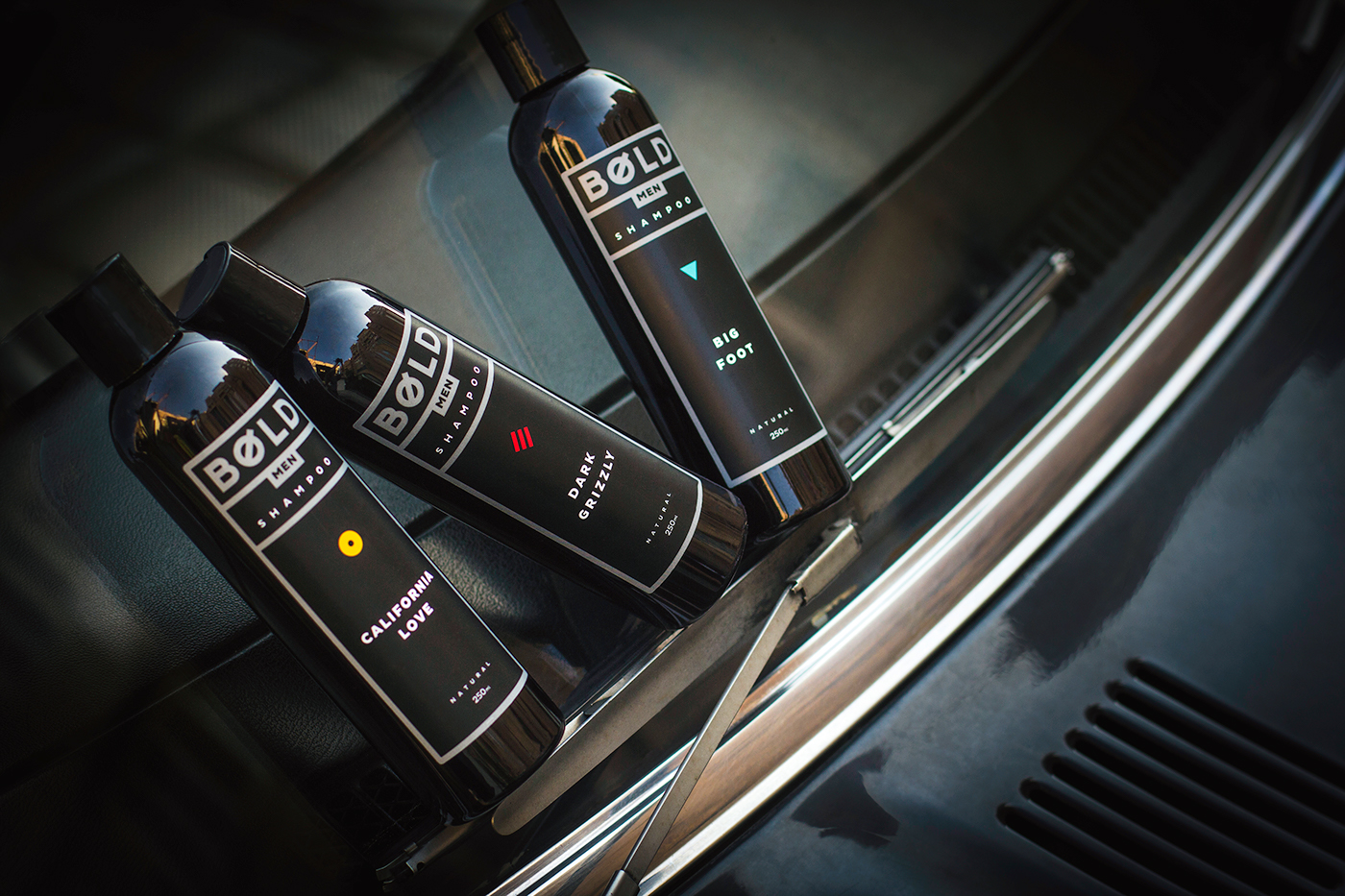


In case of shampoo, conditioner and gel scrub that are combined in a line of products, we created a line naming and symbol for each scent. The symbols are different in shape and color to truly match each of them.
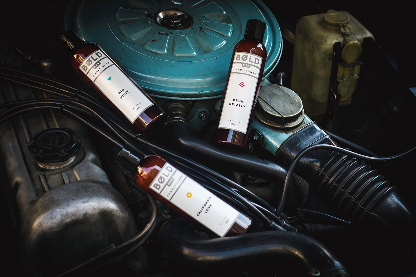


The labels of three products of every line differs from each other with the background. Conditioner is totally white, shampoo is totally black and the gel scrub is half black and half white not to mix them up while having shower you know.
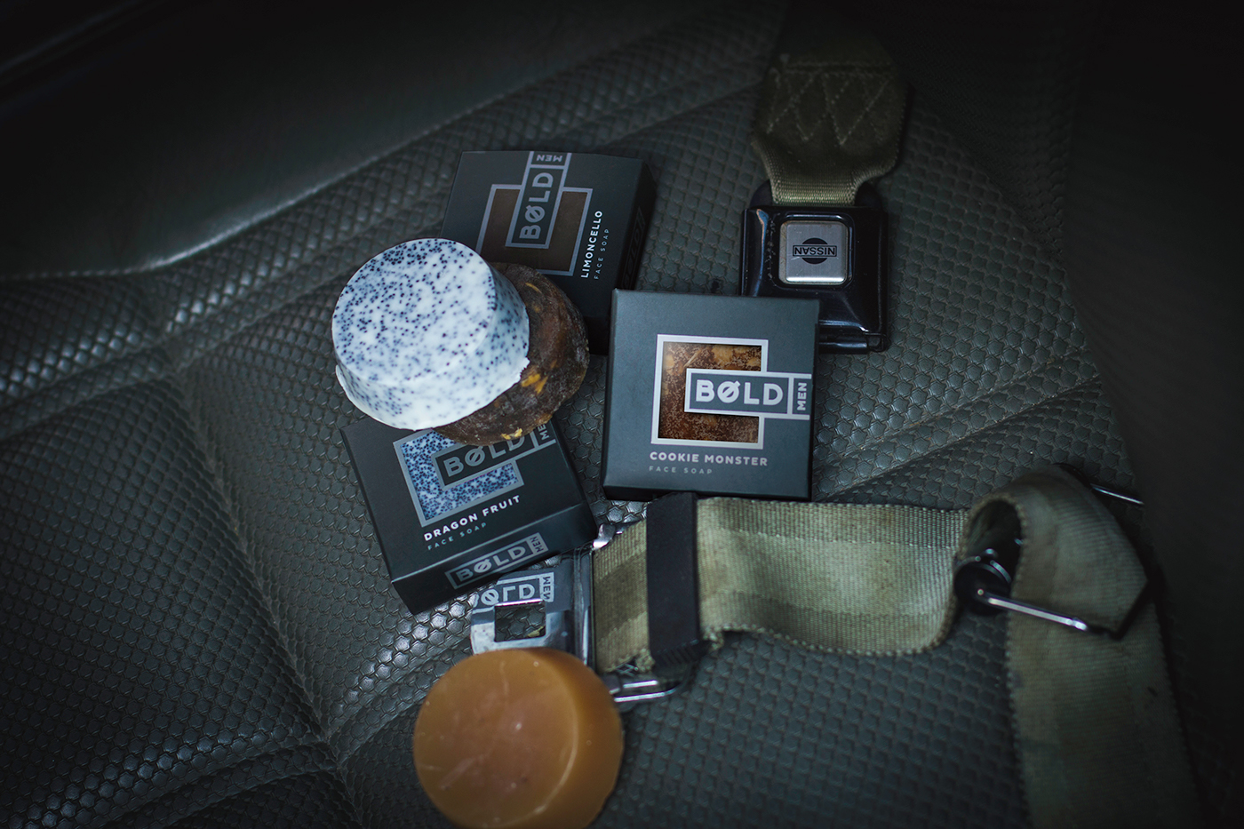


And the last but not the least is the packaging of soaps for face and beard. Here the main requirement was to show the product to the customer before he/she buys it. That is why we made a window in the soap box and applied natural soap textures like design elements. The inner side of the box is covered with brand pattern which tells about the status and seriousness of this masculine product.
