May77
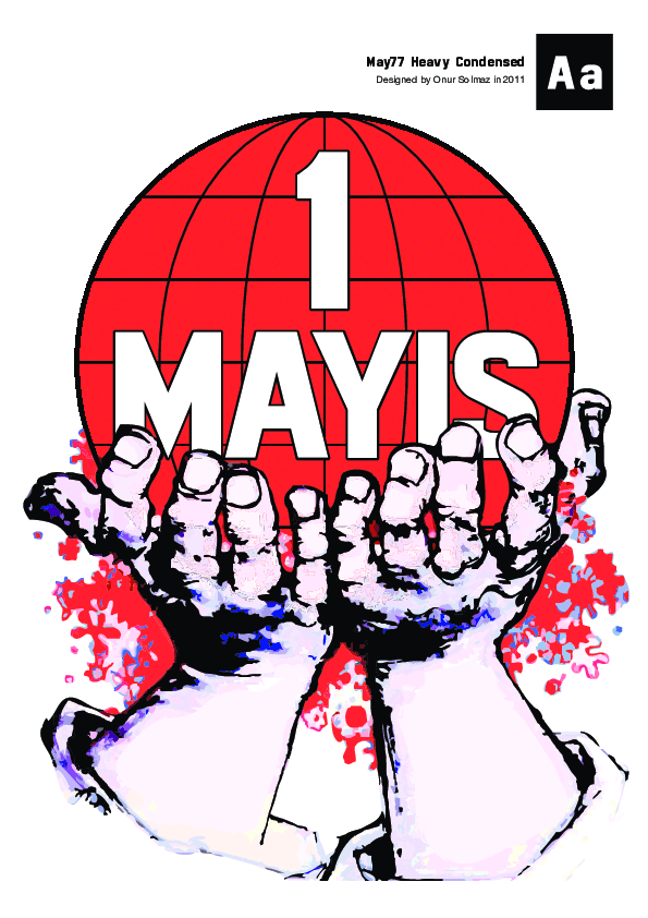
Back in 2011, I had an interest in blocky grotesque typefaces that were from 70s. Inspired by the artwork from demonstrations in Turkey in the pre-1980 era, I developed a single-weight typeface to be used for display in posters.
It was my first attempt at creating a balanced typeface. Despite the many errors that an experienced eye can detect, I learned a lot from this project, about design and about the technology used in creating fonts. I used Adobe Illustrator to draw the letters and Fontlab to create the font file.

Below is a re-rendering of a famous poster (which I had my main inspiration), with the letters that I drew.

Showcase of the first prototype, before the addition of lowercase letters