


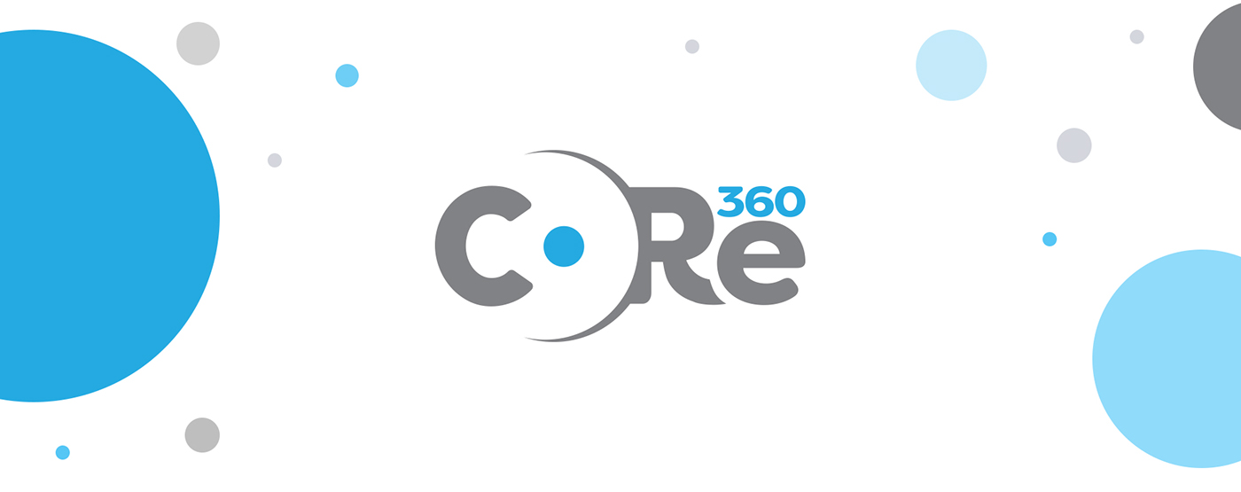
THE CHALLENGE
Core360 software is a modular approach to an all-encompassing solution for municipalities and counties built by a company called MSI. The software programs under core 360 include Parking Enforcement, Local Ordinance, Municipal Sticker, Property Management, Building Code, and Alarm Management. My job was to create a logo around the name core 360 that included a lowercase "e" while keeping the values of MSI in mind.

THE PROCESS
After understanding the challenge of creating a logo around the name core 360 with a lowercase "e", I focused on what the word Core meant. A foundation, root, origin, the heart and inner most essential part of anything. I took those words, and started pairing them with the values of MSI to make sure the two brands identities and values aligned.
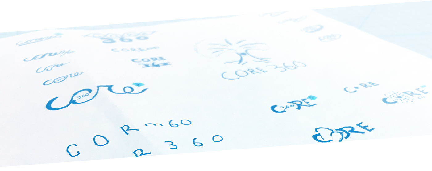
THE VERSIONS
After sketching some ideas out, it was time to go digital and watch the logo start to shape itself. I tried versions with a upper and lowercase "e" and versions with a backwards 3 that played the roll of a 3 for some word play. After deciding I like how the logo operated as a word mark, I dove deeper into customizing the typography by adjusting the back of the "R" to play with the negative space of the "o". Because the client wanted the logo to have a lowercase "e", I played around with the idea of having the "360" sitting on top of the "e" itself. This started to shape the logo into what it is now.

THE SOLUTION
A logo that plays with negative space by showing off the meaning and word "core" while keeping the lowercase "e" and fitting the numbers 360. This logo works well on with different color schemes and reads well at scale of one inch small because of how short the logo is and the bold typography used.


