Redesigning the Arab Canadian Law Association's Website
I was approached by an Executive member of the Association to refresh the visuals and suggest any content or UX changes. ACLA's old website had been built in the early 2000s when people still used tables to build the web 😱. They wanted the new site to reflect a new, younger Association that was more active than the last.
The Audience
After some research, I narrowed down ACLA's primary website audience as lawyers who want to learn more about the association, join ACLA, or attend events/read publications. The secondary audience include people looking for referrals to lawyers in the Association. I wanted to make sure they could get their needs met on the website without having to search very deeply in the site.
A Content Audit
The content audit helped us get rid of unnecessary pages and prioritize information to create a solid content hierarchy. In the audit, I realized that the following areas were not being highlighted, but should be, to drive engagement with ACLA:
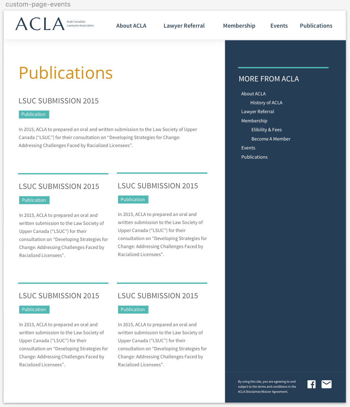
Dynamic-ish Content
The only information that changed regularly on the site were notices about the events held and publications issued by the Association. I decided to highlight this on the homepage to keep it from getting stale, to meet primary user needs, and to help ACLA promote their events.
Featuring the Executive
The executive team is the centre of this Association and coordinates all their activities. Yet, they were nowhere to be found on the old site. I suggested putting them on the homepage with links to their LinkedIn profiles to make them easy to network with.
Making Referrals
It was difficult to find a list of all the lawyers associated with ACLA, and their specialties. Since non-member queries to ACLA typically involve requests for referrals, making this front and centre meant giving users information they were seeking without having to send off an email. I suggested cleaning up this previously outdated list and making it publicly available on an easily editable google spreadsheet, which could be linked to via the homepage.


The Main Navigation
Because the website was fairly small, after the content audit I could pull together a main navigation that included all the major areas linked to on every section of the homepage:

Colours & Styles
I choose web-friendly Google fonts for this project: Marcellus for the main title, and Source Sans Pro for other headers and subtitles. Marcellus is a flared serif which felt professional but also contemporary, and Source Sans Pro is a neutral sans serif that allows users to focus on the content instead of the typeface.
For the colours, I was mindful that Arabs are a diverse group of people, and to stay away from religious colour choices such as green (associated with Muslims). I instead went with a Turkish-inspired classic royal blue and mustard scheme, with teal as a highlight for tags, dividers, and the menu dropdown. Buttons varied between royal blue or ghost (for secondary buttons) and mustard (for the main button), depending on the background. For consistency, they all had a soft 3pt radius, and white text.


The Header
To give some visual interest I wanted to integrate an image into the header. There were no high-resolution or interesting shots of ACLA events or members, so I decided to go with a vaguely Arab-themed vector pattern. I was inspired by Turkish tiles and Islamic geometric patterns, such as these:
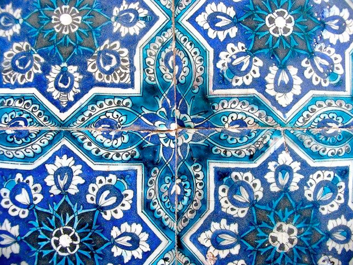


I eventually settled on an ambiguous pattern that included more flowery elements and didn't look too religiously-based, and edited to match the colour scheme.
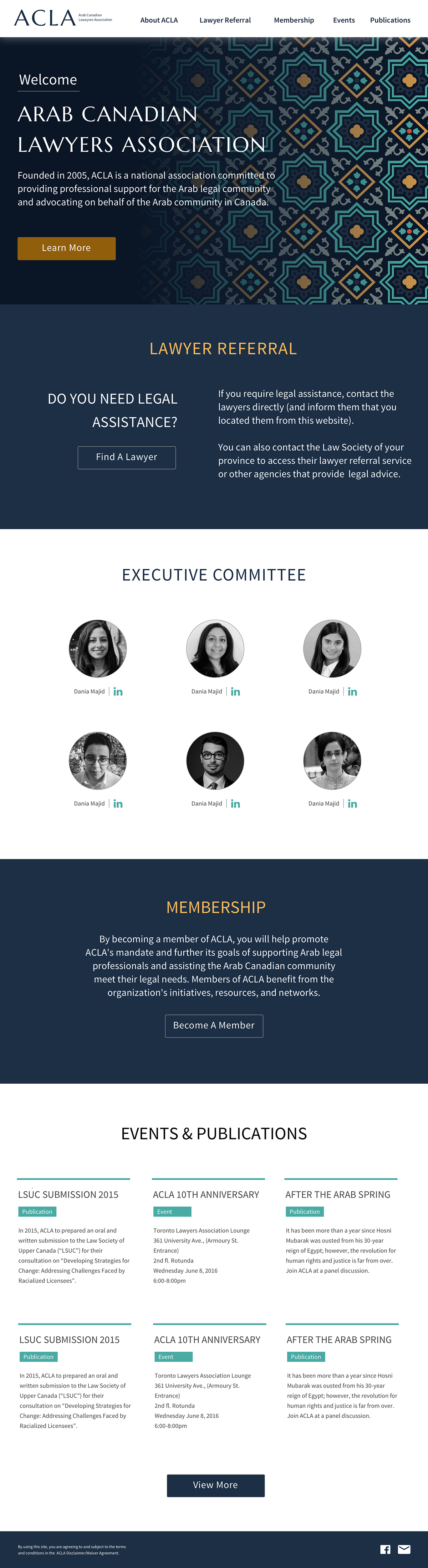
The redesigned ACLA homepage, integrating all of the design decisions above.

