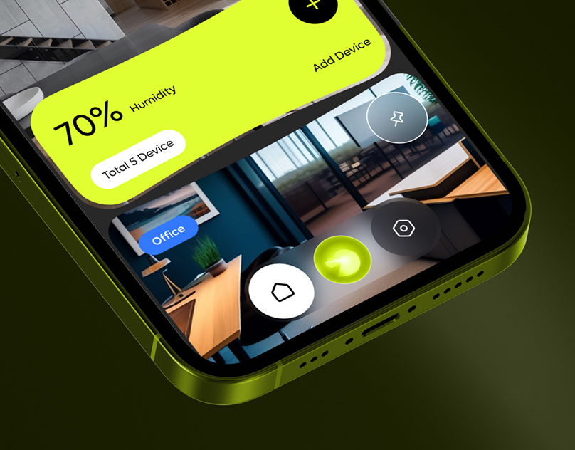
This is one of my favorite project using the Fluent Design as a base and re-redesign new version, I have tried to use the simplest way and color with this powerful tool that we use everyday.
THIS PRODUCT DON'T FOLLOW THE REAL, IT HAS BEEN CREATED TO EXPLORE PERSONAL PERSPECTIVE AND CREATIVITY IDEAS. IT'S A SELF-INITIATED AND THE THINKING BEHIND IT.
The concept:
Creating an engaging and immersive experience, a task commonly done through the flexibility using Fluent Design
The user:
Microsoft Outlook has the multi-million users that use the email to work, school or personal following to have substantial reach and easy way to communicate with other people– but the problem with Outlook (and nearly any other platform) is engagement. Multi-menus all the time, this would be an uphill battle for eyes sometimes is very confusing.


The solution:
I am of the firm belief that a UX / UI professional is responsible for understanding and maintaining the relationship between a brand and its users. In this particular case, the immersion started the moment a user read and understand the hierarchy and different sections along the app also maintain the principal structure and re-design with Fluent Design


I use a layout of 3 columns also giving context to every single section


The new empy canvas menu more simpliest posible on side

This is an idea of the canvas with the secundary menu ready to display your selection
The Result:
I think the largest victory for me was the lack of any discussion over the UI of the “choose your own adventure”. The focus should and always be on the experience, which in this case was the user being brought into immersive experience in a simplest way. And, of course, in my humble opinion, the best UI is invisible.

After numerous iterations of the visual designs I have tried to unify and sync the app when you open Outlook.
Microsoft Outlook - Final Product Design