


Access to the website: www.cupfit.de
CHALLENGE
The challenge was to design a visual identity for a product startup. It should include a logo, stationery, and the most important a website.
CONCEPTUAL
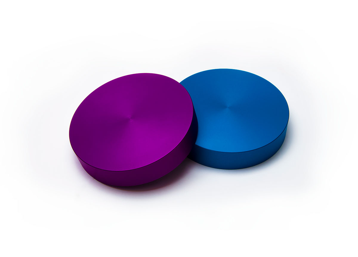
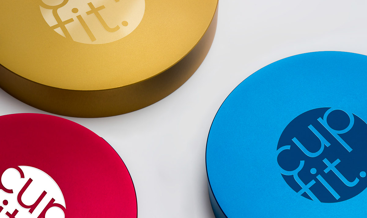
The product is a round and colorful shaped help for you to cover any to-go cup successfully and without any problems in only three steps.
1. you take the plastic cover and put it inside the cupfit.
2. you put everything on top of your to-go cup.
3. take the cupfit away and the plastic cover fits perfectly on the cup.
The challenge was to design a visual identity for a product startup. It should include a logo, stationery, and the most important a website.
CONCEPTUAL
The product is a round and colorful shaped help for you to cover any to-go cup successfully and without any problems in only three steps.
1. you take the plastic cover and put it inside the cupfit.
2. you put everything on top of your to-go cup.
3. take the cupfit away and the plastic cover fits perfectly on the cup.
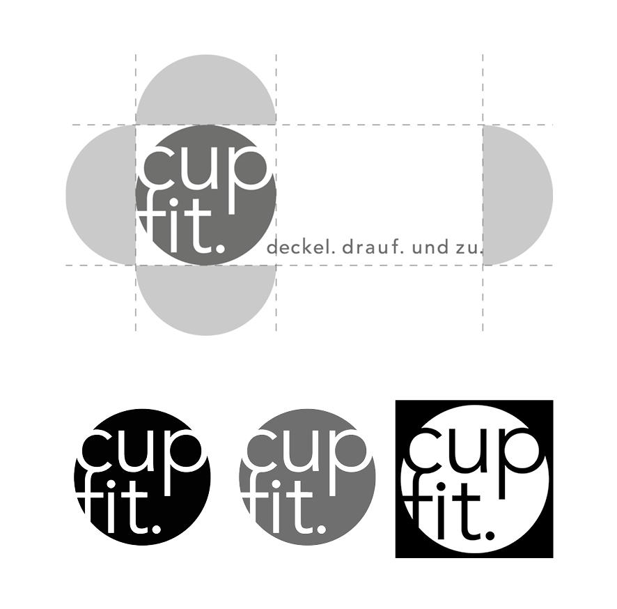
The logo.
The logo is definitely inspired by the products round shape as well as by its simple handling. Therefore, the typography is obviously without serifs and has particularly rounded hallmarks. Everything is written in small caps to engage the actual doing without any problems. To support the feeling of a fit the name cupfit fits inside the circle and additionally, the c and f are connected nicely.
The logo is definitely inspired by the products round shape as well as by its simple handling. Therefore, the typography is obviously without serifs and has particularly rounded hallmarks. Everything is written in small caps to engage the actual doing without any problems. To support the feeling of a fit the name cupfit fits inside the circle and additionally, the c and f are connected nicely.
The website.
To achieve a fresh and modern look the website is clearly structured and supported by high-quality photographies of the cupfit.
The content is reduced to a minimum and easy to access and understand.
(Note: the text is German)
To achieve a fresh and modern look the website is clearly structured and supported by high-quality photographies of the cupfit.
The content is reduced to a minimum and easy to access and understand.
(Note: the text is German)
I want to thank all people who helped me with this project. Without you, it would have been impossible.


