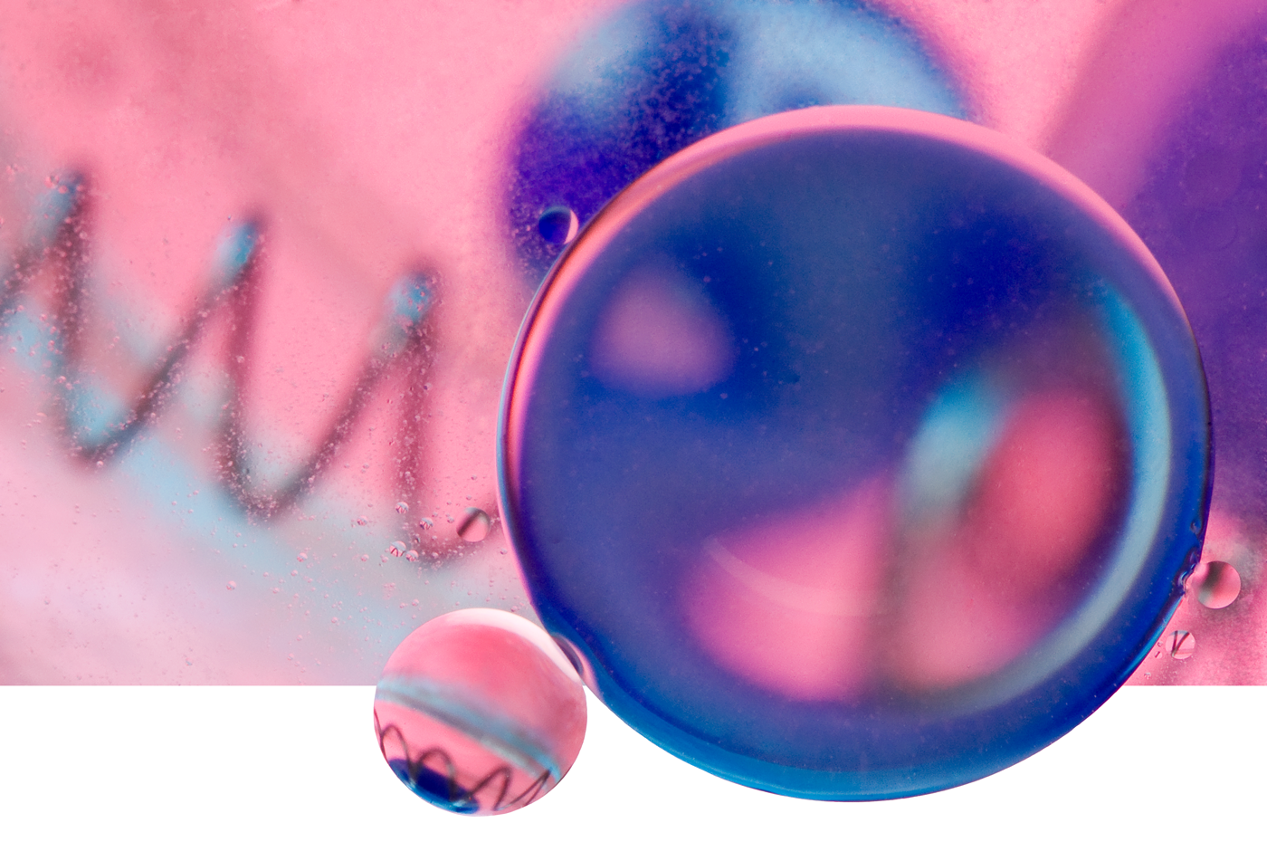
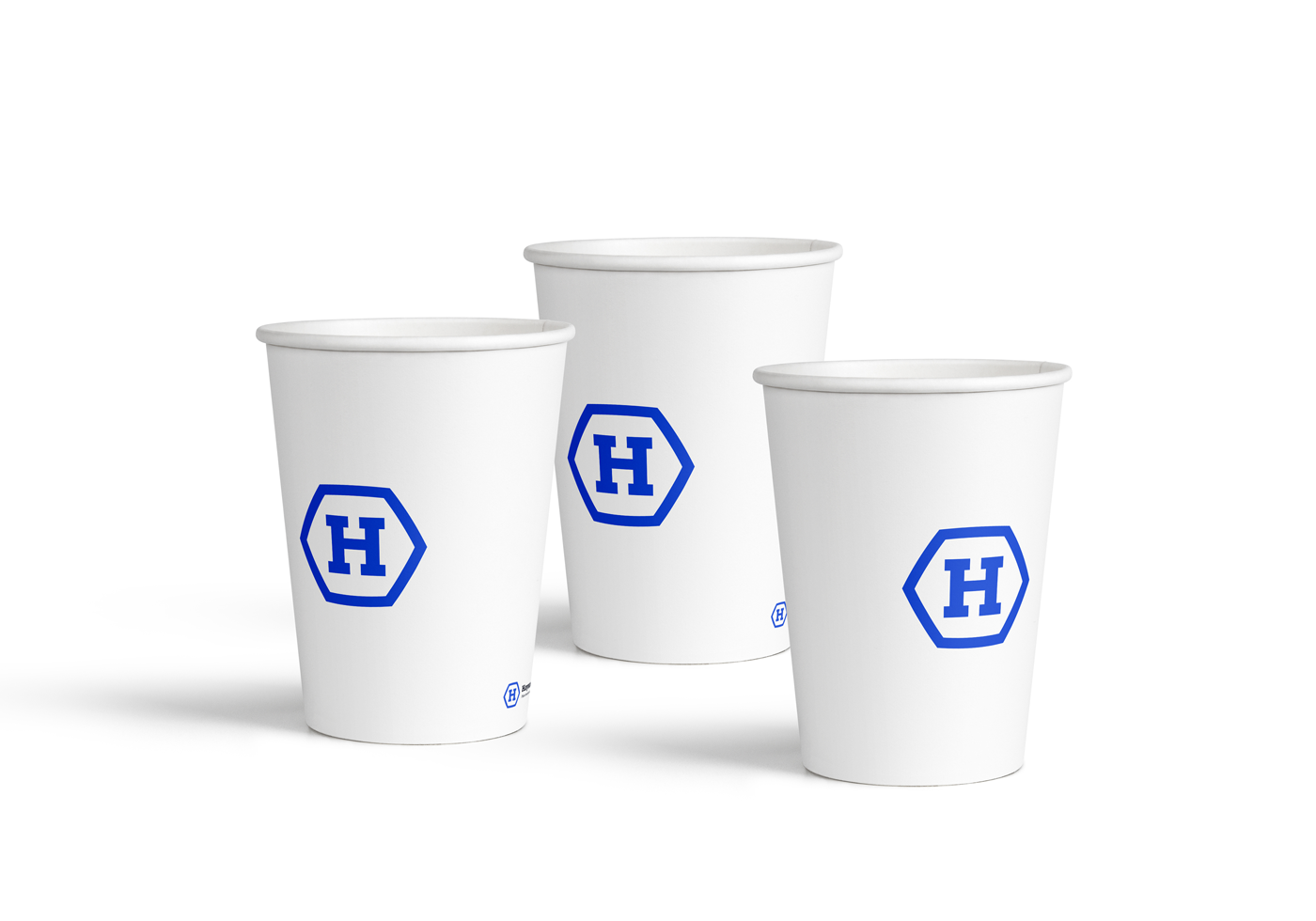
It is an educational center for kids of any age. Science is attractive because it's a different world. To look at which can be using a macro lens. Identity is divided into parts: a minimalist white-blue (for personnel) and scientific macro-world (for clients).
Task
Children’s educational center for those who want to find a entertaining way to study science in-depth. It presents courses on biology, chemistry, astronomy, geology and other scientific subjects that may not be in the school curriculum.
Design Komunikate faced the task of developing visual identity and guidelines to use the corporate identity of the scientific educational center.
Solution
The main idea was the general curiosity in what remains invisible to us. In science, any process that can be view through microscope or which nature is unclear, is of interest even for those who are skeptical towards it. To put it simply, this is interesting to everyone.
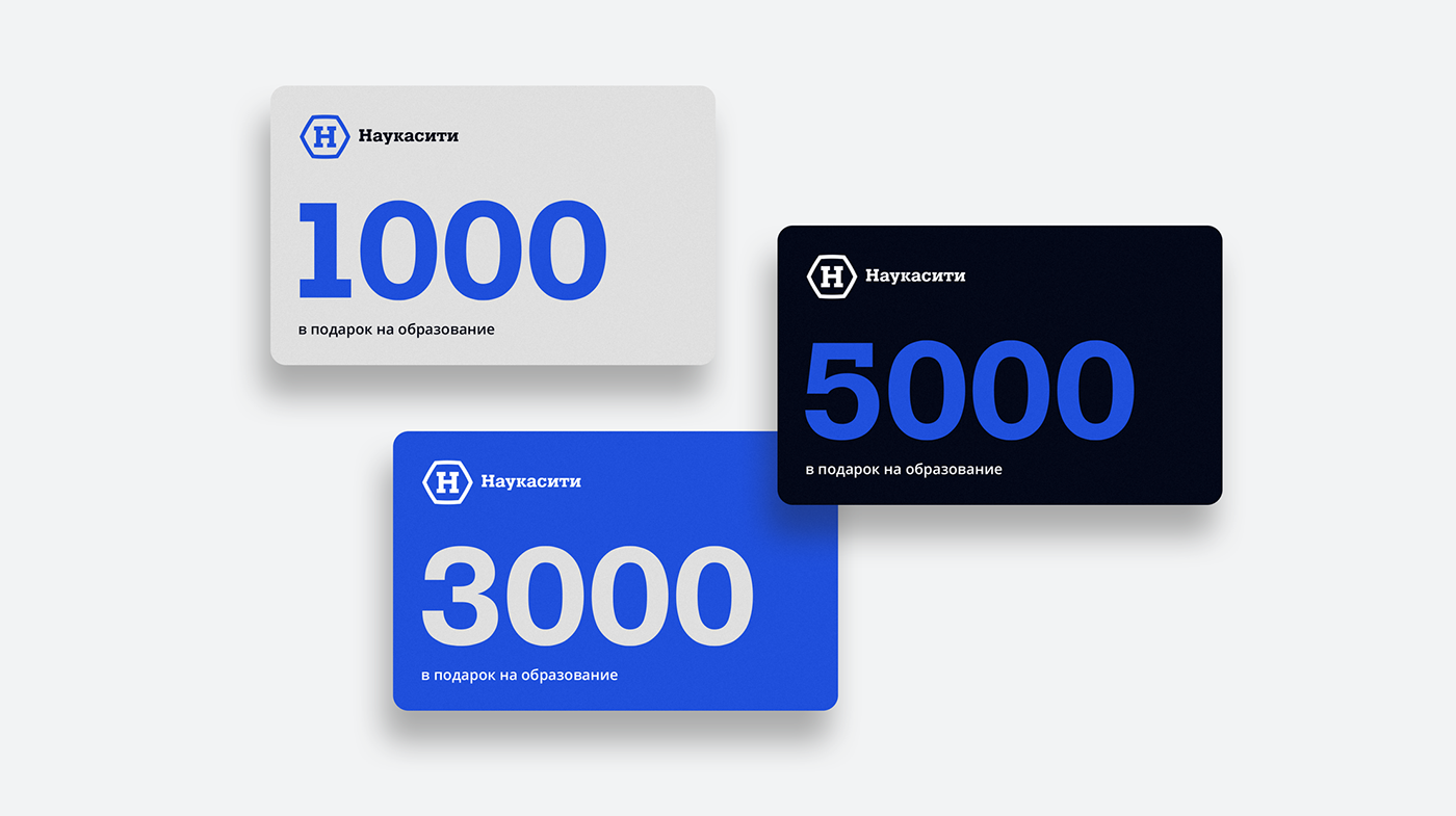
Visual communication aimed at customers of the educational center and includes illustrations of the inner world of science, which is shown through “macro-lens” (cells of organisms, bacteria, 3D spirals of chemical chains, etc.). Sterile clean shades of colours in the business part of the corporate identity, create an atmosphere a transparent organisation where real scientists work.




Thanks for watching! Put like!
Write to us — mail@dkcd.ru
Follow us on Instagram — designkomunikate
Follow us on Instagram — designkomunikate
Inspiration telegram channel — designkomunikate
© Design Komunikate. Studio
