


Brand and Brand Identity sigma dynamics
Sigma dynamics is a new engineering consultancy from Austria. Through simulation they provide practicable answers for the design and production process for complex questions. Their work save money and time in any stage of the development of a product and the clients also have less quality issues.
The start
During the design process of a product companies make dozens or hundreds of prototypes which cost a lot of money and time and can be used only once. Simulation as an alternative was not accepted very much maybe the engineering consultancies have a more scientific approach and deliver answers which are not very practicable. The client has a deep knowledge in automation and simulation so he convinced some of his clients to give simulation a chance. The demand increased and now he founded his own company providing practicable answer for his clients.
Research
Many of the competitors are focused on what they do, what they can but not on the benefit for the client. Their visual identity is very technical, cold with a lot of text. The images they are using are these kind of photoshop compositions which should look technical and futuristic but in general fail. Mostly they rely on a grown network and word of mouth.
Result
I was commissioned to build the brand and brand identity. As a result of the of the research the client and I decided to build a brand identity with a strong, modern and unique visual language. My approach was to build the visual identity without any of these ugly pictures and instead using a very graphical language. I developed a grid which lies behind everything and defines the shapes.
For this grid I was searching for the common ground of all simulations and I found it in the coordinate system. From there I defined an element which builds the grid which defines width and height and an angle at 35°.
Logo sigma dynamics with slogan

Typography: Canaro Book and Bold by René Bieder

Color Climate
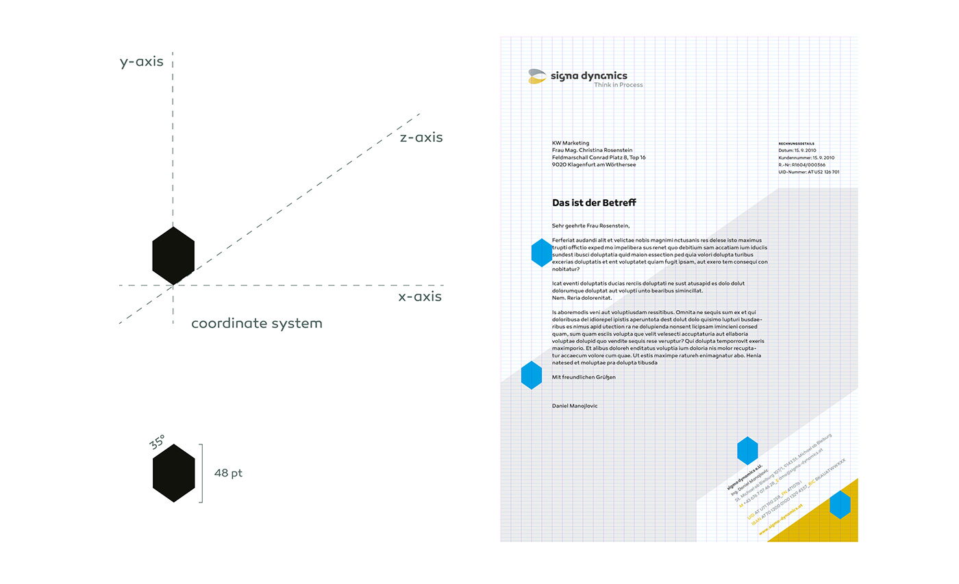
Grid element and grid system
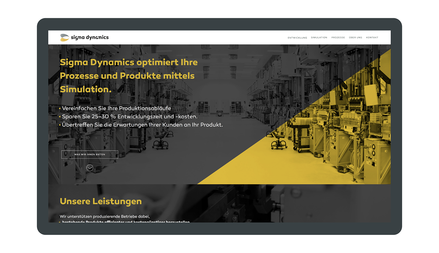
Website Fullscreen
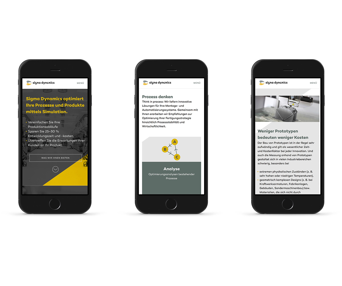
Responsive Design
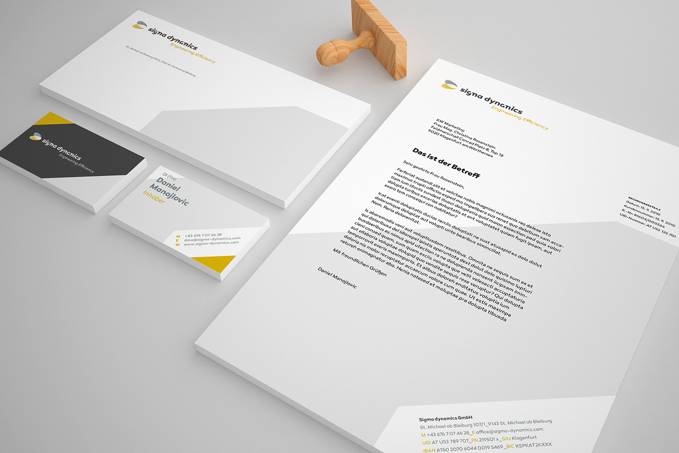
Stationary
Concept: Andreas Dobos
Art Direction: Andreas Dobos
Project Management: Andreas Dobos
Copy : Mag. Christian Seher
You can book me for freelance work.


