

‘Nothing says globalization like a noodle product made in Canada from imported Asian noodles and locally sourced organic ingredients.’
With a classic colour scheme made out of ‘Japanese Lacquer Red’, black ink and reverse white knockouts the Oolong Noodle brand was born.
The ‘Fusion’ concept for the noodle product is a reference to the fact that the asian style Ramen noodles are prepared with a western herb soup stock. A more subtle ‘Fusion’ reference comes from the fact that the manufactured noodles are dried in the sun rather than pre-fried like typical Ramen products.


The layout and wraparound design for this unique 4-sided bowl was optimized to showcase the bilingual labelling requirements as well as the custom infographic icons that explain the cooking instructions and product features.


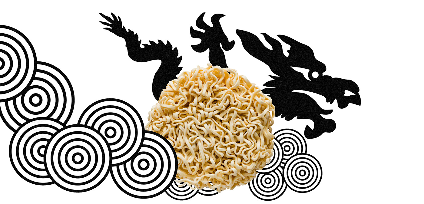
‘Oolong’ translated from Chinese means ‘Black Dragon’. In Asian mythology dragons are mystical and heavenly creatures. The Oolong Noodle emblem shows the ‘Black Dragon’ with an extended claw as it does a mighty front crawl through a sea of celestial noodles. Tireless and insatiable in it’s consumption of Ramen noodles!


