

Film & Forge
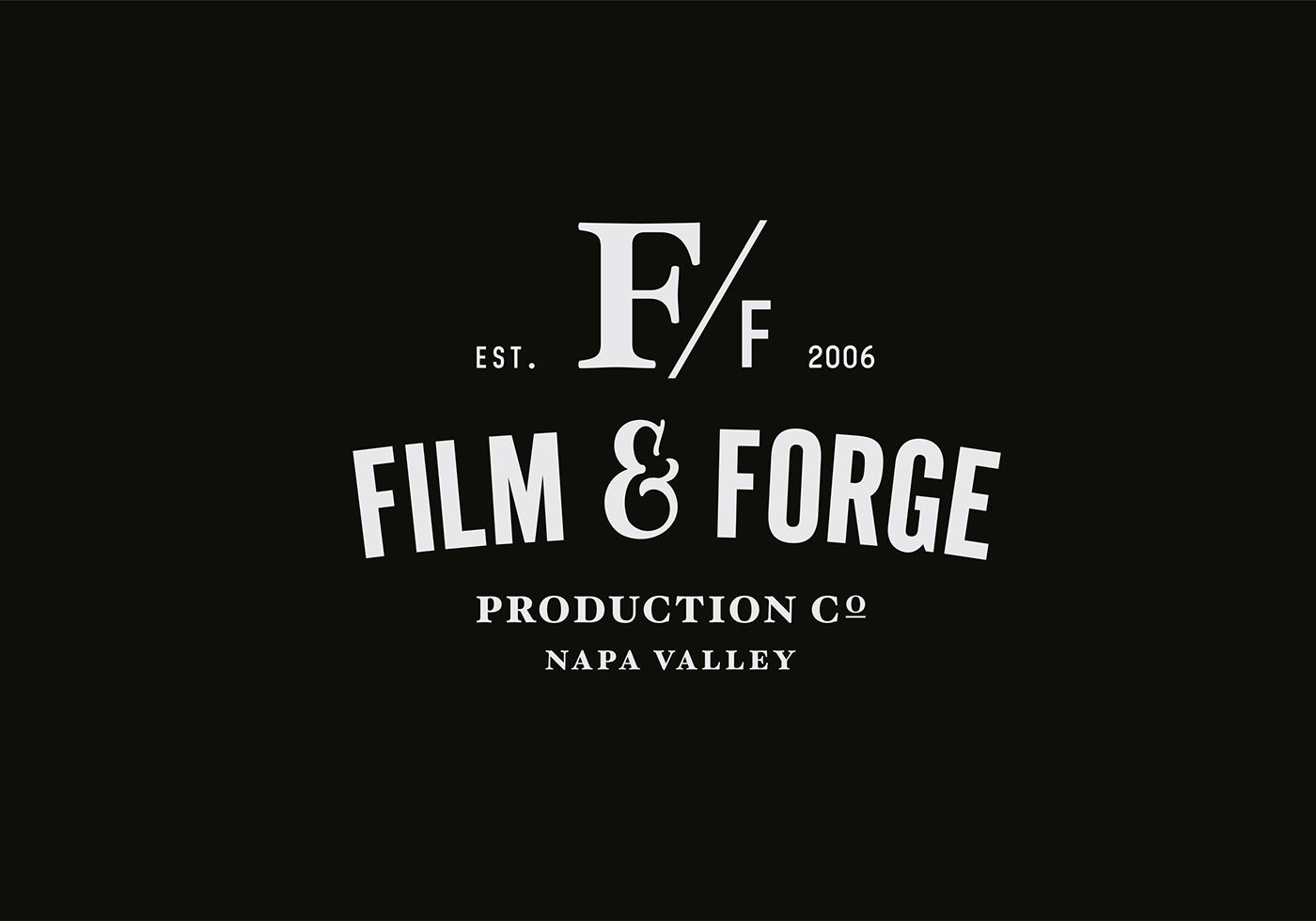
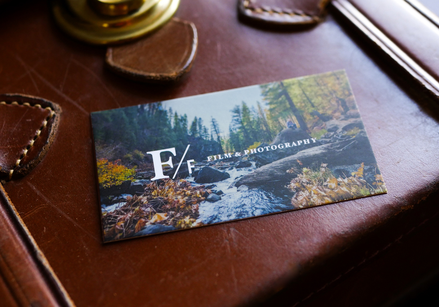
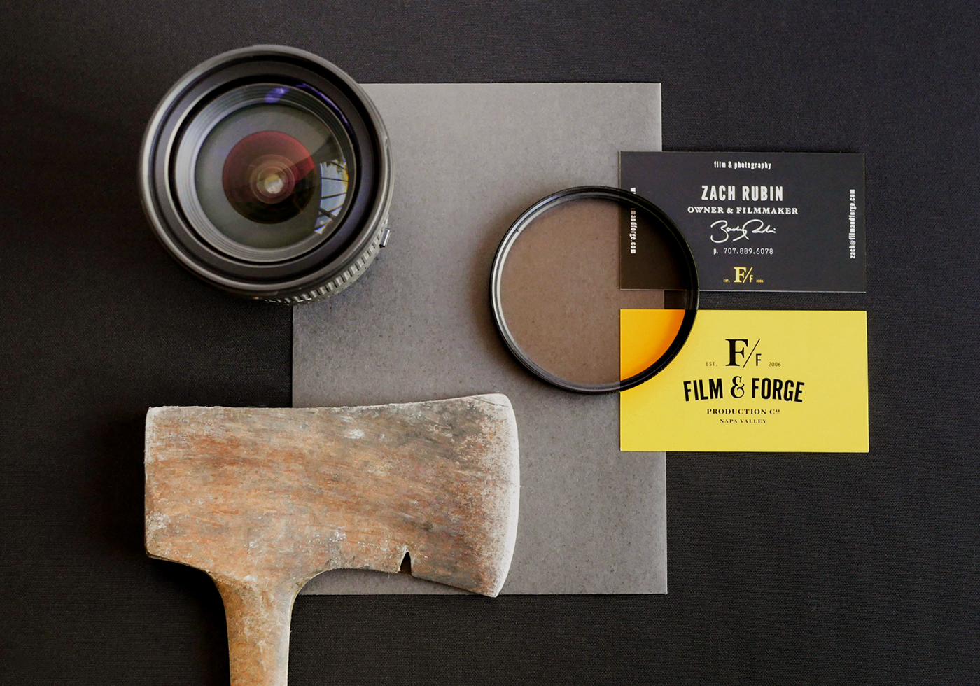
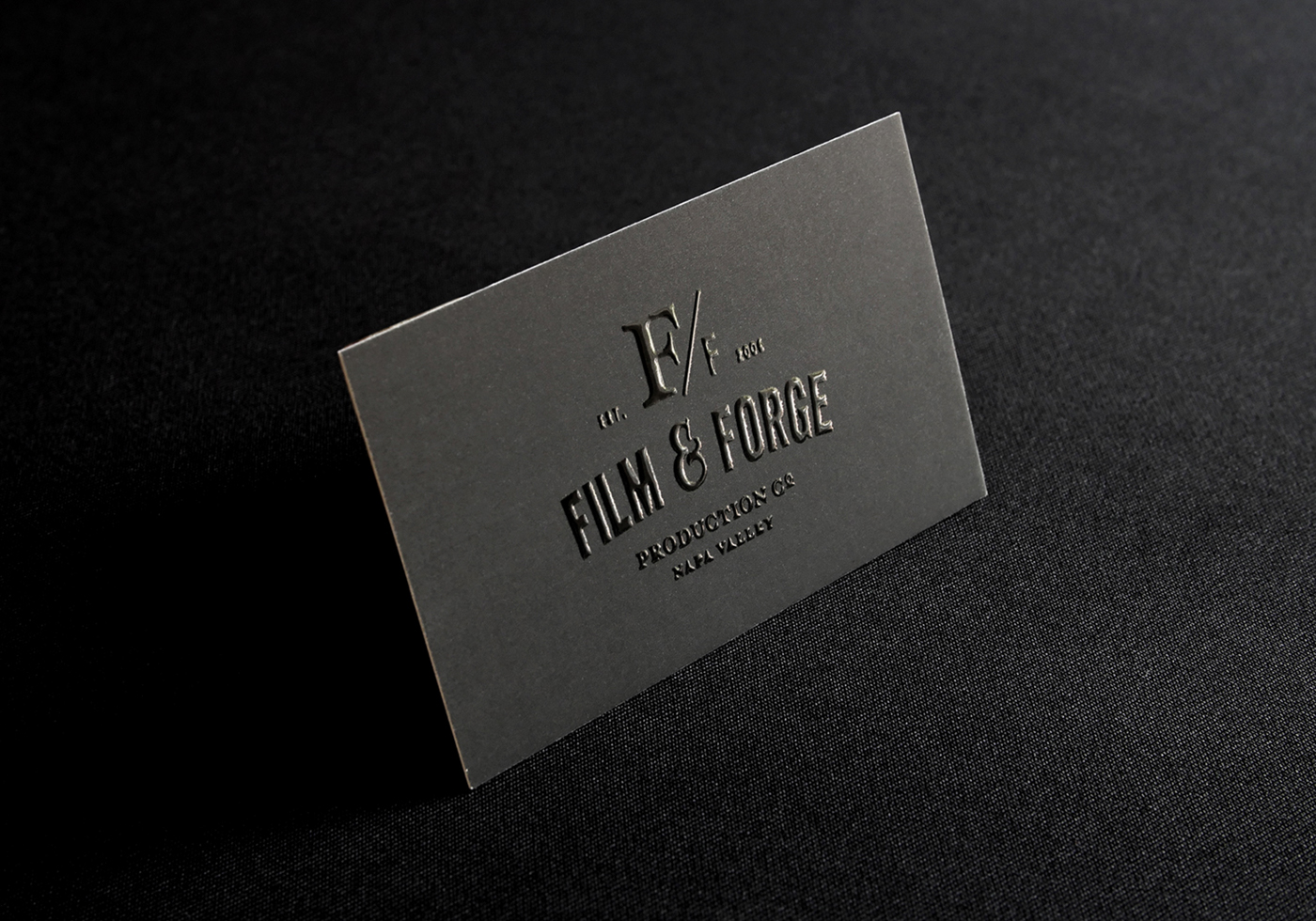
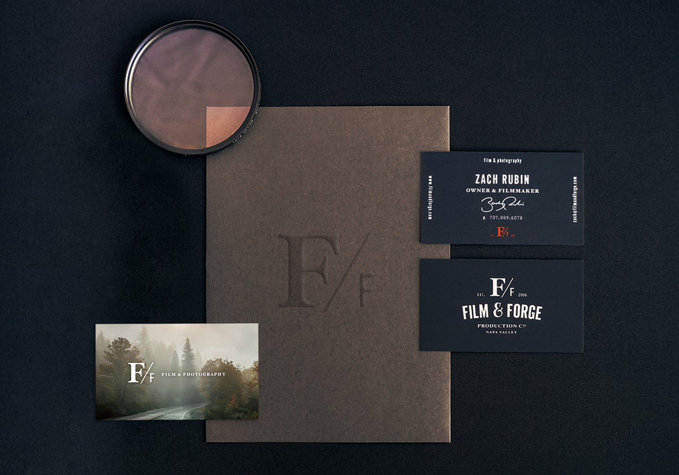
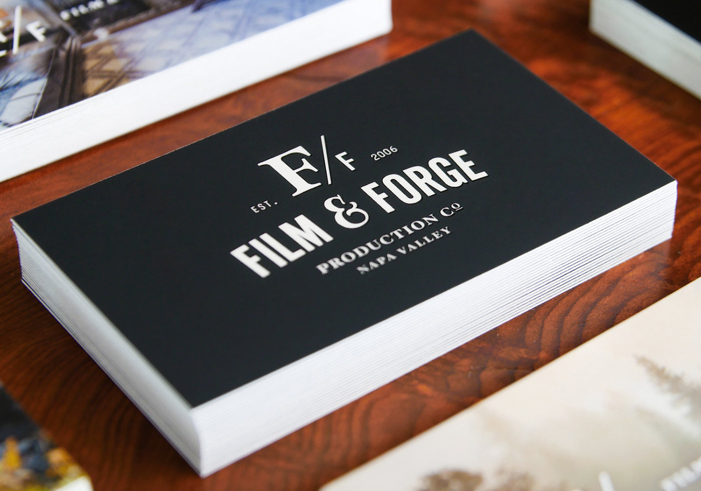
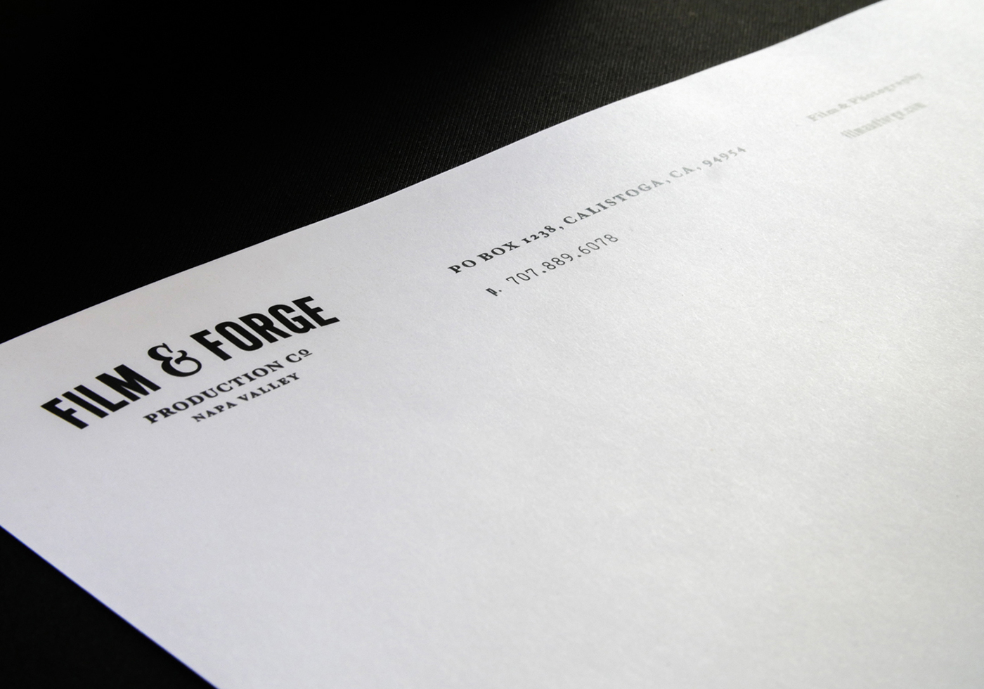
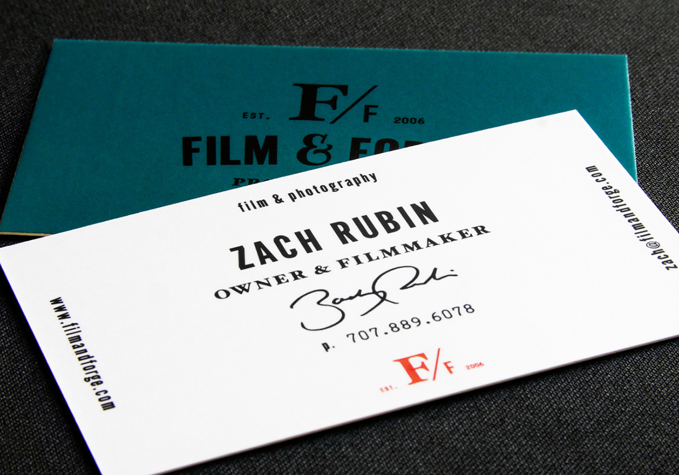
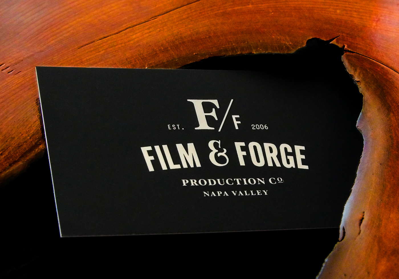
Founded in 2006, Film and Forge brings people together by telling compelling stories through the art of photography and film. Spirited by adventure and the journey, their finished products are captured in the most beautiful and authentic way possible. They have a unique and sophisticated style that is rich in color, and symbolic to each client they work with. Their relocation to Napa, California called for a rebrand with a new name and fresh look. Distinct typefaces make up the logo to suggest a vintage style that represents the forging method and the craftsman's skill of cameras and photography.
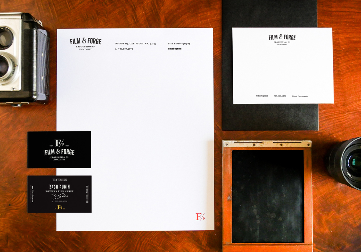
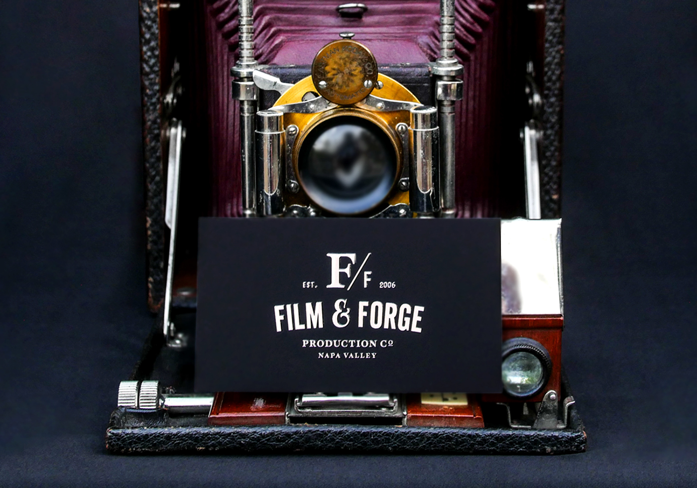
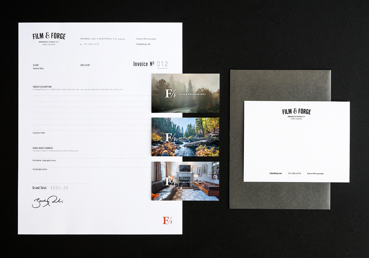
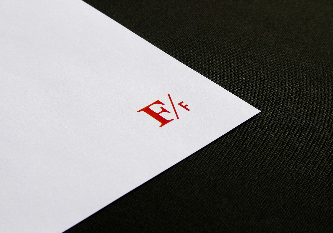
Inspired by the controls and capabilities of the more modern digital camera, the F stop takes the form of the F/F icon with contrasting letterforms. Warm yellows, fiery orange, cool blues, and black inks with stark whites make up the primary color palette and accent colors. Each color reflects the rich tones found in their photography style. The print materials and business stationary includes an 11-piece set of business cards. A raised gloss varnish coats the logo on their silk matte business cards to give it a premium finish and tactile quality. The back of each card utilizes the founders signature as a sophisticated yet personal touch. The rebrand creates business growth at their new location, and broadens their audience base for serving clients in the Bay Area and Napa region.
For more information about Film & Forge, visit our website here.

