


Sterux is a hygiene company which works with a multitude of industries to protect against microbes, bacteria, and viruses when it really matters.
We have created a no fuss, clean brand which represents what Sterux stands for. The no-nonsense approach creates a notion of professionalism, attention to detail, and most importantly an aura of cleanliness.
This brand will enable Sterux to stand ahead of competitors in the UK despite it being a relatively new business. Customers will quickly associate this distinct and honest brand with the high level professional services which it offers.

Logo construction
The mark is placed on the left hand side. The text is placed to the right. The text is the height of one level of shapes in the logo. A bounding space equivalent to the X height is applied around the logo. An optional sub text area is included for some applications if needed.
The mark itself symbolises three company aspects. It forms an arrow, which symbolises moving forwards. If cut in half horizontally it forms two surfaces with a large shine to symbolise hygiene. Finally, the individual shapes represent water jets.

Annual report
Print materials play a crucial role in this brand. The annual report provides everyone with in depth insight into the services and operations they provide.


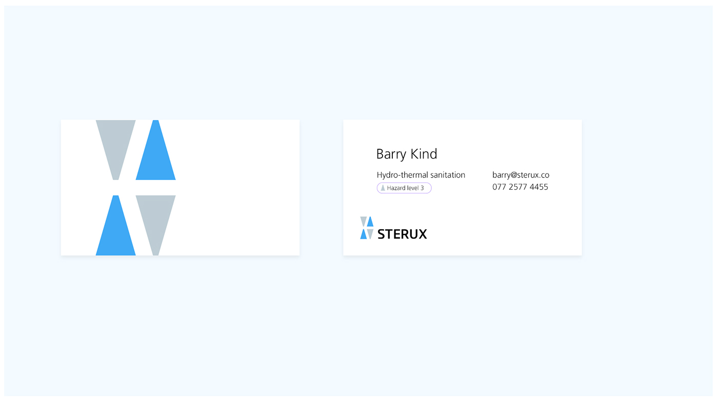
Business cards
When services are provided it is helpful to leave behind a personal business card so the company can get back in contact easily if they need to. The business card is designed to be extremely minimalistic and clean to push the notion of cleanliness and professionalism.

Flags
Flags for promotion will help reinforce the brand.

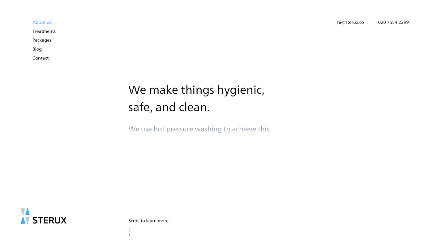
Web experience
The web experience is designed to be incredibly clean and minimal with lots of white space. It aims to make getting in touch or learning more about the services as easy as possible for potential customers.

Print advertisements
Print is still a reliable form of advertising so it will potentially be used to reinforce the brand and gain new customers.


Social media
Social media is important so we paid attention to template header images for use on the blog as part of their content strategy.


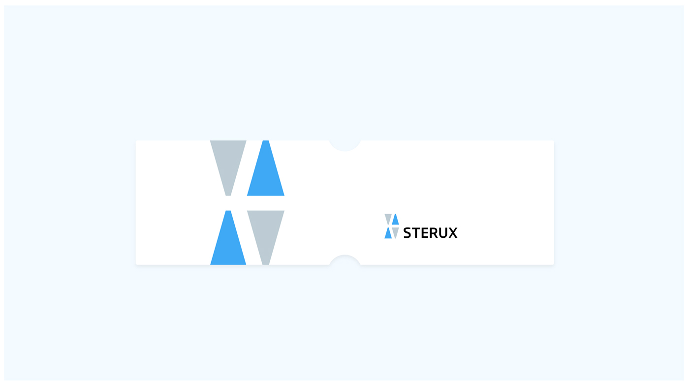
Card holder
To further promote the brand as an industry leader transport pass holders will be produced. Again, an incredibly clean and minimal approach in design to reinforce the brand values.
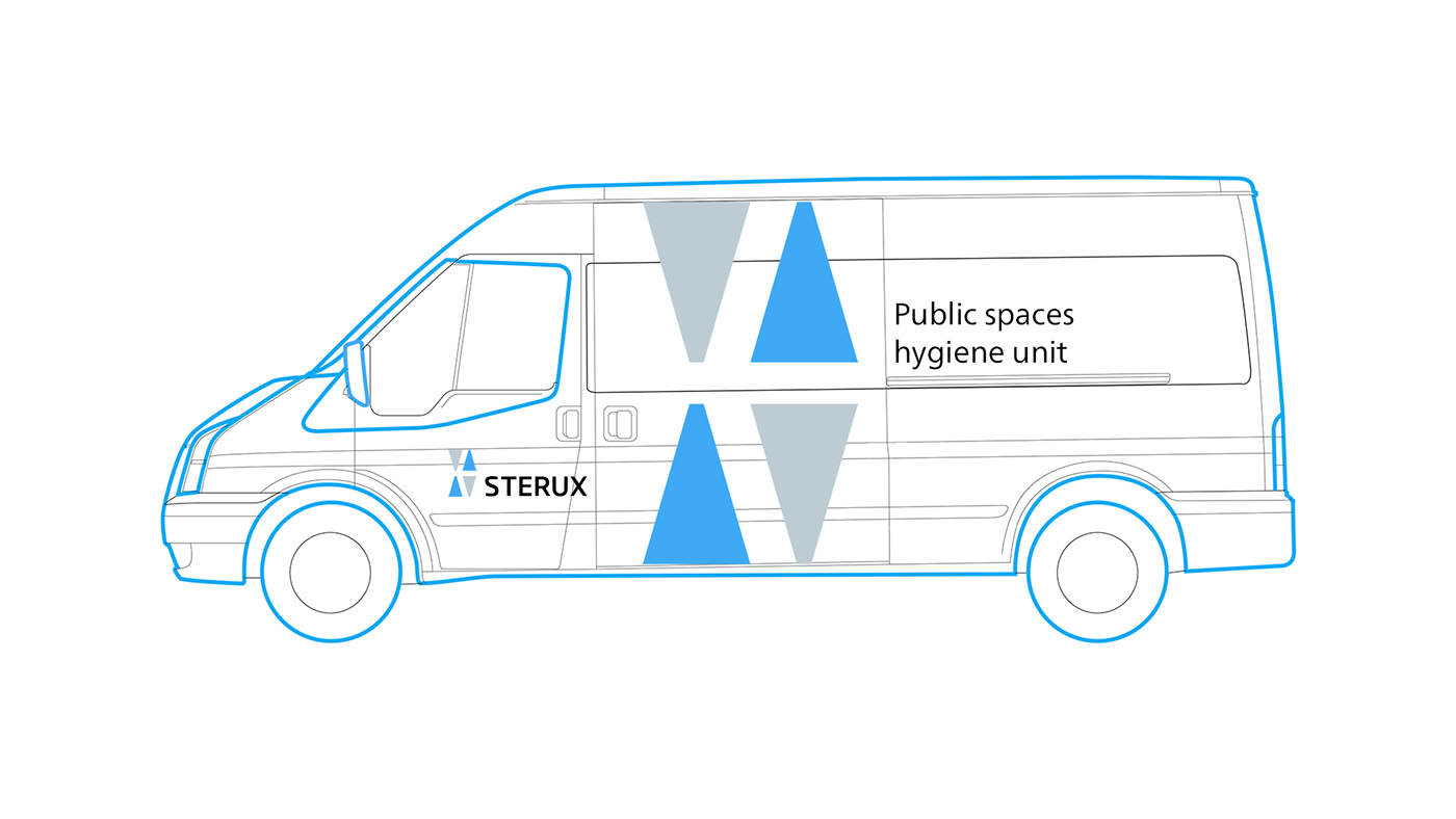
Van livery design
When staff arrive to a job often the van has the potential to be the most important form of not only brand reinforcement, but identification. So we used a large version of the logo across the side of the vehicle so customers will be able to identify the trusted service they know immediately.
Uniform
To keep within budget a standard uniform in blue will be used.


Thank you for viewing
Please give this project a like and we are open to any feedback you may have.


