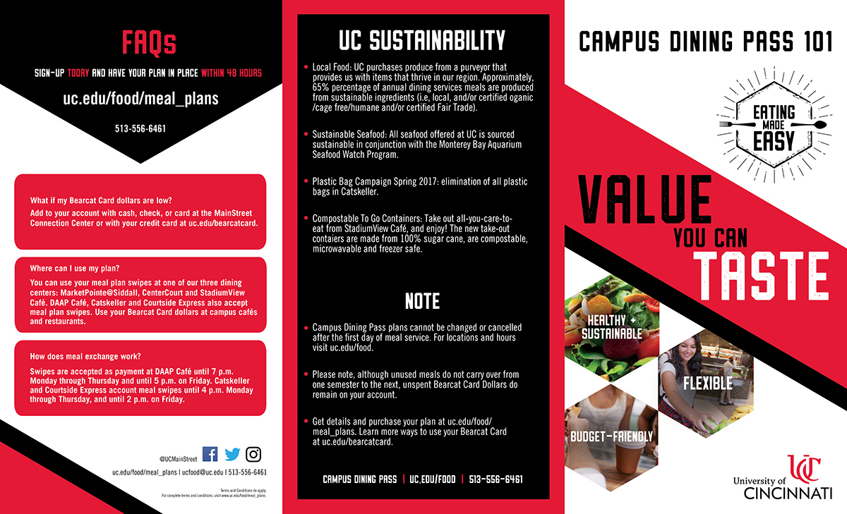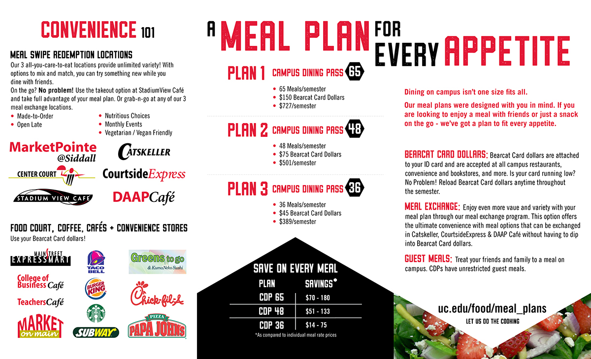

Original Brochure:


Re-Designed Brochure:


Creative Brief: Re-design the Campus Dining Pass Brochure that was used in the previous years. Eliminate the Yellow and Blue color scheme that was used in the past and instead use the red, black, and white, colors of the UC brand. Use the same graphics in different orientations in order to create a similar brochure that will be cohesive with the UC brand. The scale of this brochure will be reduced into a Tri Fold. The visual content that is to be added are the logos from UC's dining centers. The original design was a four fold brochure.
Artist's Statement: Working with a re-design caused me to consider scale, placement, composition, and space. With the limitations of only using previous graphics that were given to me, I was challenged as I created the overall look of the brochure. This project taught me how to use a given graphic in many different ways to create a new look that was still cohesive with the old.


