
RUSSIAN STANDARD
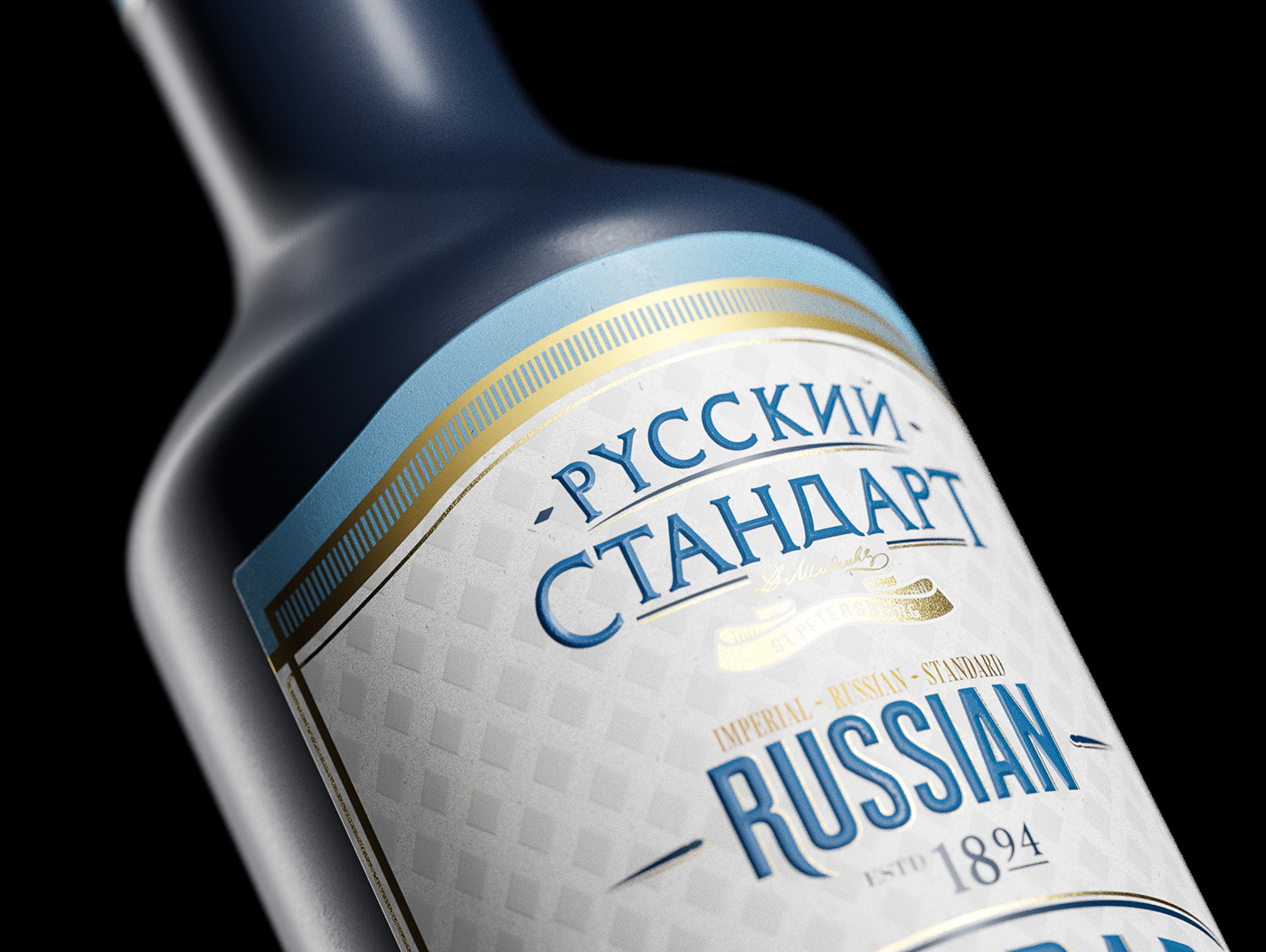
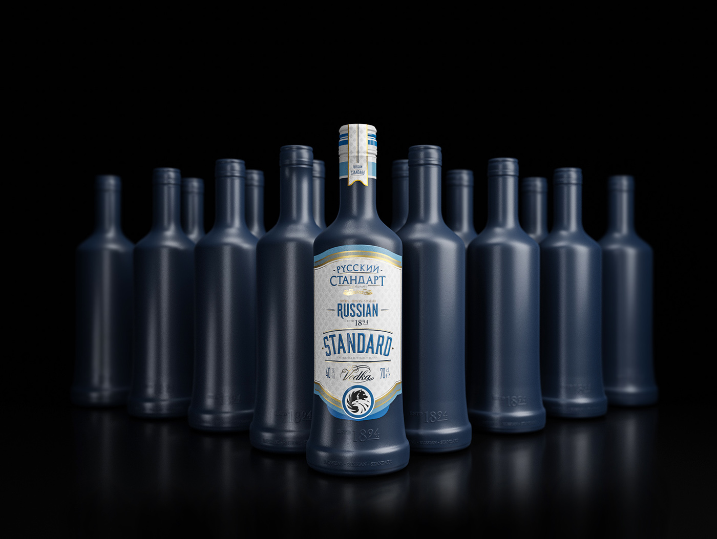
Russian Standard is renowned vodka brand that produces one of the purest liquors in the world. Using premium water distilled from the lake Ladoga in the north western region of Russia. The purity and flavour of vodka are central features that make it stand out. It’s tradition, culture and heritage are as important as it’s distinct taste. The concept was to build around the idea of taking it’s ‘purity’ and stripping it down to its core base. Using the lake as a source of inspiration, shapes were intended to be minimalistic and semi organic, adding a fresh colour palette, gave the design a brand new life and a modern feel to it.Majority of Vodka bottles are clear glassed. The intention was not to change it completely, as Russian Standard already has a shape that helps create it’s brand image. The mission was to enhance it without going over board. We stripped the bottle down of all its original elements, gave it some colour and added our own imprint on it. Typography was chosen as the leading component to be featured. Type and it’s graphics were inspired by the city’s grand architecture. Being the bridge between east and west, it gave a perfect chance to use it as a communication tool to represent modern Russian brand to the world without losing its values.


C R E D I T S
Packaging design: Dominic Rios Sakalauskas
Renders: Mindaugas Petrikas


