

why:
From Japan's long-established store of Edo, expose its culture to the world.
日本が誇る江戸の老舗から、文化を世界に届ける
YAMAMOTOYAMA, one of Japan's long-established companies, is known to many as the famous TV commercial along with other programs broadcasted until the 1990’s. It is well-known as the first tea company in Edo to ever sell Sencha (a type of Japanese green tea), first founded by Kahei Yamamoto in 1690 (Genroku 3), developed by ancestor of Nagatanien founder Souen Nagatani. YAMAMOTOYAMA has a strong image as a seaweed maker due to the influence of commercial advertisements, also as a famous tea company that invented Gyokuro (another type of Japanese green tea), which is still enjoyed today. There is a history here that has greatly contributed to the development of Japanese green tea culture. However, due to the recession, although having supported Japan's food culture and sense of beauty of Edo, has been going through a difficult time to stay in the market in places such as department stores.
1990年代まで放映されていたTVCMなどによって、多くの国民に知られている山本山は、日本が誇る老舗企業のひとつです。1690年(元禄3年)に初代山本嘉兵衛が創業し、永谷園創業者の先祖・永谷宗円が開発した煎茶を江戸で最初に販売した茶商であったことが記されています。CMの影響などによって、海苔のメーカーとしてのイメージが強い山本山ですが、実は煎茶を扱った日本最古の茶商であり、また今でも広く楽しまれる玉露を発明した銘茶企業として、日本の緑茶文化の発展に大きく寄与してきた歴史があります。しかし、日本の食文化や江戸の美意識を支えてきた山本山は、主要販路である百貨店が不況に苦しむ中、改めて市場を獲得しなければならない苦しい局面に立たされていました。

how:
Going back to its origins, designed Edo of 330 years ago.
330年前の江戸の粋への原点回帰をデザインする
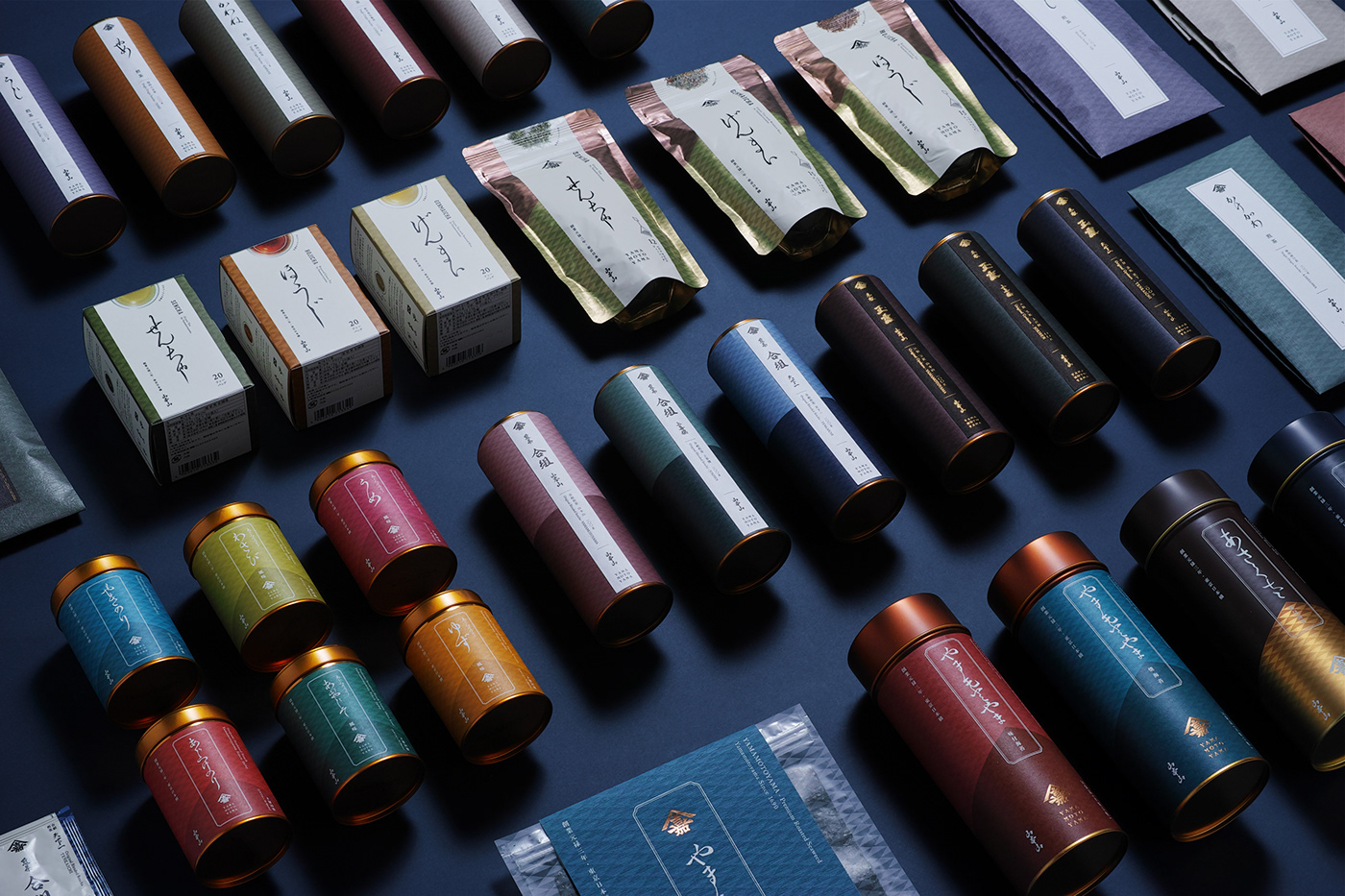
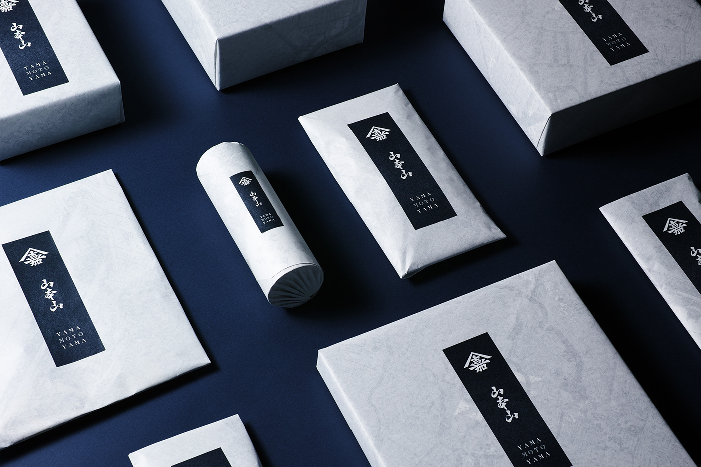
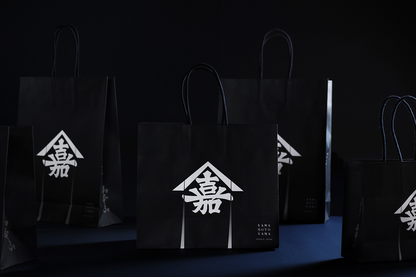
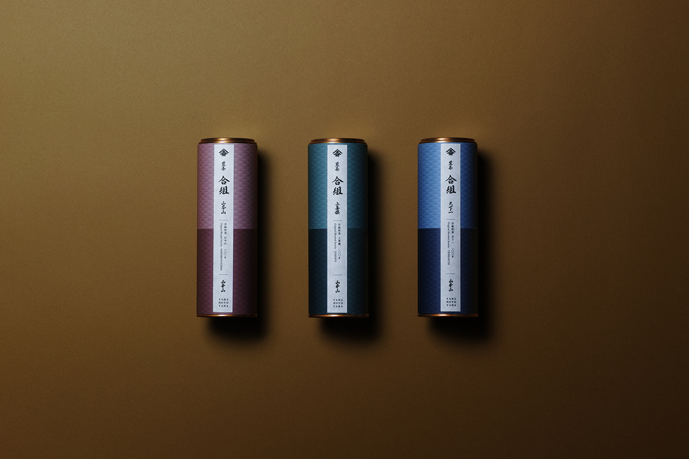
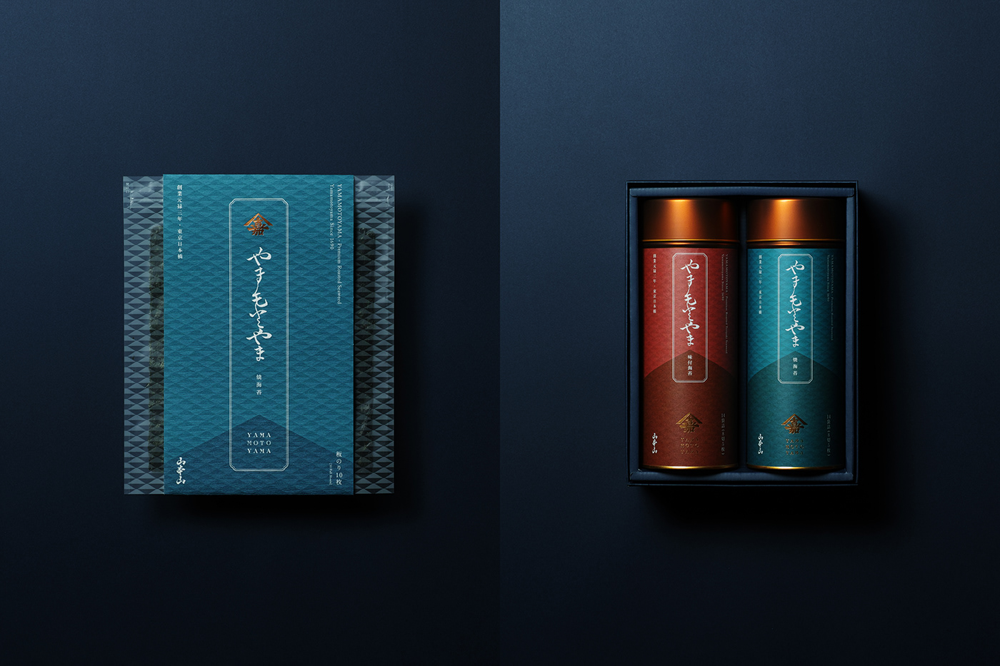
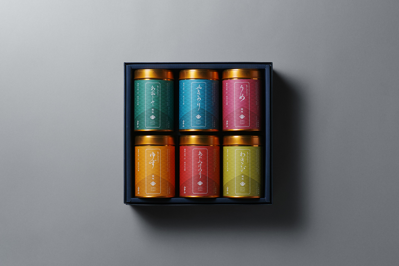
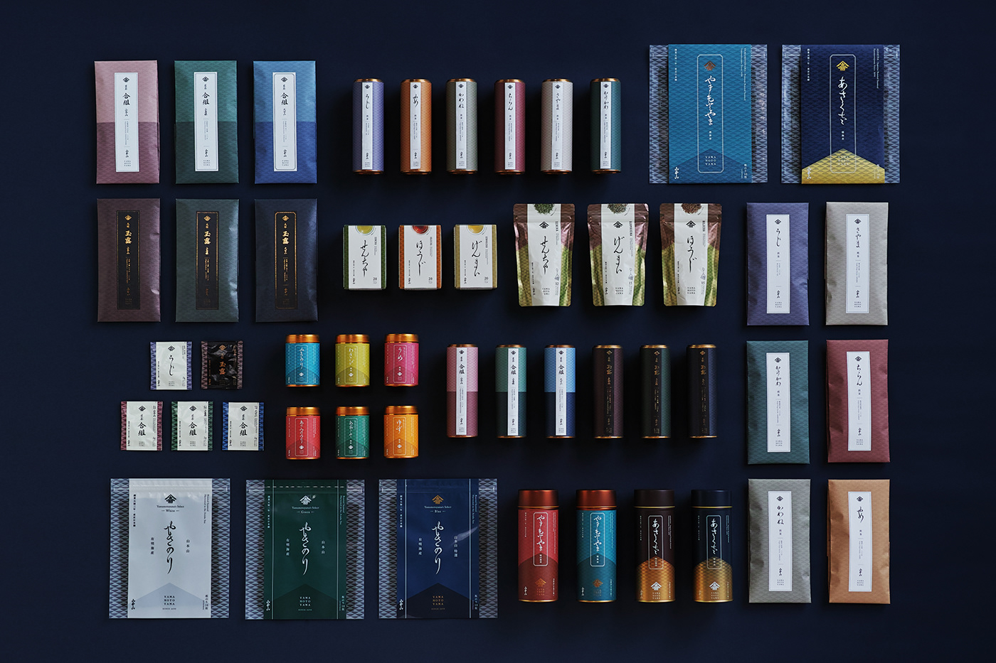
In re-branding YAMAMOTOYAMA, to clarify the position of a long-established company that began in the Edo period, we set our aim to "return to the origin of Edo." By revitalizing the crest of "Yamaka" (山嘉) that was used previously for articles and advertisements of the era when "Yamamoto Kahei shōten" store was founded, we combined this with the alphabetical typeface that was simultaneously popular around 1690. We were able to design a brand logo that reproduced the aesthetics and atmosphere of the Edo period. Furthermore, even in existing products, we incorporated the original small pattern of Edo writing style, quoting the structure of traditional colors and structure of scrolls, redesigning the packaging into a contemporary and elegant style, retaining the charm of the long-established store. In rebranding the history of a long-established company from Edo and the traditional aesthetics of Yamamotoyama, we arranged new products and existing products on the sales floor without the sense of incongruity. We were able to gradually make a shift towards a new brand, avoiding any risks of replacement.
山本山のリブランディングにあたって、江戸時代に端を発する老舗企業というポジショニングを明確にするために、「江戸の粋への原点回帰」をコンセプトに据えました。そして、創業期の「山本嘉兵衛商店」だった時代のお品書きや広告などに使われていた「山嘉」の屋号紋を復活させ、同じく1690年頃に流行していた英字書体と合わせることで、江戸時代の美意識や空気感を再現し原点回帰するブランドロゴを設計しました。さらに、既存商品においても、山本山オリジナルの小紋柄や江戸の書風を取り入れるとともに、江戸の伝統的な色や巻物という書物の構造を引用することによって、老舗の魅力を保ちつつ、現代的で格調高いパッケージへとリデザインしています。江戸から続く老舗企業という歴史や、従来の山本山の美意識の延長線上でリブランディングを行ったことによって、新商品と既存商品を違和感なく売場に並べることを可能にし、それによって、在庫を一斉に入れ替えるリスクを回避しながら、ゆるやかに新しいブランドへとシフトしていくプロセスを取ることができました。


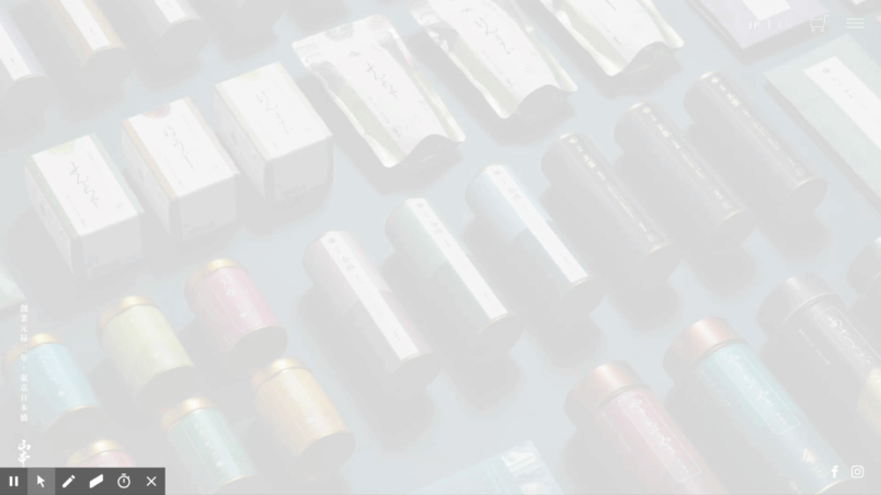
YAMAMOTOYAMA is a well-established brand representing Japan that has been in existence for over 330 years. When designing the website, we wanted to convey the aesthetic sense of Edo in a more contemporary manner. We incorporated a vertical typography style and place dJapanese paper as a texture for the background. Learning from the elements of books of the Edo period, we aimed to create a long-established, modern, timeless web design.
330年以上続く日本を代表する老舗のブランドとして、WEBデザインで意識したのは、いかに江戸の美意識を現代的に伝えるかでした。縦組みのタイポグラフィを取り入れ、背景には和紙のテクスチャを配置。江戸期の書物のエレメントに習うことで、老舗らしく、かつモダンな、タイムレスなウェブデザインを目指して製作しました。


now:
Combining tradition and innovation, connected Edo culture, and taste to the next generation.
伝統と革新を両立させ、江戸の文化と味を次世代へつなぐ
While working close to Edo aesthetics, tools and packages with bilingual signage, increased purchases by foreigners and the younger generation. Currently, a new line "YMY" has launched, where products such as Uji Matcha popcorn and Seaweed soup have made it possible to create a new brand experience, as we work on developing the brand to new customers. YAMAMOTOYAMA will continue to respect traditions of the Edo period, introducing a breath of fresh air into the products without fearing change, to connect the Edo culture and tastes to the next generation.
江戸の美意識に寄り添いながら、バイリンガル表記にした各種ツールやパッケージによって、外国人や若い世代による購買が増え、ブランドとしての未来も広がりつつあります。 現在は新ライン「YMY」を立ち上げ、宇治抹茶ポップコーンや海苔スープなどの商品を通じて、新たなブランド体験を創り、新規顧客の開拓にも取り組んでいます。今後も山本山は、江戸時代からの伝統を尊重するとともに、変化を恐れず新しい息吹を商品に吹き込むことで、次世代の世界へと江戸の文化と味を繋いでいきます。
Awards:
Red Dot Award: Brands & Communication Design (2019)

what:
YAMAMOTOYAMA
when:
2017
where:
where:
Tokyo, Japan
who:
Art Direction
NOSIGNER (Eisuke Tachikawa)
Graphic Design
NOSIGNER (Eisuke Tachikawa, Ryota Mizusako, Nozomi Aoyama)
NOSIGNER (Eisuke Tachikawa, Ryota Mizusako, Nozomi Aoyama)
Photo
Kunihiko Sato
Client


