One Image Per Day 2017
DXB 202 - Image Production
Week 2: Passing of Time
Exploring the theme of passing time, this series shows the various stages of decomposition of an apple. These sketches were done on paper using 4B and 6B pencils. I thought series of images showing these stages adequately implies the passing of time. My work involves being constantly surrounded by fruit and vegetables so naturally when I thought of time, showing the decomposition of produce came to my mind. I decided to sketch this series as I knew it would challenge me to look at the finer details and the changes between each image. I placed an apple on the bench at home and photographed it as rotted over a week or so. I used these images as a reference for the five sketches. I found it difficult to show the deformed shape in later images through illustration so this formed a good challenge. I did however like the style and how they appeared when positioned as a series.

Apple Decay 1
This first image shows its initial form, appetising and ready to be consumed. This sketch was done on paper using 4B and 6B pencils.

Apple Decay 2
As the second image, initial decay of the apple can be seen through lines and shading showing bruises beginning to appear. The skin of the fruit also begins to wrinkle as it is no longer pulled taught to protect the flesh within. This sketch was done on paper using 4B and 6B pencils.

Apple Decay 3
The third image shows further decay as the apple develops a notable impression due to the flesh deteriorating. This is visible through dark shading. This sketch was done on paper using 4B and 6B pencils.
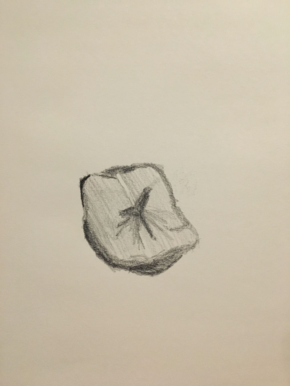
Apply Decay 4
The fourth image in this series shows the spherical form lost due to the decomposition of the fruit. The darkest shading indicates the areas decaying at the fastest rate. This sketch was done on paper using 4B and 6B pencils.

In the final sketch of the apple, it appears shrivelled, notable by the differing directions of line and shading. The physical shape is further deformed and the apple appears smaller in comparison to the other illustrations. This sketch was done on paper using 4B and 6B pencils.


The series is shown above to show the decomposition process as a whole.
Week 3: Portraits

A Morning Coffee - Housemate
I composed this image of my housemate Mayumi portraying her naturally, and hinting at her gentle personality. She holds the cup she uses for her morning coffee each day and sits in a cane chair, gifted to her as a housewarming gift. The photo was taken on our back deck, the morning sun coming in through the trees, while twirling her hair, a habit she obtained many years ago and can't seem to shake.
A Canon 600D was used, exploiting the warm morning light which cast nice shadows across the subject's face. I was motivated to create an image with as little stylisation as possible. I wanted to focus on capturing Mayumi's personality as opposed to taking a stereotypical styled portrait. For this reason I made her feel comfortable by taking the photo during our typical breakfast routine. The photo was taken in the middle of a conversation, the timing unplanned to an extent.
I was really happy with the result. A challenge in composing this image was the white door and its position in the background./ I do really love the way the light filters through the trees, both onto the subject's face and also onto the deck and wall as well.
The following camera settings were used:
Canon EOS 600D
ISO: 200
17mm
Aperture: f / 7.1
Shutter speed: 1/100
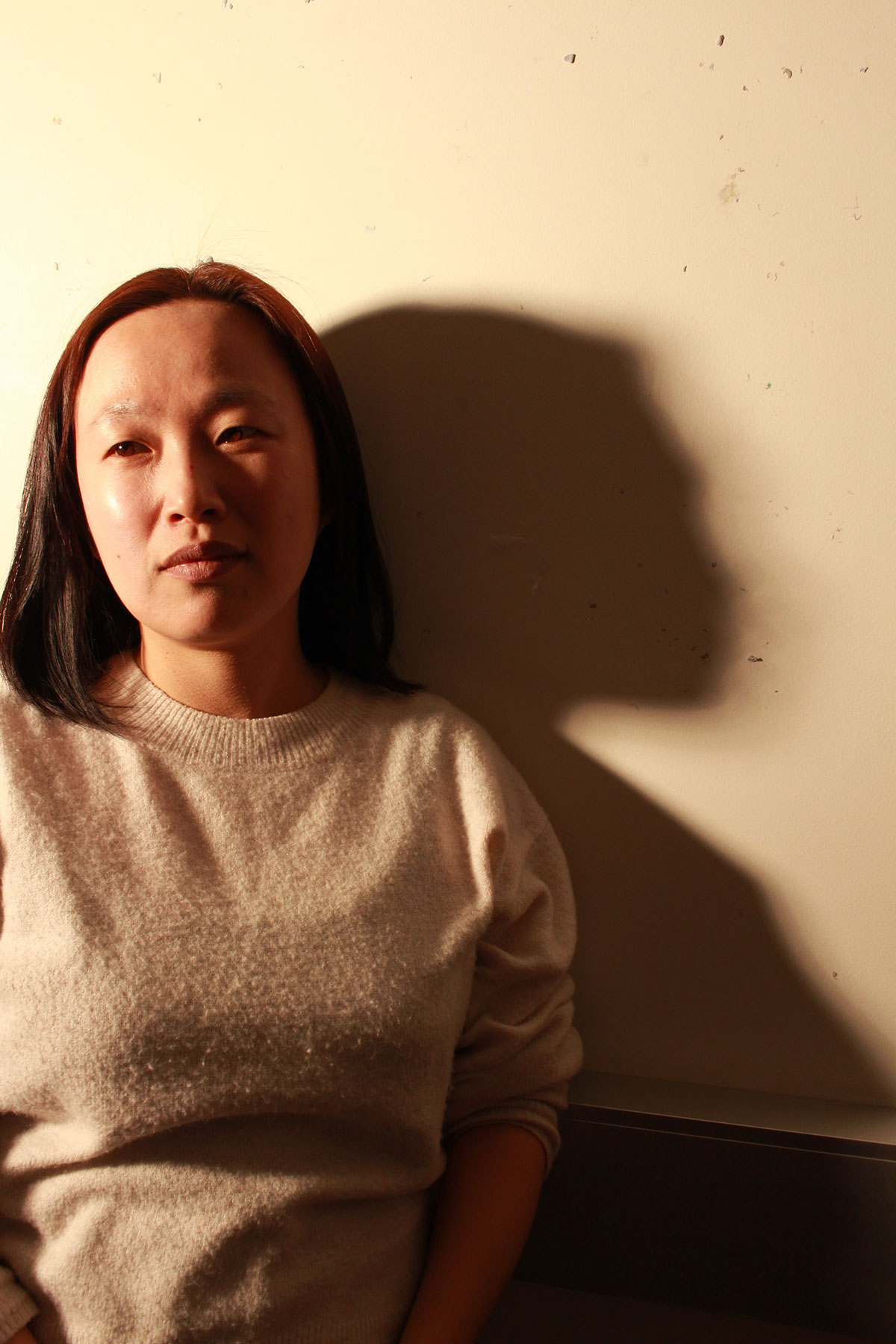
Deep in thought - a stranger
I loved the way the light hit this women's face as she stood waiting alone with the shadow that her figure casts against the creamy white wall. She appears deep in thought yet her expression draws you in as if she is looking right at you. I love the texture of her jumper as it adds interest and depth to the image. Split lighting is used to light the left side of the subjects face whilst a small amount of light spills onto the right side. This lighting causes the deep shadow seen on the wall that I feel emphasises her solemn expression.
I was quite happy with this image as it was taken naturally, the focus being the subject and capturing her expression. In hindsight, if I had planned out the shot a little more, i could have diffused the light which would eliminate the glow on her left check.
The following camera settings were used:
Canon EOS 700D
ISO: 400
22mm
Aperture: f / 9
Shutter speed: 1/80

Looking Down - A Classmate
During the week's tutorial we experimented with lighting and how that can shape an image and help represent a personality within a still photograph. By lighting Hannah's face from the left side slightly below her face and diffusing this light, the result is a moody image capturing a moment of contemplation. This utilises short lighting with the light source positioned at a 45 degree angle to the subject.
The following camera settings were used:
Canon EOS 700D
ISO: 400
38mm
Aperture: f / 9
Shutter speed: 1/80

Light Patterns - Self-portrait
Self portraits are difficult because it is so easy to attempt to style an image due to your own predispositions and societal influences. I believe capturing yourself, and remaining true to the person that you are with no facade, is genuinely a challenge. Living in Queenslander homes all my life, there is a certain comfort in sitting on a deck and observing time pass by around you. The light patterns on the face are all created by the trees beyond the back deck swaying in the breeze. I composed the shot and then watched their movement as i pressed the shutter, incorporating their physical presence in the light cast across the face and their calming movement in the expression the face holds.
If I had of retaken this image I would have improved my posture so my shoulders weren't slumped forwards. I like how classic Queenslander elements such as the windows and glass doors are visible in the background to set the scene for the image.
The following camera settings were used:
Canon EOS 700D
ISO: 100
18mm
Aperture: f / 7.1
Shutter speed: 1/50
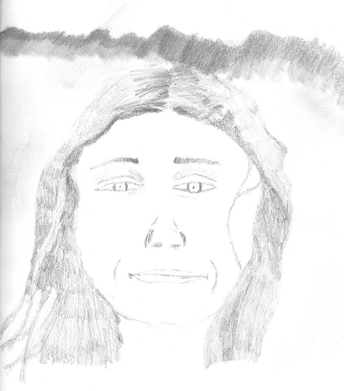
Me - A self-portrait
Using shading techniques i completed an illustrated self-portrait using a photo for reference. I turned the image upside down, along with the paper as to get a more accurate representation of what I was drawing. I used pencils of various weights and shaded different areas to create depth within the image and show light and shade.
This was quite challenging for me as I am not strong at illustrating although I really enjoyed exploring this medium. I think the depth shown with shading of the hair around the face was done well although shading at the part line was not as effective. I was proud of the finishing product as it took me quite a while to complete.
Week 4: The Ekka
Initially I wasn't sure how I wanted to approach the task of documenting the Ekka but as a first time show participant it soon became apparent to me. Held over 10 days in the heart of Brisbane City I began to wonder the extent of the environmental impact the Ekka imposes.

Popped
This image shows the extensive amount of waste from just one of the many 'Bust a Balloon' stalls at the show. Visiting the show at night, the lighting from the inside of the stalls was perfect for capturing silhouettes. They also show the vast amount of balloons both on the wall, and popped, left abandoned on the ground.
If the edge of the stall matt had of been lined up horizontally, I believe the image would have been a lot more effective. The blue of the sign at the top of the image also draws away from the image as the colours do not match the warm tones throughout the entirety of the photograph. As cool colours naturally are foregrounded, attention is drawn to this part of the image where it should not be.
The following camera settings were used:
Canon EOS 600D
ISO: 6400
10mm
Aperture: f / 16
Shutter speed: 1/80

Smoke and Viewers
The fireworks display is one of the most anticipated events at the show. This image depicts the smoke left following a string of fireworks at the beginning of the sequence, showing how much pollution entered the air during the 10 minute pyrotechnics display.
The clarity is not ideal due to the fact that this image was taken on an iPhone however this is only really noticeable when looking at the observers in the bottom right corner.
This image was taken on an iPhone 6s.

The Bear King
Plush toys are a large part of the Ekka experience, especially for children. I believe this teddy personifies the negative impact these toys have on the environment after their short lifetime. Embracing planned obsolescence, they aren't built to last a long period of time so whether its a few loving moments with a young child or straight to landfill at the completion of the show, life for these toys is short.
Taking this image from below made it looks extremely large and emphasised its dull expression. The typography 'King' in the background was coincidental but I believe it compliments this image quite well. Also, having a collection of plush toys scattered throughout the background emphasises the shear amount of toys in circulation during the show.
If I was to work further on this image, I would have detracted the attention from the lightbulbs strung across by dulling just that element of the image in Photoshop.
The following camera settings were used:
Canon EOS 600D
ISO: 5000
18mm
Aperture: f / 13
Shutter speed: 1/50
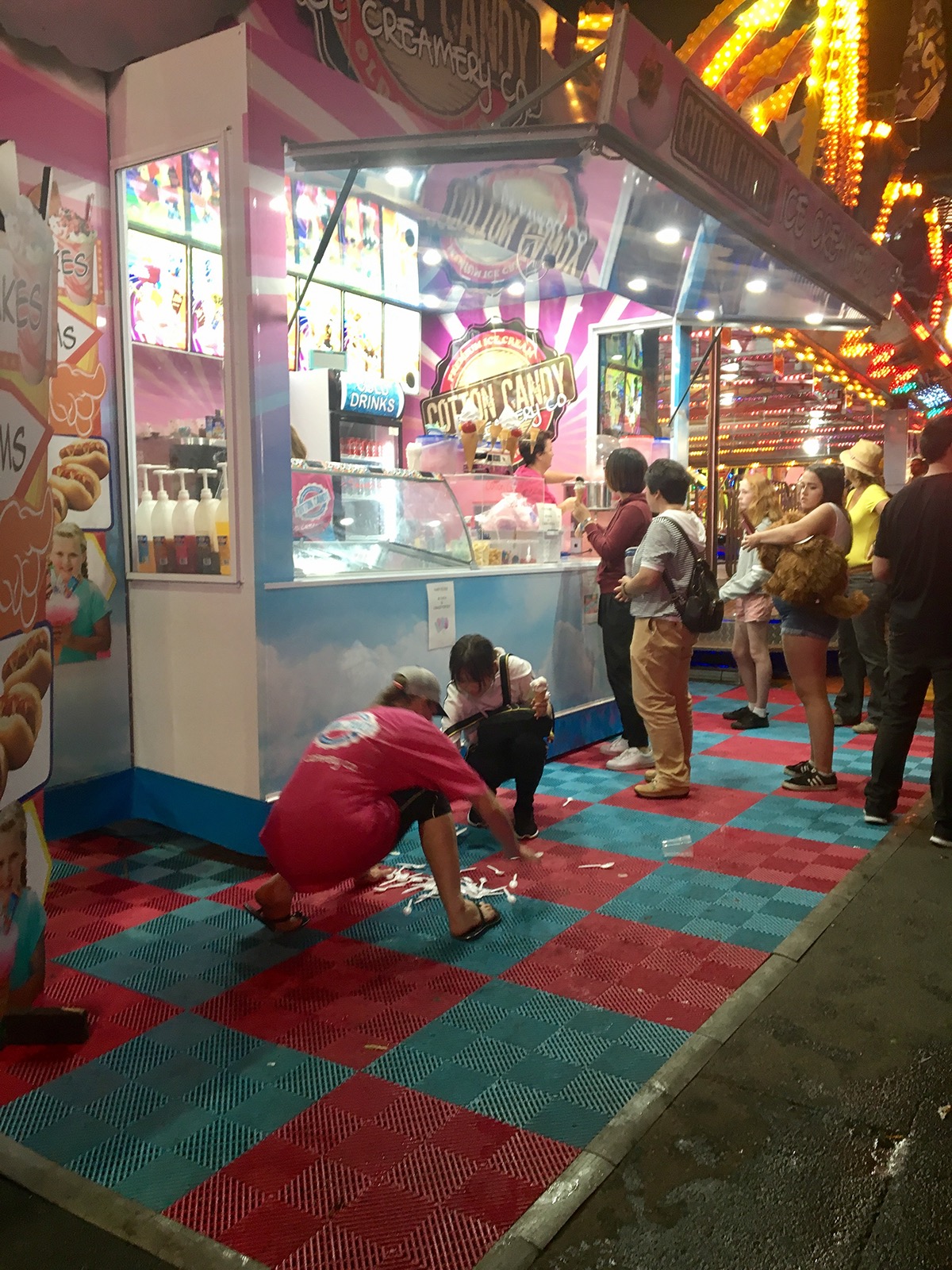
Spoons
Adding to the mass of waste left in the wake of the Ekka, a collection of spoons was dropped off the counter of an ice-cream stall, making them unusable. This was an image I captured in the spur of the moment as a passer by. If taken again, the lighting would be changed to create a more appealing image and avoid overexposure within the stall itself. The colour scheme, being mostly pink and blue is almost complimentary and gives the image a nice aesthetic appeal.
This image was taken on an iPhone 6s.

Neon lights
As with any show, as evening falls the neon lights flicker on and the Ekka had no shortage of them. This image shows the light pollution of just one ride at the show. By using a slow shutter speed, the lights within the ride are blurred, creating a sea of different colours. This image through the exploitation of shutter speed, emphasises the extensive and essentially excessive use of lighting around the show as a whole.
If I had of worked on this image further, I would have darkened the ceiling area and floor area not featuring neon lights in order to draw more attention to the focus of the image.
The following camera settings were used:
Canon EOS 600D
ISO: 100
18mm
Aperture: f / 16
Shutter speed: 1/0.5
Week 5: Down Memory Lane
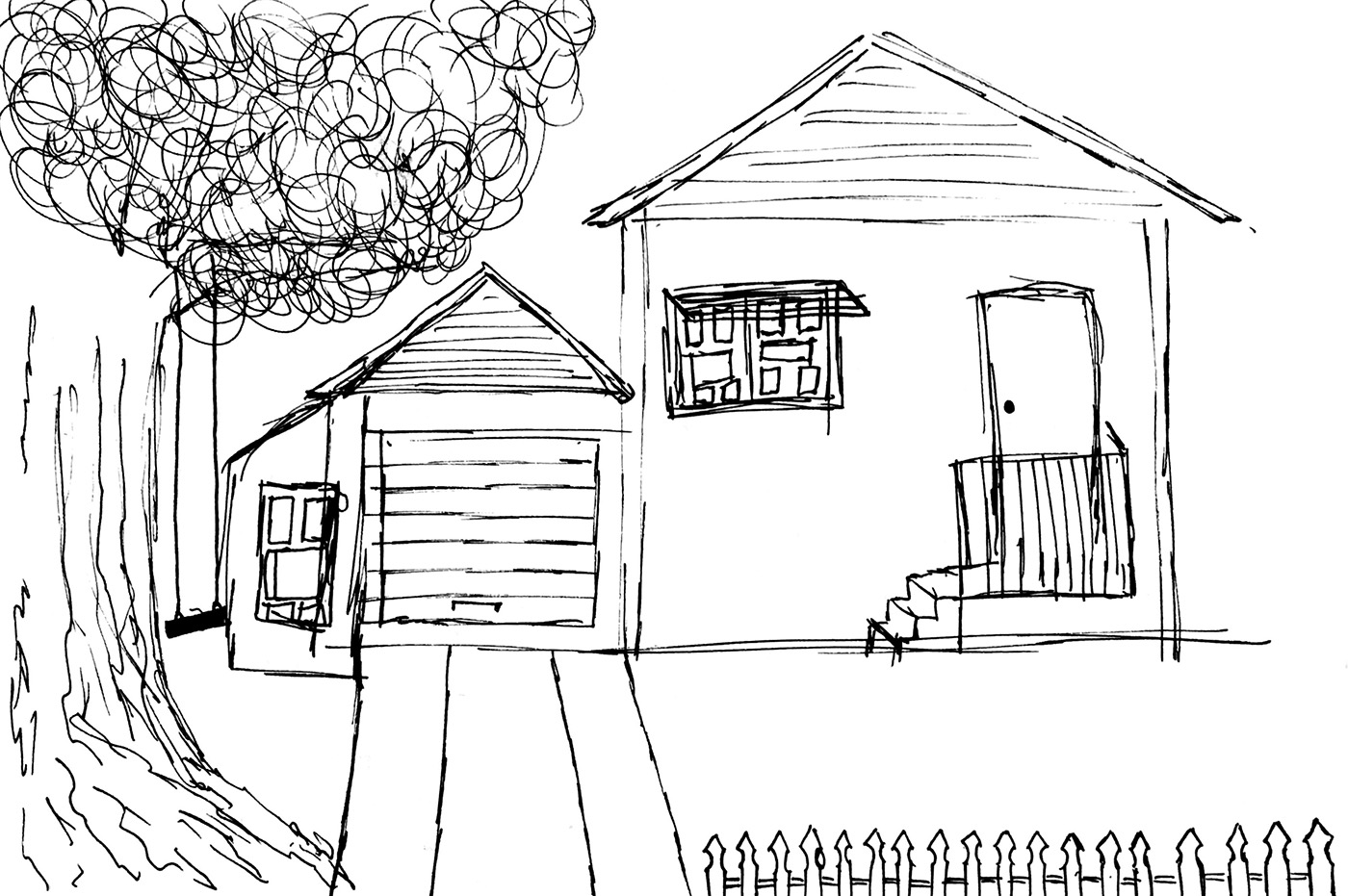
28 Passchendaele St - Childhood Home
When thinking of a place from my childhood, this house in Cairns came to my mind. I lived here between the ages of three and eleven and it became a very sentimental location for me. This image was created using pen on paper. The big tree and the swing that hung from it were a feature in the front yard. The white picket fence was painted by my parents and both my sister and I took great pride in helping with the smaller details. As an old Queenslander, the windows were iconic elements and very memorable.
Looking back, I wish I had included the back deck and the pool, both of which were also really important parts of my childhood. Including colour would have made the image a lot more vibrant and realistic I feel.

Elastics was a game I played every lunch break when i was in grade three and four. This diagram shows how the game is played. The bottom sequence shows a step by step demonstration on how to play while the the top section includes an image and a list of equipment. This diagram was creating using pen on paper.
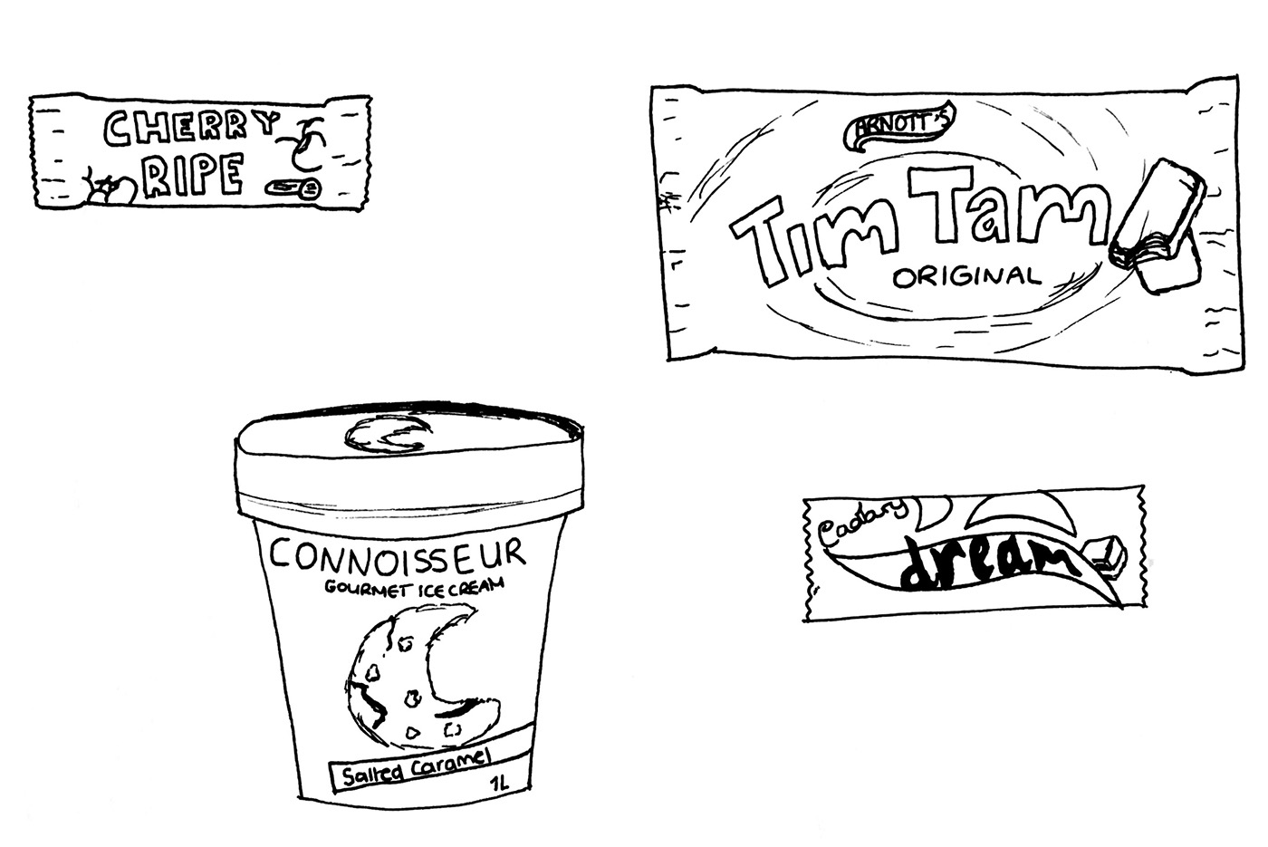
This illustration features the labels of my favourite treats enjoyed during my teenage years. It was created using pen on paper. The labels are sketched roughly however I like the way they turned out.

My house
This image shows the house I lived in when I started at QUT and still live in at the moment. As it is hidden behind a large fence from the street, I decided a photo from the back would best show the character of the house. Being an old Queenslander this house has so much personality. It sits off a busy road yet backs onto a nature reserve, creating a sense of escape from city life.
It was a challenge to capture the house whilst also capturing the sky above. If I was to spend more time perfecting this image, I would increase the brightness on the house and decrease the exposure of the sky to create a more balanced imaged.
The following camera settings were used:
Canon EOS 600D
ISO: 200
12mm
Aperture: f / 7.1
Shutter speed: 1/100

Sky-day Friday
This image of the sky was taken at 2pm on the Friday of Week 5. I find it so interesting to look at as you can see the detached, floating nature of the clouds and foregrounded is the sharper more static shape of the trees. The clouds form soft, flowing lines and are light in colour whilst the trees are almost silhouetted and have much harsher lines. It was challenging to get this image dark enough to show a dynamic contrast between the foreground and background. A small amount of editing could have decreased the exposure of the sky slightly and fully silhouetted the trees, creating more contrast but also balancing the two elements of the image.
The following camera settings were used:
Canon EOS 600D
ISO: 100
13mm
Aperture: f / 14
Shutter speed: 1/100
Week 6: See that thing?

Bathroom Rays
I was struck by the resemblance this toilet roll holder had to a sun so i decided to emphasise this alikeness by overlaying this clipart style sun shape. I took the photo on an iPhone 6s, then took the image into Photoshop. I made the image in photoshop and then created the sun shape in Illustrator. I took this shape and overlaid it in Photoshop to get the finished result. The lasso selection of the object to remove the background could have been achieved to a higher standard but the message within the image was still present.
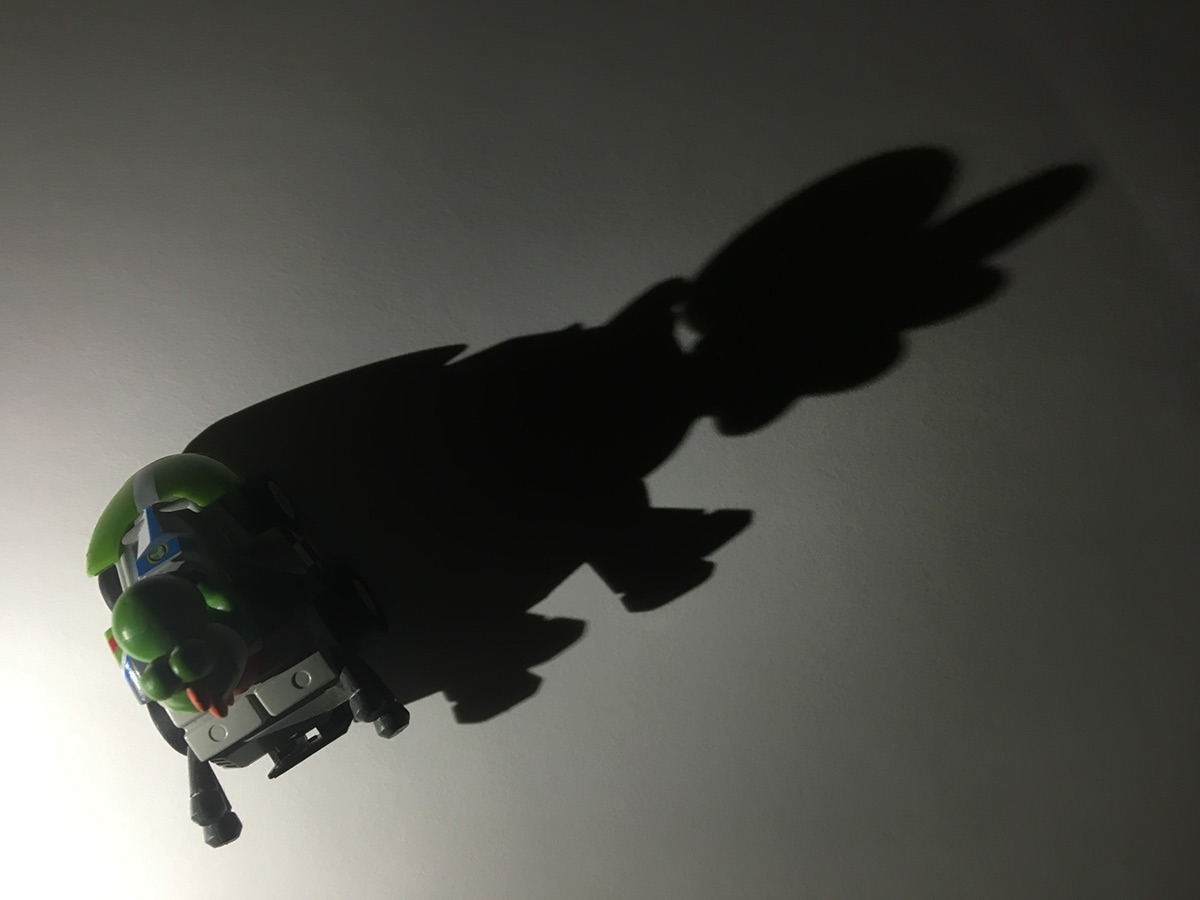
Maggie
When playing around with the shadow cast by this toy, I noticed at this angle the it resembles Maggie, the baby from the Simpsons movie. This photo was taken on an iPhone 6s. The toy was placed on a piece of white paper as a background with the camera positioned above. The light source was positioned only slightly above the toy on the left side, casting a shadow long across the shot. I liked how it distorted the shape of the toy to appear as a completely different object.

Reflecting on Mountains
This idea came to me when I first thought about this week's theme. I got two pieces of foil and arranged them with two peaks to look like mountains. I photographed them and then put them into Photoshop. I used the quick selection tool to select just the foil and then created a layer mask. Then using the clone tool and the brush tool, I painted the background back in underneath the foil which was the marble of the table top. I liked the lines that this created. I was inspired for this image by the work of Yuji Hamada who creates realistic landscapes by turning foil into mountain ranges. It was challenging to make the image look realistic but I think experimenting with lighting may have helped drastically. With more experience in Photoshop and with taking images like this one, I would be able to improve the outcome significantly.

Babushka doll
Within this image, a shadow cast from a vase takes the shape of a Russian stacking doll or Babushka doll. By placing the light source to the top right of the vase and above it, a relatively short shadow is cast. With the camera positioned on top of the object and a piece of paper below it, the image is created. I was really interested in the way casting a shadow at different angles can change the shape of the object.
Week 7: Light and Scale
Light painting involves using a slow shutter speed and a dark environment to capture areas of the photographed space selectively as well as painting shapes and patterns. Painting was done by shining a phone torch in the direction of the camera and drawing the shape. The subjects were illuminated by shining light from behind the camera towards the scene for a short period of time.

Imaginary Friends
In this image, the subject was lit for approximately two seconds, then I begun painting, shining the light towards the camera. By covering the light before and after drawing, clean lines were ensured and the stick figure looked cleaner and more realistic. The red line within the face appeared through poor covering of the light before I started drawing. I think it adds interest to the image and I also really like the glowing reflection on the deck.
The following camera settings were used:
Canon Powershot G7 X
ISO: 125
8.8mm
Aperture: f / 4
Shutter speed: 10

Head in Hands
I wanted to experiment with light painting and a relationship with inanimate objects. I came up with the idea to place a chair in the shot and paint a figure sitting on it. He sits with his head in his hands. This shot was particularly challenging in regards to spatial awareness with the light. I reworked this image so many times trying to align the body with the chair and correct the proportions. Although this image isn't perfect, I like the lines that were created. I also really like the glow cast onto the deck.
The following camera settings were used:
Canon Powershot G7 X
ISO: 125
8.8mm
Aperture: f / 4
Shutter speed: 10

Take a Stand
This time I lit the subject for a shorter amount of time (about one second) before moving the light source in wide circles behind the subject. I was inspired to take this image from the many light painting photographers who use light beams. I didn't had a wide light beam but decided to try with an iPhone torch. I initially moved the light source too fast and the light didn't come through in the photograph properly. It took some experimentation to get the right speed in order to best show the circles. I also took this image into Photoshop to get rid of my feet which were visible as I stood behind the subject to do the light painting.
The following camera settings were used:
Canon Powershot G7 X
ISO: 125
8.8mm
Aperture: f / 4
Shutter speed: 8
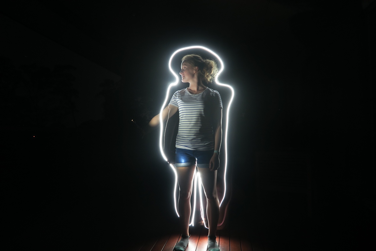
Outline Jess
To achieve this image I used a ten second exposure. The subject was illuminated for approximately two seconds first and then I ran around behind her to outline her body. Timing was definitely a challenge with long exposure photographs. I found a nice balance with a ten second exposure and the amount of light I was letting in to create the image without including background details. Having an extra person helping out would have been beneficial as the subject would not have had to illuminate themselves. Therefore her arm would not be outstretched, interupting the outline. Nevertheless, I was happy with the result and really enjoyed making this image.
The following camera settings were used:
Canon Powershot G7 X
ISO: 200
8.8mm
Aperture: f / 4
Shutter speed: 10

Silhouette
This image was taken during an experimentation in this week's tutorial. I wanted to explore how a silhouette could be captured through light painting as opposed to lighting from the front of the subject or 'painting' around them. By shading an area of light, only the subject's silhouette is visible. I initially was disappointed that we hadn't managed to shade the outline of the subject's whole body. This ended up being my favourite part of the image; I like the imperfection in the way that a whole silhouette isn't visible. It adds a sense of continuity as legs blend with darkness, as does the shoulder. The exposure was just long enough to take in enough light without illuminating the background of the classroom.
The following camera settings were used:
Canon EOS 700D
ISO: 100
18mm
Aperture: f / 8
Shutter speed: 10
Week 8: Textures and Patterns

Texture from Nature
This plant is a ground cover that hangs over a retaining wall in my backyard. Due to the dry weather over the winter, the plant has died. I found it created a really nice texture as you can see the dryness. It appeals a lot more as a texture by being a black and image. The gaps filled with darkness also add mystery as you cannot see what is beneath the plant. This image was taken on an iPhone 6s. I would use a DSLR next time to increase the clarity of the image.


Man-made texture
This mirror shows a man-made texture, being that of the frame. The metal texture moulded into the frame is imperfect, therefore making the object appear hand-crafted. The bumps create visual interest and draw attention to the piece as a whole. This texture was created as an aesthetic addition to the mirror. The images were taken on an iPhone 6s.

Texture created
I created this texture by first rubbing an old tile and then bringing it into Photoshop. I then adjusted the brightness and contrast and used the Image Trace function. Following that I added a green tone to the image to create a little more interest. My experience with Photoshop prevented me from creating a texture as well as I had hoped.

Pattern from Nature
This plant is a perfect example of a pattern within nature. As each new layer of leaves unfolds, an additional level of complexity is added to the pattern. As a black and white image, the eye is drawn to the leaves and the way they disperse towards the edges of the image. This image was taken on an iPhone 6s.

Mathematical Pattern
I created this pattern on Photoshop mathematically. I gathered each of the four icons from the Noun Project website and arranged them as they appear above. I then created a pattern within photoshop and added the background colour. I am quite happy with the way it turned out. I was challenged with matching the spacing within the pattern as I wanted there to be some imperfection within the pattern.
Week 9: Image Manipulation
When thinking about what image to produce for this week I looked back through my photo library and stumbled across my base image, a photograph taken at Litchfield National Park in December last year. I had forgotten about it but when I saw it I was reminded of how much I loved both the photo and the landscape of that area. It was for this reason that I decided to create an image set in this location. I gathered two photos with various inflatable toys to incorporate. I also chose to replace the sky as the visual interest of clouds detracts slightly from the main focus of the photograph, being the waterfall. To add to the image i decided to add some weight to the foreground in the form of rocks. I took these from two landscape photos of the coastline.
It was really challenging to blend the images together and make the composition look realistic and with more experience and practice I know I could have improved the finished product but I focused on the placement of the image elements. Each image component fits with the others, and the colour balance is reasonably similar. I was impressed with my first image composition experiment and the way it turned out.

Summer Days


