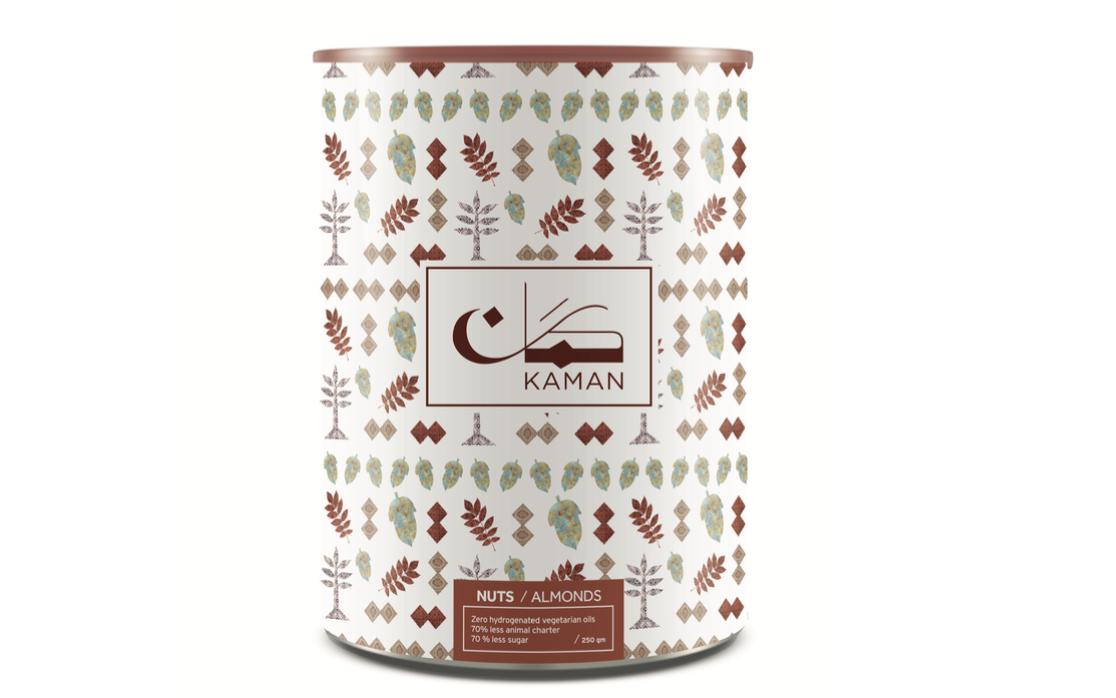
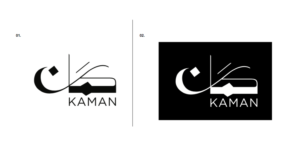
Kaman is a Mediterranean brand of delicacies targeting duty free retails around the world. The project started in the KSA and originated from a passion of sharing cultural flavours to the rest the world. I worked on this project during my work at Kite. Kaman- which refers to a culture-specific violin - was explored through an Arabic logotype where the intersection of 2 letters hints at the object of the representation. The merge of thick and thin strokes together with the combination of organic and geometric forms emphasize the flavourful and musical attributes of the brand. The visual elements created through photographic textures and silhouettes of cultural references connect across packages conveying different stories and moments of Kaman's journey.

Primary sketches, creating custom made typography for the album and trying different lockups.
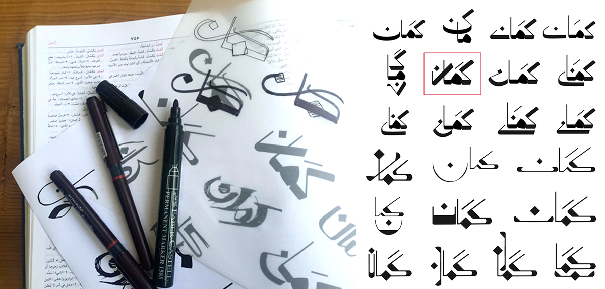
Drafts of Various Logotypes
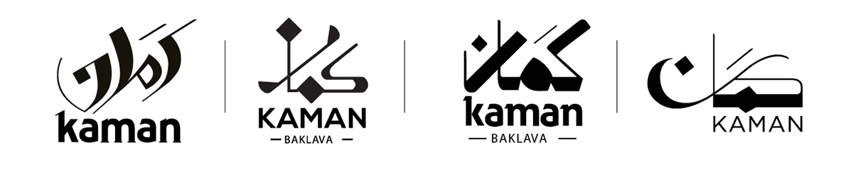
Approved Logotype
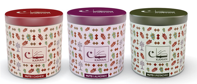
Visual Elements for Packaging
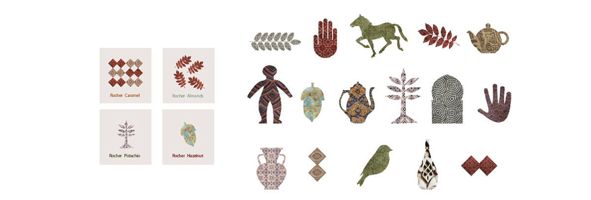
Patterns and Various Compositions